| Image |
Comment |
| 10/01/2004 12:17:01 PM |
"Back" Cover Girlby DougPazComment: Very creative idea, I like it. The match is not perfect, but I don't care. I think you could not have moved the magazine closer to achieve a perfect match with the face and at the same time have a natural look with a normal reading distance. What I do find disturbing are the imperfections around the edge of the desaturation, especially the edge of the left arm (viewer right) holding the magazine, a part of the hair and a small spot on the magazine. |
 Photographer found comment helpful. Photographer found comment helpful. |
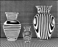
| 10/01/2004 11:52:44 AM |
Vases Filled With Waterby RefocusedComment: I wonder how many people will notice the structure of lines in the vases is not all the same and does not match the background. Did you put separate cardboard with lines behind them ? Very nice. I find the very slight irregularities in the background material distracting, nothing major, but not perfect. Cropping in the middle of the last dark line on the left would have reduced attention to that. |
| Photographer found comment helpful. |
| 10/01/2004 11:47:34 AM |
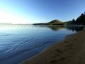
First Lightby autoolComment: A nice peaceful and tranquil atmosphere, hard to get right with such extreme highlights and shadows in the image. The only thing I am wondering is how it would have looked twelve hours later, at sunset. I looks like the light is coming from the right and therefore a sunset from the left would put some more light on the sand and increase structure and add some more WOW factor. |
| Photographer found comment helpful. |
| 10/01/2004 11:39:02 AM |
The Blue Windowby aKiwiComment: I love the vibrant colors and the soft light in the image. I think I would have preferred just one main focal point, I find my eyes moving back and forth between the sundial and the window. The window is non square, probably due to your viewpoint below it, I would have tried to distort it to make it absolutely square, although it also works well as it is. |
| Photographer found comment helpful. |
| 10/01/2004 11:28:44 AM |
The Bearded Ladyby ellamayComment: I am going to be critical (well I usually am anyway). I like the shot but think it could have been better. I like the colors and details of the butterfly and the soft green undistracting surroundings. But the butterfly is in the perfect position to get full sharpness and in your image the top of the wings and the top of the antenna is outside the depth of field. You were probably limited from using a smaller aperture due to low light (I don't see sunny highlights or flash) but I am making my comments anyway. |
| Photographer found comment helpful. |
| 10/01/2004 11:20:00 AM |
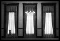
Haunting Absenceby tyt2000Comment: I like it that this image makes me wonder what is going on, what is the story behind it. It looks overall slightly soft. Also I find my eyes moving back and forth between the lights and the chair and, considering your title, the chair should maybe have had a more prominent position so it becomes the one and only focal point. |
| Photographer found comment helpful. |
| 10/01/2004 11:16:43 AM |
Naughty .... but niceby agwrightComment: An attractive image to me, appealing, but no WOW factor. Could be used in advertising with some more empty space around it. Technically I cannot suggest any improvements. Nice clean background. Good focus on the strawberry, nice depth of field and blur, good soft light without overexposed white parts. |
| Photographer found comment helpful. |
| 10/01/2004 11:12:48 AM |
Ethan, Dirty Face and Allby smellyfish1002Comment: The expression is great, the eyes are radiating, full of energy, and the B&W works well. To fully appreciate this image I think you must be a relative or close friend. For me it does not have the appeal that some of the others in the challenge have, but a good image anyway. |
| Photographer found comment helpful. |
| 10/01/2004 07:39:10 AM |
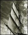
Aloft by BradComment: Great, fantastic atmosphere, great choice of toning of the image. Such a sailing ship can really give a messy image with all the ropes going across, but I think you have managed to use that to your advantage here. The diagonals created by the sails, the line of the mast, the ropes and then on top of it the lines in the sky all add to a well composed image. Congrats. |
| Photographer found comment helpful. |
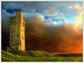
| 10/01/2004 07:34:14 AM |
Sunset at Castle Hill by BobsterLobsterComment: Great job, what a dramatic and beautiful atmosphere. I assume the colors are not fully like they were in real life, but I think they are not too artifical to hurt the image. It all fits well together, I especially like the low light across the grass and against the tower. |
| Photographer found comment helpful. |
Home -
Challenges -
Community -
League -
Photos -
Cameras -
Lenses -
Learn -
Help -
Terms of Use -
Privacy -
Top ^
DPChallenge, and website content and design, Copyright © 2001-2026 Challenging Technologies, LLC.
All digital photo copyrights belong to the photographers and may not be used without permission.
Current Server Time: 06/21/2026 05:25:04 AM EDT.