| Image |
Comment |
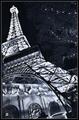
| 10/04/2004 08:14:08 AM |
Paris, Las Vegasby Pep VentosaComment: I like the angle of view and coloring of this image. Some parts look to loose some detail as result of overexposure, especially towards the top of the tower. |
 Photographer found comment helpful. Photographer found comment helpful. |
| 10/04/2004 08:12:09 AM |
|
| Photographer found comment helpful. |
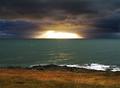
| 10/04/2004 07:33:28 AM |
Breaking Throughby muur88Comment: The sunshine part looks totally burned out, no detail left, and also the clouds above it look strange to me, a pale yellow colors as if extensive dodging was done. Looks rather unnatural. You have some great elements here for an impressive picture, but the issues mentioned, plus the fact I have no real other focal point, make this score lower. |
| 10/04/2004 07:30:22 AM |
A Study in Colorby HRoxasComment: A technically perfect image with great primary colors, composition and lighting. A good specimen as well. It unfortunately fails to touch me emotionally like some other good images in this challenge do, which is why it ends up a bit lower in my ranking. |
| Photographer found comment helpful. |
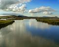
| 10/04/2004 07:27:38 AM |
All the Good Thingsby mbardeenComment: Very nice atmosphere, great clouds and reflection. I am missing some focal point and find the left edge distracting. It looks like a small boat is coming into the picture at the edge, cropping that away, up to the middle of the first large tree, would have improved the image in my opinion. |
| Photographer found comment helpful. |
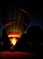
| 10/04/2004 07:24:30 AM |
Night Torchby crabappl3Comment: I like the night time atmosphere with all the balloon enthusiasts getting together, the warm glow in the front and the silhouettes and small lights at the back. I probably would have cropped a significant part of the top (without hurting the silhouettes) and a bit of the left, to get a bit more concentrated view. |
| Photographer found comment helpful. |
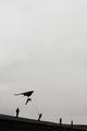
| 10/04/2004 06:45:55 AM |
Megalomaniaby RemieComment: I am sorry I find this image not particularly appealing. The large empty space does not work for me because it is just a flat and dull grey, I would have understood it better if it emphasised the enormous spcae around us, for example by using colors and having some great clouds in there. Then I also would have understood the title, which does not seem to fit at the moment. And finally I find the distance to the persons too big. A shot closer and more from underneath would have emphased the height, the ambition to fly. etc. |
| 10/03/2004 03:56:53 PM |
MAIDby DrJOnesComment: A master in his own genre. A great shot, beautiful model, beautiful surroundings and props, perfect lighting etc. Comments ? Not sure, but there is no apparent reason to bend forward (other then to show of course) and maybe it would be better to show part of her face. |
| 10/03/2004 01:00:57 PM |
The Kozakby smokeditorComment: Show the horse !! For me that is such an essential element, belonging to a kozak. But a good portrait anyway. |
| Photographer found comment helpful. |
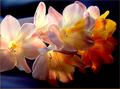
| 10/03/2004 12:59:34 PM |
Spring Flowersby trainComment: The details and colors caused by the backlight are great. I wonder whether a slightly more structured arrangement or a tighter crop could have improved the composition more, currently I find there are just too many flowers. |
| Photographer found comment helpful. |
Home -
Challenges -
Community -
League -
Photos -
Cameras -
Lenses -
Learn -
Help -
Terms of Use -
Privacy -
Top ^
DPChallenge, and website content and design, Copyright © 2001-2026 Challenging Technologies, LLC.
All digital photo copyrights belong to the photographers and may not be used without permission.
Current Server Time: 06/21/2026 01:36:11 PM EDT.