|
|
|
Showing 511 - 520 of ~4957 |
| Image |
Comment |
| 07/24/2009 06:46:39 AM | "Red-in-Blue"by MarceloBazaniComment:  Critique Club Critique
First Impressions
Critique Club Critique
First Impressions
Bright blue, brighter red - I like the woman's face. It is interesting with the sign, alas I don't understand the language, therefore the message is not conveyed. As mentioned, the woman's face and capture of the expression of the moment in it, is quite interesting, but once the eyes search the rest of the image and find other people with less interesting expressions and movement, I lose interest in the image.
Photograph Information, Technicals & Composition Review
I wonder whether a much shallower depth of field may have produced more interest and drama as it would have allowed the woman (and the sign) to dominate even more. The people would become background filler and shapes and may have added color elements.
Composition is difficult to comment on - I like that the woman is down the bottom of the frame, but I think a tighter crop or variation in framing would have given this more balance. For me, the sign seems the main objective. The architecture on the buildings add some interest, but again I think a more refined crop would have helped. The electricity pole cropped out may have also helped. The fact her arm is chopped is not so good, but fairly minor. There is something 'creeping in' bottom left of frame, that cropped out would have been better.
I just read your Photographer's Comments - a protest where people have runner's numbers? - perhaps that is how it is done in Brazil. The subject (the condition of Santos' streets) - sounds like an interesting photojournalism subject...
Comments, Score & Placement Review
Most commenters seem pre-occupied with the sign - this tells me that that is the most interesting aspect of your image - if that was your intent, ok, but if it was 'Street Photography in Color' - then allowing the woman (and 'the street') to feature more, would likely have helped create a stronger image for this Challenge. Your score and placement are quite good for this Challenge.
Summary
I can't help wondering if the Challenge theme was 'lost in translation' - nevertheless, I like the bold colors in this, but overall it has a hurried snapshot feel - which at times can capture special moments, but I'm not seeing it in this photograph. I do think the woman has an interesting face and carries the image. |
| 07/24/2009 06:20:28 AM | Stratificationby EssAreDubyaComment:
Critique Club Critique
First Impressions
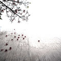
The first feature I noticed in this image is the white blown-out areas in the water. These dominate the image too much, especially because the main feature is the geology for the Challenge. On focussing on the geology subject, it is an interesting formation and the angle you have captured it from has helped show that. I wonder about a variation in angle to help showcase the layers and 'stratification' even more. I appreciate that you may not have been able to gain a better position or angle, so in that case, trying to focus on a particular area of the rock may have provided more interest.
As is, I think cropping out the primary blown areas of the water would have helped a little. However you would still be left with a lighting dilemma. Beside visiting at a particular time of day when the natural light is in your favor, this would also help bring the colors into play more. There may be some technical tips for lighting or use of long exposure from technical experts, both here at DPC or elsewhere on the net.
If you visit this scene again, I would suggest a tripod or a makeshift one if you do not have one, as there is some slight blur noticeable. There may also be some benefit in a slight perspective correction in pp (post-processing).
Photograph Information, Technicals & Composition Review
F/6.3 doesn't seem deep enough to get the detail you need in the rock. With a speed of 1/640 I expect you may have been more focussed on capturing the water, rather than the rock. As already mentioned, the water dominates too much of the frame, in fact almost cuts a diagonal across half of the image. With a refined crop and more overall balance compositionally, the scene would form and flow better, in my opinion. The rock formations may also lend themselves well to a dramatic style of image.
Comments, Score & Placement Review
I agree with the crop comment and think some good points and pointers have been made elsewhere as well. 5.27 is quite a good score - a difficult Challenge, one in which you chose a good subject for. 55/82 is not a bad showing. I didn't vote in this Challenge or I'd tell you my vote.
Summary
I like your title and think it suits the concept well. Next time, try to eliminate 'distractions' that dominate the image. Also try experimenting in pp with crop and zooming variations. An interesting subject choice, just wish I could see more detail in it. |
| 07/17/2009 05:49:17 PM | Desert Blossomby JohannesFrankComment: 6 - Like this, especially how you've shown how the flowers transform and paint a landscape, which your processing has enhanced. Just wish they were a little more dominant overall in the image. |
| 07/17/2009 05:48:07 PM | |  Photographer found comment helpful. Photographer found comment helpful. |
| 07/17/2009 05:47:49 PM | | | Photographer found comment helpful. |
| 07/17/2009 05:47:30 PM | | | Photographer found comment helpful. |
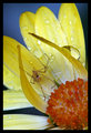
| 07/17/2009 05:44:54 PM | Pretty in pinkby BudyaComment: 7 - 'Ah Lotus'. Beautiful colors and really like the detail in the center. | | Photographer found comment helpful. |
| 07/17/2009 05:44:22 PM | | | Photographer found comment helpful. |
| 07/17/2009 05:43:02 PM | | | Photographer found comment helpful. |
| 07/17/2009 05:38:37 PM | Poppyby SJCarterComment: 8 - Nice soft image but yet bold colors. Like the barely discernible soft grain - wonder about it even more visible, but maybe another image. Slightly more refined crop, maybe - but that's just my opinion. | | Photographer found comment helpful. |
|
Showing 511 - 520 of ~4957 |
Home -
Challenges -
Community -
League -
Photos -
Cameras -
Lenses -
Learn -
Help -
Terms of Use -
Privacy -
Top ^
DPChallenge, and website content and design, Copyright © 2001-2026 Challenging Technologies, LLC.
All digital photo copyrights belong to the photographers and may not be used without permission.
Current Server Time: 06/26/2026 11:22:18 PM EDT.
|