|
|
|
Showing 4621 - 4630 of ~4957 |
| Image |
Comment |
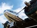
| 08/13/2005 01:10:02 AM | 1937by JollyRogerComment: 6 - Good idea for capturing an essence of this era for the Challenge (in my opinion a shot of this into a time capsule for this year depicts the era well). Criticism; as I am sure you both know and are being 'told', a bigger shot. Whilst a sepia style for this era would work well I think the colors here are great. I really like the ultra polish on the metal, especially set against the sky. A different angle (especially to try to exclude/hide that 'sign' would make this a better photograph in my opinion. Also, to be able to include both 'engines'/blades. |
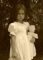
| 08/13/2005 01:06:25 AM | 1890by mandyturnerComment: 6 - Good shot to depict the feel/era for the Challenge (in my opinion this shot in a time capsule would do that for future generations). Criticism; whilst you have obviously applied a few effects (sepia?, grain?), if you had taken them a little further and included perhaps softening too, it may have made this a better photograph in my opinion. I think her pose / expression is 'classic' and the dress and doll and basket? (which I would like to see more of) adds the required character to capture this era. She is getting a little 'lost' in front of the tree though, with her dark hair in my opinion. Good effort to capture 'childhood in this era', in my opinion. |  Photographer found comment helpful. Photographer found comment helpful. |
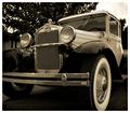
| 08/13/2005 12:52:01 AM | 1930by oOWonderBreadOoComment: 7 - Good shot for the Challenge (in my opinion a shot of this into a time capsule for the year depicts the era/feel for future generations well). I like the b/w or sepia? Criticism; not sure if you have softened/blurred, and whilst I do like that effect, for me if it were 'crisper', especially on the wheels (more contrast there too re the white) and on the emblem/crest, would have made this a better photograph in my opinion. Just a nice 'feel' to this shot. I can't quite discern if it is a 'pick up truck', if it is, I would like to have seen the tray incorporated for added character. | | Photographer found comment helpful. |
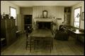
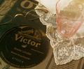
| 08/13/2005 12:44:37 AM | 1850by Fibre OptixComment: 7 - Good effort to meet the Challenge (picture of this in a time capsule for this year depicts the era well for future generations). I like the b/w or sepia?. Like how you have captured just about the entire room, including ceiling. Criticism; for me, either a softening, or, more detail (especially on the lady) would make this a better photograph in my opinion. | | Photographer found comment helpful. |
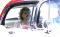
| 08/13/2005 12:42:34 AM | 1957by KaDiComment: 6 - Good effort to capture the era for the Challenge (in my opinion, this shot put into a time capsule for this year captures it well - albeit 'highly stylized). Criticism; whilst I like the dummies - 'he' looks less real than 'her', so for me, detracts. So, in my opinion, either a blurring out more or a cropping out of him, would make this a better photograph in my opinion. I like the colors and the contrast, the lighting too, but just a tiny bit 'blown' (but I'm guessing that's what you were going for) in my opinion. Creative though, you went to a lot of trouble. | | Photographer found comment helpful. |
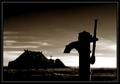
| 08/13/2005 12:31:46 AM | 1881by JohannesFrankComment: 7 - Good effort to capture the era/year/feel for the Challenge (in my opinion, a shot of this put in a time capsule for this year gives a good depiction). Criticism; whilst I do really like this shot and the feel, I'll state the obvious and go against what you are obviously trying to achieve - for me, it is too dark. Especially on the pump, if that just had a touch more 'detail', it would make it a better photograph in my opinion. It is a fine shot though and the setting is good - even getting more detail on the house(?) or church(?) would lift it more for me, but I think I get your intent, and it still 'fits the Challenge' just a 'creative' take, so well done. Ok, from 6 -> 7. | | Photographer found comment helpful. |
| 08/13/2005 12:21:12 AM | 1908by Debster5Comment: 6 - Good effort to meet the Challenge (be it in the true time capsule sense or just a photo of this put into a time capsule). Criticism; whilst I do like the soft colors and the way they complement each other, in my opinion if you had perhaps added some more contrast, possibly even a softening (not sure) it would have made this a better photograph in my opinion. Perhaps also not so tight a crop, or just a different/sharper angle. You have some 'character' in this shot which I like, but again, would like to see that emphasized more, somehow. Looks pretty 'authentic' to your year to me, so well done. | | Photographer found comment helpful. |
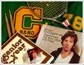
| 08/13/2005 12:17:38 AM | 1978by glad2badadComment: 6 - Good effort to meet the Challenge, especially in a true time capsule sense. Criticism; in my opinion this would be a more 'interesting' picture if you had composed it / arranged slightly differently. For me, nothing really 'stands out'. The coloring is good, but the blend of colors (in my opinion), just isn't 'bold' enough - not sure how to describe it, sorry. I think you captured the essence of 'youth' in this year well, just as I said, maybe a different angle, crop, layout, would have made this a better photograph in my opinion. | | Photographer found comment helpful. |
| 08/13/2005 12:12:04 AM | 1914by dsaditesComment: 7 - Good effort to meet the Challenge (especially in a true time capsule sense). Criticism; I would like to see more contrast, especially in the 'blues'. A sharper focus on the coins perhaps, bringing out their detail, would have made this a better photograph in my opinion. I do like what seems to be a 'central' lighting effect - just perhaps a different layout, especially to show more detail on the magazine. | | Photographer found comment helpful. |
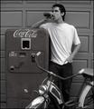
| 08/13/2005 12:10:16 AM | 1954by Joey LawrenceComment: 7 - Good effort to meet the Challenge (in my opinion a photo of this put into a time capsule would capture this era for future generations well). I like the b/w and the 'style'. Criticism; I think you have captured the essence quite well but for me, it just needs an extra 'something' - perhaps angle, rather than straight on. As far as true 'authenticity' goes, the shirt and jeans (while close) are not 'true' so maybe not as much detail on those, or just as I said a different angle, may have made this a better photograph in my opinion. It looks like you had fun though and definitely made an effort to meet the Challenge and for that I say well done. And extra points for finding a Coke bottle in that shape. | | Photographer found comment helpful. |
|
Showing 4621 - 4630 of ~4957 |
Home -
Challenges -
Community -
League -
Photos -
Cameras -
Lenses -
Learn -
Help -
Terms of Use -
Privacy -
Top ^
DPChallenge, and website content and design, Copyright © 2001-2026 Challenging Technologies, LLC.
All digital photo copyrights belong to the photographers and may not be used without permission.
Current Server Time: 07/16/2026 10:52:55 PM EDT.
|