|
|
|
Showing 4581 - 4590 of ~4957 |
| Image |
Comment |
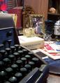
| 08/14/2005 07:47:49 AM | 1968by codauberComment: 5 - Met the Challenge (both in the respect that most of these items could go IN a time capsule, and also the respect of a photo of this could go in a time capsule to depict the era for future generations). Criticism; I think that if you had less (even none) typewriter (as it is too disproportionate to the other items), and more attention paid to the arrangement/composition of the items you have, it would have made this a better photograph in my opinion. Although I am a fan of unusual angles, I think you have lost detail on a lot of your items with the angle you have chosen. I tried to discern '....space odyssey' and can't make out if it is a record or what, so just detail paid to such things, via the composition/arrangement, would have made this a better shot in my opinion. There are quite a few things I can't decipher, but in general it looks like you have gone to a lot of effort to ensure all items are specific and authentic to your year. The colors are a little 'haphazard', but again, in my opinion, if you had given more attention to arrangement etc, it would have made a difference for that aspect as well. More clarity is also required, especially seeing as the most dominant item (the typewriter) is out of focus, in my opinion, the items looked at 'beyond that', seem 'out' as well. |  Photographer found comment helpful. Photographer found comment helpful. |
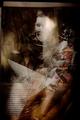
| 08/14/2005 07:39:45 AM | 1991by nico_blueComment: 5 - There is too much here that I can't discern - if it is 'time capsule contents' or a shot that could be printed off and put into a time capsule. I am surmising it is an era to do with Chechnya(?), so, in my opinion, as for if it meets the Challenge, I'm guessing it is 'contents' and that you have made some effort here to meet the Challenge especially with your title and not elaborating or trying to 'explain' - which is what you were asked. Criticism; as I said, I think if more of the 'items' were distinguishable, it would make it a better photograph in my opinion. I like the colors and 'feel', just would like to be able to focus on more than the text and child to get 'the story'. A cropping out of the top 'nothing' would have helped too in my opinion. | | Photographer found comment helpful. |
| 08/14/2005 07:35:26 AM | Sweet Southern Summer 1959by just_havin_funComment: 4 - This is a nice set up, but for me, not scoring higher as I would like to see only the year in the title (likely be a 6 if so) to really 'meet the Challenge'. A photo of this put into a time capsule for that year, would fairly well convey/depict a sense of the times for that era, though the more I look at, not sure that it does convey this specific era well. Criticism; whilst I can see you have applied some 'ageing effects', I would like to see more of it. Perhaps more grain or, not sure. I like the clothes and bear choice (although, for me, it portrays an older 'era'). Perhaps if the little girl had a slightly different expression may have given this a more 'authentic' feel for the time/era, and made this a better photograph in my opinion. Perhaps a little 'wider', further out, may have been better too, in my opinion, etc etc. | | Photographer found comment helpful. |
| 08/14/2005 07:31:46 AM | Circa 1865by JeileenComment: 5 - I like this shot and think a photo of this into a time capsule for said year depicts the era well for future generations but I do wish you did not put circa there, not only for the Challenge description, but it speaks for itself in my opinion. Criticism; I am not sure on the choice of frame. I think if there were perhaps a little more fore space, it may have made this a better photograph in my opinion. I think the b/w works well and I like the look of the 'boarded background'. The detail in the carriage is good enough, especially seeing as it is black(?) so hard to pick up. Just a little more 'fore' and a little less 'top', in my opinion would make this better. And yes for me, without 'circa', likely a 7. | | Photographer found comment helpful. |
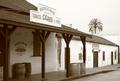
| 08/14/2005 06:39:18 AM | 1920'sby lenahComment: 5 - Met the Challenge with the 'feel' of the era (a shot of this in a time capsule would depict it for future generations). I just wish you had left it at '1920' (be a 7 if you did from me). Criticism; I like the angle, but would like it even 'sharper', get more of a depth of field, depending of course what is there 'right of screen'. Whilst this shot is fairly 'clean', given the Challenge and trying to capture the 'feel' of the era, I would like to have seen a few more 'era' specific items - a horse would be great or a man leaning on the post smoking a cigar or pipe (where are they when you need them). Good shot and 'depiction'. The building/billboard at the end of the building on the right is a touch distracting but minor. The color is good, maybe just a tad more contrast/drama, may have made this a better photograph in my opinion. edit: typos Message edited by author 2005-08-17 05:13:25. | | Photographer found comment helpful. |
| 08/14/2005 06:31:39 AM | Eighteen Hundred Eighty-Oneby Dr.ConfuserComment: 5 - Good composition to meet the Challenge (in my opinion a shot of this put into a time capsule would fairly well depict the era for future generations). Not sure about the spelling out of the title, sure it is different, but in looking at all the thumbnails, I personally like seeing them all with just the 'year' in numbers. Criticism; whilst I like the simplicity, and the composition is good, the lighting is also nice, I would like to see perhaps a little more 'yellowing' here and softening. I think you captured the candle well and I think if you had not cropped off the tip of the flame, and if possible, brought all items further down the table to gain just the one 'grain' as the 'background/base', it would have made this a better photograph in my opinion. Also, I would like to have seen the bullets placed closer to the gun, maybe on the 'white'(?) gloves. Lastly, frames are always questionable in my opinion, but in this shot, perhaps a nice dark thickish frame might have set this off better. I think there is potential for a more 'dramatic' feel here that I would like to have seen somehow emphasized. | | Photographer found comment helpful. |
| 08/14/2005 06:25:00 AM | 1952by dfrenetteComment: 5 - Good improvisation/emulation to meet the challenge, you could even FIT this in a time capsule, so well done. Criticism; I would like to see more 'eraness' within the composition - somehow. I do like the angle, and whilst I know you were likely trying to get it as realistic as possible (and the dof of green in the back is good at that), maybe a 'head on' shot, with some little 'people' (if you had them) - not sure. Perhaps a little blurring or even oversharpening, maybe even sepia, to gain more 'era feel', not sure. Creative and good effort though. |
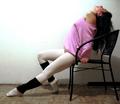
| 08/14/2005 06:21:36 AM | 1983by mesmerajComment: 6 - Met the Challenge, re a photo of this put into a time capsule depicts this era quite well for future generations, in my opinion. Criticism; to 'nitpick', just attention to detail, such as the white paper on the floor far right, and the style of chair (but I may be wrong there) doesn't have a real 80's feel in my opinion. Actually I would like to have seen this also (as I do like the pose you've gone for) in the 'maniac' dance (upright) position. The clothes are pretty spot on and the lighting top left is good but if this was a little further out (and taking advantage of the shadow play) and perhaps even a little 'softened', would have made this a better, and more dramatic shot, in my opinion. Maybe even a little 'ghetto blaster' whacked in there somewhere too. I think a plainer flooring might also not detract as this patterned one does, but that is just my opinion. Ok, 6, from 5. edit: typo Message edited by author 2005-08-17 01:14:54. | | Photographer found comment helpful. |
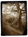
| 08/14/2005 06:12:44 AM | 1985by PatryckComment: 6 - Ok I do really like this shot but have convinced myself you did a typo with the title in your year. At least that is my hope as I would like to think of this (especially given the effects you have applied) as an older 'era' (even though I doubt the frame of the main steps would be that 'machined' long ago). I think you met the Challenge (based yes on this supposition) as a photo of this into a time capsule captures a certain 'childhood' essence of this era for future generations. Criticism; whilst I like the darkness around the edges, I am not in favor of the particular frame you chose. I like the sepia(?) effect a lot and an even grainier or 'softened' effect would possibly make this a better photograph in my opinion. It is a unique 'treehouse' and adds a definite character to the photo which is really why I am commenting on this shot. Extra points too for not 'explaining/elaborating on' the year. Ok, also, if this IS 1985, then maybe color to bring the character of the era more to the photo ... either way, I like it. Ok 6 from 5. edit: sp Message edited by author 2005-08-17 00:57:37. |
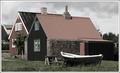
| 08/14/2005 06:05:46 AM | 1883by sigrun_thComment: 5 - I like the concept of this shot and feel you pretty well met the Challenge (re a photo of this into a time capsule depicts the era for future generations). Criticism; having said that, the 'authenticity' (fooling me re the year) is detracted in my opinion by the roof of the right house (but I could be wrong), did they have galvanized iron then? I like the composition though but if the angle were a little sharper, perhaps more front on (depending what was on the right) it may have made this a better photograph in my opinion. Also the introduction of a selective desaturation effect, might have worked quite dramatically here, if not a b/w or sepia, but not sure on that. | | Photographer found comment helpful. |
|
Showing 4581 - 4590 of ~4957 |
Home -
Challenges -
Community -
League -
Photos -
Cameras -
Lenses -
Learn -
Help -
Terms of Use -
Privacy -
Top ^
DPChallenge, and website content and design, Copyright © 2001-2026 Challenging Technologies, LLC.
All digital photo copyrights belong to the photographers and may not be used without permission.
Current Server Time: 07/17/2026 02:39:04 AM EDT.
|