| Image |
Comment |
| 10/16/2005 09:50:12 PM |
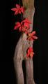
Lady of the Forestby TransitComment: 8 - Like this. Criticism; somehow, would like to have seen more depth and perhaps 'creative' lighting. Colors and texture are nice, just like to see both emphasized 'somehow'. Perhaps a slightly different crop too, not sure. |
 Photographer found comment helpful. Photographer found comment helpful. |
| 10/16/2005 09:47:37 PM |
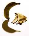
Griefby tateComment: 8 - Well done. Criticism; perhaps the lighting, but difficult, as it seems to me you are going for a somewhat 'high key' effect, but the 'face' (at least I see a 'tiny' one, not just the 'overshadowing posture', which is perhaps all you were going for, if so apologies) in the 'living banana' - somehow - I would like to see 'enhanced' more, difficult, especially retaining the shadow, 'perspective' and said 'high key' effect. |
| Photographer found comment helpful. |
| 10/16/2005 09:43:05 PM |
Forbidden vegetable by LevTComment: 8 - 'Good'. Criticism; some finer lace to enhance the 'illusion' may have made this better in my opinion, however I do like the color & texture combinations you have achieved with this. Lighting seems good, particularly given the 'shine' of the 'subject', was likely difficult. Shame about the 'eroded flesh'. |
| Photographer found comment helpful. |
| 10/12/2005 12:23:53 AM |
By Designby macrothingComment: Wow, didn't expect to place so high so thank you to the voters. For those that saw the orange as yellow, here is a crop of the original:
 Message edited by author 2005-10-23 10:08:47. Message edited by author 2005-10-23 10:08:47. |
| 10/09/2005 07:53:12 AM |
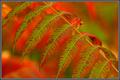
sumacby undieyatchComment: 8 - Nice. Criticism; not much, maybe not so tight a crop, but this is nice as is. The 'bokeh' is very good, especially for the Challenge. Maybe somehow a little more 'sharp' on the veins/edges. Frame doesn't suit in my opinion. edit:typo Message edited by author 2005-10-12 06:51:26. |
| 10/09/2005 07:51:43 AM |
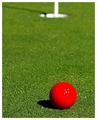
“If you drink don't drive. Don't even putt.”by Marc923Comment: 8 - Good. Criticism; the lighting(?) on the top right of the ball detracts slightly, would like to have seen the 'dimples' all the way around. Good texture on the grass, whole composition and set up is good. |
| Photographer found comment helpful. |
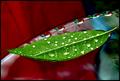
| 10/09/2005 07:50:34 AM |
"Thank You", said Red to Green, "that was very Complementary of you."by STEINRComment: 8 - Like this, including the title. Criticism; not much, perhaps that light(?) mainly on the right, is a little distracting. Difficult, but would like to have seen a little more clarity on the 'bunch', and perhaps even incorporating the veins in the leaf under more if possible. Maybe a tighter crop or just closer, not sure. |
| Photographer found comment helpful. |
| 10/09/2005 07:48:15 AM |
Floatby jaxedComment: 8 - Nice. Criticism; wish it were pure red and green, so different angle/placement. Nice coloring, nice drops, perhaps a slightly softer background (seems a little noisy). Nice composition, with the elevated leaf on table/plate/etc, just like to have seen that end of the leaf in focus too. Not sure on the frame. |
| Photographer found comment helpful. |
| 10/09/2005 07:46:11 AM |
Born in the purpleby holidayComment: 8 - Very nice. Good coloring. Criticism; not much, perhaps more detail on the foremost violet, little less fabric right fore, not sure. Nice lighting. Not sure on the frame. |
| Photographer found comment helpful. |
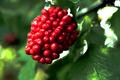
| 10/09/2005 07:34:09 AM |
Getting ripe.by jimsappComment: 8 - Excellent. Cricitism; the 'white' (droppings?) slightly detracting/distracting, but otherwise perhaps a slight 'softening' of the leaves, really making those berries pop even more, perhaps a touch more sharpness/definition in the berries, may have made this better in my opinion. Nice 'composition' and colors. |
Home -
Challenges -
Community -
League -
Photos -
Cameras -
Lenses -
Learn -
Help -
Terms of Use -
Privacy -
Top ^
DPChallenge, and website content and design, Copyright © 2001-2026 Challenging Technologies, LLC.
All digital photo copyrights belong to the photographers and may not be used without permission.
Current Server Time: 07/18/2026 11:14:24 AM EDT.