|
|
|
Showing 4351 - 4360 of ~4957 |
| Image |
Comment |
| 11/02/2005 05:55:50 AM | Mrs Misumenaby macrothingComment: Originally posted by Jammur:
Good finish for a good picture.
Now, do you have one showing the pink stripes? |
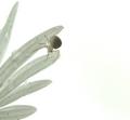
Thank you. As a matter of fact, I do - but it IS a different spider. Not sure if you are suggesting 'Mrs Misumena' had 'pink stripes' or not, but she did not. This shot is of another 'Misumena Vatia' who lives a couple of bushes to the east:

And, if really interested, more information/research can be had here (BugGuide.Net), here (What's That Bug?) and here (SpiderRoom.info).
and
Originally posted by Jutilda:
I wish the spider were more focused - maybe he is and it's just opaque. Hmmmm
The use of negative space is good. I like the crop. The water droplets add some nice shadowing to the petals. |
She is fairly opaque/translucent in the legs. The 'lens I should have used' is 'unavailable' at present, but my little Fuji did quite well to show some of her features.
Thank you to all those that voted it high. Again, very pleased with my 'place'. I would like to take this opportunity to publicly thank Mrs Misumena for her patience and cooperation, she threw a few 'draglines' out that day, but 'we persisted' and she went safely back 'home'. |
| 10/29/2005 11:23:28 PM | Gardeniasby Eagle EyeComment: 4 - Like the potential here. Criticism; in my opinion the gardenias are getting lost on the 'fabric background' - by the 'focal point' (seems that the embroidery in the fabric is sharper (may just be the coloring though)) than on the gardenias and, that the embroidery is too dominant for this shot. Either 'further back' or else more of a macro, to get the focus on (especially tips of) the gardenias, along with a more 'bland'/less 'busy' background (but obviously still white re the Challenge) would have made this a better shot in my opinion. Perhaps even a different 'composition' of the flowers, especially that top one, so the three were more 'uniform'. edit:typo Message edited by author 2005-11-02 00:25:34. |
| 10/29/2005 11:10:30 PM | Morning Dip circa 205A.Dby lytaComment: 8 - Nice. Good subtle colors. Good use of grain/noise(?) for the Challenge. Criticism; not much, perhaps a tighter crop at the top, or a slightly sharper (ground up-ish) angle, may have made this a better shot in my opinion. I imagine it would look good b/w or sepia too, but I like that you left it like this. Perhaps even more grain too, not sure. |  Photographer found comment helpful. Photographer found comment helpful. |
| 10/29/2005 10:49:05 PM | | | Photographer found comment helpful. |
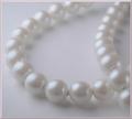
| 10/27/2005 07:37:37 AM | Remembranceby LucidLotusComment: 6 - Like the potential of this and the concept. Criticism; for what appears to be a macro (apologies if wrong) seems 'too close', or maybe it is just over blurred/softened. Definition/sharpness in at least a few 'pearls' at the fore would have made this much better in my opinion. I like the angle, and whilst I also like the 'composition'/centering, I wonder if some more 'space' left or fore, may have also made this better, not sure. As far as 'highlights' go, while no expert, seems you have done a good job to not blow any in this. | | Photographer found comment helpful. |
| 10/27/2005 07:25:42 AM | America's Favorite Pastimeby Tommy 2 ToneComment: 5 - Like the potential of this. Criticism; 2nd thing I saw was the 'CHINA(s)', so attention to that detail (especially given your title) would have made this better in my opinion. The base/background seems a bit 'dirty' and I can just discern 'PIX'(?), so again just minor details. The frame detracts from this shot in my opinion. |
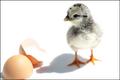
| 10/27/2005 07:21:41 AM | ... Chicken or the Egg? by banditComment: 5 - Do like this but - Criticism; main subject is too dark in my opinion to be able to effectively have the technical challenge of not blowing highlights. I would like to have seen the egg also in focus (especially for the Challenge and the highlight/technical issues, but this is a good shot as is), and be able to 'see' how well you did with not blowing the light color of the eggshell against the white background. | | Photographer found comment helpful. |
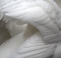
| 10/27/2005 07:18:37 AM | Cygnus Olorby TallblokeComment: 7 - Wow. Whilst no expert on 'highlight control' re the Challenge, seems to me you have done very well to not 'blow' any surface, save for a few feathers top middle. Criticism; difficult, as I do like this unusual view/angle, but (and especially for the Challenge) would like to have seen more of a 'white background' (even though I know the swan itself is basically 'the background'). Just, perhaps some more 'space' somewhere, giving more perspective/depth/not sure. Of course with 'basic' little could be done about the 'fly'(?) on the back. Good and very unusual shot. Up to 7 from 6. | | Photographer found comment helpful. |
| 10/27/2005 07:14:39 AM | maestro Eduardo Barbociby the PljucComment: 7 - Very nice portrait, good character capture. Whilst no expert on 'highlight control' re the Challenge, seems to me you have done very well with the gentleman's head/hair to not 'blow' any highlights, but seems some issues in the shirt. Criticism; not much aside from the said 'issues' on the shirt and possibly the hair bottom right. Very good. |
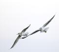
| 10/27/2005 07:10:51 AM | Being Freeby mpembertonComment: 7 - Good shot. Whilst no expert on 'highlight control' re the Challenge, seems to me you have done very well to not 'blow' any surface. Double took on this one, very similar to the other, however the other has more 'light coloring' in it, that and the angle / 'composition' and slightly 'whiter' background got it a touch higher from me. Still a great shot though. Criticism; if possible, different angle/tighter or different crop, just like to see more of the 'light coloring' of the bird(s) against the background. Very difficult I imagine to adjust the contrast here given the colors. |
|
Showing 4351 - 4360 of ~4957 |
Home -
Challenges -
Community -
League -
Photos -
Cameras -
Lenses -
Learn -
Help -
Terms of Use -
Privacy -
Top ^
DPChallenge, and website content and design, Copyright © 2001-2026 Challenging Technologies, LLC.
All digital photo copyrights belong to the photographers and may not be used without permission.
Current Server Time: 07/20/2026 06:40:04 AM EDT.
|