| Image |
Comment |
| 11/30/2005 06:37:06 PM |
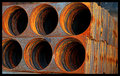
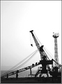
Industrial tunnelsby M&MComment: 4 - Good potential, good colors. Criticism; needs symmetry and better cropping. |
 Photographer found comment helpful. Photographer found comment helpful. |
| 11/30/2005 06:36:24 PM |
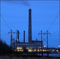
1.21 Gigawattsby MQuinnComment: 7 - Good shot, good symmetry. Criticism; want to say I'd like to see the 'smoke' more, but difficult at this angle/size. I like the effect with the lower lights. seems either a flaw or not sure, in the middle of the 'stack'/'tower' but could be lights. Overall the feel is good but seems just a little 'overprocessed', detracting (albeit slightly) from the main subject, in my opinion. |
| Photographer found comment helpful. |
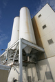
| 11/30/2005 06:30:14 PM |
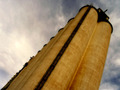
Grain Industryby arsenalComment: 7 - Like this and the colors together. Criticism; don't know how you did this under 'basic', but seems like it is 'over' burned. A more subtle 'burn effect', would have made this better in my opinion. Too much detail is lost in the concrete(?) structure/silos/tanks/whatever. Good angle/perspective. Just those black areas seem too 'processed' to me, hard to explain. edit:typo Message edited by author 2005-12-07 07:27:37. |
| Photographer found comment helpful. |
| 11/30/2005 06:27:39 PM |
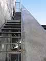
To Industrial Heightsby ernaComment: 6 - Like the potential. Criticism; in my opinion there is too much grain, whether it was intentional or not, not sure, either way, detracts from an already 'texturous' enough shot in my opinion. Like the perspective, but wonder if that roofing on the right detracts a little from the sharp perspective. Like to see the focal point perhaps a little more to the fore. |
| Photographer found comment helpful. |
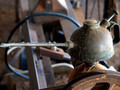
| 11/30/2005 06:25:44 PM |
Senior oilcan looking for a new jobby alexgarciaComment: 6 - Like it. Criticism; perhaps just a little more space either side of the can, and a slight rotation up on the left, may have made this better in my opinion. It is obviously unused, and the 'filaments' attached to it add an extra element to the feel of this, which have been captured in the sunlight(?). Perhaps just a bit stronger colors, but difficult I imagine with contrast issues. |
| Photographer found comment helpful. |
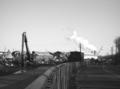
| 11/30/2005 06:18:52 PM |
End of the Roadby panynjComment: 6 - Good perspective and 'view'. Criticism; without the cars, and those 'billowing smoke clouds' emphasized somehow, would have made this better in my opinion. |
| Photographer found comment helpful. |
| 11/30/2005 06:17:25 PM |
City Breweryby EastKentGoldingComment: 6 - Good perspective. Criticism; like to see an even sharper perspective - creating an 'ominous' type of feel. The colors are good, with the variations in white, perhaps this accentuated somehow, may have made this even better in my opinion. The bottom left edge of the 'building' slightly detracts, but minor. |
| Photographer found comment helpful. |
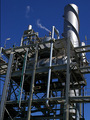
| 11/30/2005 06:12:05 PM |
Part of my work place.by Aussie_BlueyComment: 5 - Coloring is good. Criticism; this looks like it has more potential than has been captured. Depending on opportunity - but I think a more symmetrical or 'front on' angle/perspective would have made this a better shot in my opinion, or else perhaps a different crop, not sure. edit:typo Message edited by author 2005-12-07 07:32:45. |
| 11/30/2005 06:10:14 PM |
untitledby TiberiusComment: 7 - Good shot, good almost silhouette effect. Criticism; difficult to tell, but seems it needs a slight nudge rotation up on the left, but the horizon in the distance seems level from what I can discern so not sure. This definitely needs 640 height to help it. The b/w(?) toning works well here, nice overall 'feel'. |
| Photographer found comment helpful. |
| 11/30/2005 06:07:14 PM |
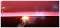
Ship Repairmentby gsalComment: 6 - Like the potential here and I am sure the size restrictions do not do this shot justice. Criticism; seems slight rotation up on the left needed, or maybe it is the cropping. Like to see more detail, or focus, somehow on the welder. Just noticed the 'smoke', so that, if possible (no idea how and may be camera/lens dependent) incorporated or 'highlighted' more, may have made this even better in my opinion. Good coloring. Not sure on the frame. |
| Photographer found comment helpful. |
Home -
Challenges -
Community -
League -
Photos -
Cameras -
Lenses -
Learn -
Help -
Terms of Use -
Privacy -
Top ^
DPChallenge, and website content and design, Copyright © 2001-2026 Challenging Technologies, LLC.
All digital photo copyrights belong to the photographers and may not be used without permission.
Current Server Time: 07/23/2026 05:03:42 AM EDT.