|
|
|
Showing 4061 - 4070 of ~4957 |
| Image |
Comment |
| 11/30/2005 07:30:15 PM | Stacksby drake217Comment: 7 - Very good, good coloring too. Criticism; seems like it needs a nudge rotation up on the left - this looks like it is crooked, but apologies if wrong. Coloring is good, and while has a slight 'grungy' feel, like to see a little more contrast, and/or bolder colors, if possible. Maybe a different cropping too, not sure. |
| 11/30/2005 07:27:10 PM | "We all leave a footprint on the earth"by John WhiteComment: 7 - Excellent perspective/angle/view. Criticism; your title nearly ruined this for me - it seems 'forced' and doesn't suit/complement this shot in my opinion, in fact detracts from it. Really like this shot, and if this view/idea is original, well done. |  Photographer found comment helpful. Photographer found comment helpful. |
| 11/30/2005 07:08:34 PM | Winkin', Blinkin' and Nodby taterbugComment: 7 - Nice colors and perspective. Criticism; less trees in the fore and perhaps an even sharper perspective, and a slightly different crop at the fore, may have made this even better in my opinion. | | Photographer found comment helpful. |
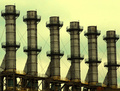
| 11/30/2005 07:06:14 PM | Thales the Miletianby bairasComment: 6 - Good coloring and use of lines and silhouetting. Criticism; apologies if wrong, but seems this is 'tilted' and needs a rotation up on the left, perhaps even only slightly. Maybe without the cloud top right, might have given this an even more unusual and dramatic feel (especially the silhouette effect), not sure. Those 5 extra pixels in width would also have helped this. | | Photographer found comment helpful. |
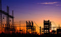
| 11/30/2005 07:03:01 PM | Working Conditionsby jjbeguinComment: 7 - Good concept and perspective. Criticism; difficult, as you were likely going for such 'darkness', but in my opinion a little more 'balance', and/or color/toning and detail, would have made this even better. The 'grain' works, but perhaps if it were either enhanced to make it more dominant, or the whole shot softened, not sure, just seems to be hovering in the middle, yet still noticeable, if that makes sense. edit:typos Message edited by author 2005-12-07 07:16:25. | | Photographer found comment helpful. |
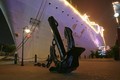
| 11/30/2005 06:59:03 PM | A Retired Lady of Industry,by modprodComment: 5 - Mostly for the potential. Like the sharp perspective angle. Criticism; needs to be at least 640, in this case width. Not an overt 'industrial' type feel in the ship itself, but the anchor helps this. Just needs to be bigger. The anchor sharper too would have made this better in my opinion. Perhaps a slightly different crop too, not sure. | | Photographer found comment helpful. |
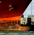
| 11/30/2005 06:55:12 PM | Tying Upby joezlComment: 7 - Good shot, almost abstract. Good coloring. Criticism; difficult, but perhaps if the anchor were sharper, might have made this better in my opinion. Like the silhouette effect of the workers. | | Photographer found comment helpful. |
| 11/30/2005 06:51:10 PM | end of the lineby cq107Comment: 7 - Great perspective/angle. Good color. Criticism; wish it were a fraction wider. If the top of that left tower in the background were not cut off, would make this even better in my opinion. Difficult to tell, but seems perhaps a fraction nudge rotation up on the right is needed, not sure. Really like the detail and texture capture at the fore - even sharper still 'somehow' would be good, but likely hard to get the background as it is so who knows. |
| 11/30/2005 06:43:37 PM | U smell that?by zapgrafxComment: 7 - Good shot, effects and lighting and overall 'feel'. Criticism; bottom left 'green' detracts in my opinion. I like the 'grass/seedheads' contrasting there but if they were more subtle (ie just the green behind cropped out and less of the 'grass'), make this even better in my opinion. | | Photographer found comment helpful. |
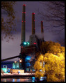
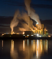
| 11/30/2005 06:40:25 PM | Samoa Pulp Mill by bryanbrazilComment: 8 - Wow. Great shot. Criticism; difficult, but given the 'smoke' adds so much in this shot, if possible, the inclusion of 'more' of that center one, even if it meant sacrificing some reflection (or possibly gaining both by a sharper perspective who knows), may have made this even better in my opinion. Lighting is good and colors are good, but would like to see the few colors that are there (as opposed to lights), ie; that green on the left, bolder, if possible. Good industrial shot. | | Photographer found comment helpful. |
|
Showing 4061 - 4070 of ~4957 |
Home -
Challenges -
Community -
League -
Photos -
Cameras -
Lenses -
Learn -
Help -
Terms of Use -
Privacy -
Top ^
DPChallenge, and website content and design, Copyright © 2001-2026 Challenging Technologies, LLC.
All digital photo copyrights belong to the photographers and may not be used without permission.
Current Server Time: 07/23/2026 05:06:47 AM EDT.
|