| Image |
Comment |
| 12/21/2005 08:33:30 AM |
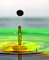
Colorfull Dropby JasenkaComment: 6 - Good, especially for basic editing. Criticism; difficult re the shallow depth 'featuring', but perhaps (depending of course what you had to work with), incorporating that reflection may have given this even more. The 'flow of color' within the elevated drop is good, and unusual. Nice colors, difficult, but perhaps if they were enhanced more somehow to make them even more vivid, but likely conrast issues, as this seems getting close to bordering on them now, in the rear. |
 Photographer found comment helpful. Photographer found comment helpful. |
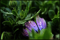
| 12/21/2005 08:30:49 AM |
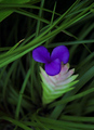
Floraby jpetersComment: 5 - Well that's unusual. I like the 'lines' etc. Criticism; no idea what type of flower this is so will come back post challenge to see, looks 'out of place' but who knows. Given the unusual color combinations, perhaps a slightly more 'off centered' composition may have made this even better, possibly a slightly sharper angle too, not sure. |
| Photographer found comment helpful. |
| 12/21/2005 08:23:29 AM |
spectrumby drueovComment: 6 - Good. Criticism; like to see the blue glass slightly sharper if possible and if the colored reflections were 'used' more, make this even better in my opinion. Maybe a little 'wider', incorporating the full glasses too, who knows. |
| Photographer found comment helpful. |
| 12/21/2005 08:21:20 AM |
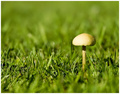
Stand Tallby seriocomicComment: 5 - Nice. Criticism; seems a little 'blown' at the top, but difficult to control likely. Apologies if wrong, but the grass looks just a fraction 'off' natural, hard to explain, butthe bits of clover(?) I can discern look 'true' so, who knows. May also just be the focal effects. Just wish the mushroom/toadstool were as defined as the grass. |
| Photographer found comment helpful. |
| 12/21/2005 08:14:07 AM |
Black & Whiteby medoComment: 5 - Like this, good potential. Criticism; 640 would have helped this a lot. More attention paid to the lone pencil being straight, as well as just a fraction sharper on it, would have made this better in my opinion. |
| Photographer found comment helpful. |
| 12/21/2005 08:02:46 AM |
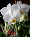
Orchidsby StopDownComment: 5 - Very nice. Criticism; the pots(?) in the background detract but only slightly. Perhaps a different angle (and composition variation), trying to eliminate them, may have made this even better in my opinion. Seems fairly good contrast control on the whites, although overall this seems a little 'dark', but difficult to adjust given the whites I imagine. |
| Photographer found comment helpful. |
| 12/21/2005 07:11:34 AM |
Harmonyby BradComment: 4/5/4..5 - Nice rich colors. Like the potential. Criticism; a little dark, especially at this size in my opinion, but difficult to adjust the colors I imagine. A cropping variation, top left of the bud (especially as that seems in sharpest focus), and bottom/bottom right, may have made this better, not sure. The petals/drops a little sharper too may have also made this better. Not sure on the frame, especially that it adds to the 'darkness' and emphasizes the crop 'lines'. |
| Photographer found comment helpful. |
| 12/21/2005 06:56:17 AM |
End of the Branchby jab119Comment: 5 - Nice 'catch' and colors. Depth is good. Criticism; firstly that one extra pixel, other than that perhaps slightly more space below compositionally, not sure. Like to see that 'fore stem' in focus, but realize you'd lose what you have so perhaps a different angle, as that 'fore stem' slightly detracts in my opinion. Looks like the quality is there, so an even tighter crop perhaps to get more detail on the drop/stem, who knows. |
| Photographer found comment helpful. |
| 12/21/2005 06:51:43 AM |
Scrabble Vertigoby spart4cusComment: 5 - Like the concept. Criticism; if the 'A' were sharper, and perhaps a slightly different angle, to allow the 'pile of tiles' to be seen better (even though it may have reduced the shallow effect), may have made this better in my opinion. |
| Photographer found comment helpful. |
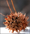
| 12/21/2005 06:49:54 AM |
Three Stickyby admart01Comment: 6 - Nice. Good texture/macro/lighting. Looks like a Liquidambar seed pod. Criticism; not sure on the white base 'contrast' or composition, especially of 'stems/stalks'. |
| Photographer found comment helpful. |
Home -
Challenges -
Community -
League -
Photos -
Cameras -
Lenses -
Learn -
Help -
Terms of Use -
Privacy -
Top ^
DPChallenge, and website content and design, Copyright © 2001-2026 Challenging Technologies, LLC.
All digital photo copyrights belong to the photographers and may not be used without permission.
Current Server Time: 07/25/2026 03:13:53 AM EDT.