|
|
|
Showing 3771 - 3780 of ~4957 |
| Image |
Comment |
| 12/22/2005 06:55:59 AM | Will You Be My...by GIS_boyComment: 6 - Good use of shallow DOF. Criticism; looks like a few 'blown' areas on the ring/stone and nail. Nice and simple composition and the coloring is nice. Just perhaps a different angle/pose of the fingers and ring plus a variation in lighting, make this better in my opinion. Looks like she has her hands to her face, but that is not easily discernable, so perhaps 'allowing that in' a bit more somehow, who knows. |  Photographer found comment helpful. Photographer found comment helpful. |
| 12/22/2005 06:45:00 AM | C A Tby CalliopeKelComment: 6 - Like this. The focus just on the nose is good and the use of shallow DOF also good. Criticism; the dark areas between the eyes are slightly detracting. The whiskers add a nice element here, especially the DOF/blurred effect, and if they were not 'cut' (so perhaps a different crop/framing depending what you had to work with) may have made this even better in my opinion. The ears as well, but the whiskers add something different here. Frame is too thick at this size in my opinion. | | Photographer found comment helpful. |
| 12/22/2005 06:40:31 AM | Flat Coloursby tonyvComment: 6 - Nice. Criticism; attention to minor aspects like the gold print on the pencils, a slightly different crop and/or angle, to allow the 'beginning' and the 'end' to fade in and out in 'synch' (the bottom right has some space in front of it which if similar to the top left would 'flow' better) and perhaps trying to attain more 'shallow DOF'/blur at beginning and end, would have likely made this even better in my opinion. Not sure on the base, 'works', but it seems to be competing with the colors/pencils too much. Also just noticed some shadow play so perhaps incorporating that may have given this an extra element as well. | | Photographer found comment helpful. |
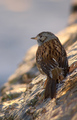
| 12/22/2005 06:31:58 AM | Hey! I'm just out of the shower!by ZorbaTheGeekComment: 7 - Nice capture and slightly unusual on the rock. Criticism; not much, difficult from this angle, but perhaps even sharper, 'somehow' on the eye and beak (if not the whole bird, but you may have been going for this 'depth') may have made this even better, not sure. Perhaps a crop variation to eliminate that dark 'something' top right as it slightly detracts, but minor. | | Photographer found comment helpful. |
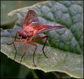
| 12/21/2005 09:32:49 PM | Untitledby MrsFuzzButtComment: Already commented on this, but putting a little note here to let you know why I added this to my Favorites. This is one of the more 'memorable' favorites I have. I really liked the capture, pose and the color of the fly. It was not 'perfect' of course, as I said in my comments, but the potential was there and for your camera, this was a pretty good shot. Having been here a while now, I'd also add that this at 640 likely would have helped, perhaps by incorporating more 'context'/environment, depending of course what you had. temporary note: just read one of your 'forum posts', so another reason I wanted to put this down now, in the hope that you will see it. Also to let you know that I like many of your shots and your 'style'. edit: the "7" in my original comments was only 'pretend', hopefully you worked that out at the time (I was new), but for what it's worth, I'd give it a 7 today if I were voting in the same Challenge. Message edited by author 2005-12-21 21:35:06. |
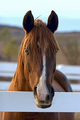
| 12/21/2005 09:02:58 PM | Nearly Night Mareby lynnesiteComment: 6 - Nice capture. Nice simple composition and good use of colors in the DOF as well. Criticism; 'if only' this were 640 height, would have helped a lot. Like the 'crispness' in the horse's right eye, the lighting is very nice, especially enhancing the 'fringe' over the eyes. Difficult, but if the 'whiskers' (even on that same right side) could have been a little sharper (especially to contrast against the white frame/fencing), likely make this even better in my opinion. Seems possible 'gamma/contrast' issues down the bottom of the neck/chest area, but could be markings on the horse. Just noticed, possibly some in the dark area of the ears too, but difficult to control, or adjust, especially under basic editing. | | Photographer found comment helpful. |
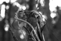
| 12/21/2005 08:57:24 PM | writhingby dunnewoldComment: 6 - Nice angle. Criticism; toning 'works', but perhaps a variation to give it more 'depth'/'feel', somehow, may have made this even better. Difficult, but would like to see a little more texture on the wood/twine/etc. Perhaps a slight variation in crop &/or framing, depending what you had to work with, not sure. | | Photographer found comment helpful. |
| 12/21/2005 08:52:51 PM | There used to be summerby olbolComment: 8 - Very nice. Criticism; whilst I'd like to see more definitiion and clarity on the 'ends', I really like this perspective and the overall pattern/effect. Perhaps this horizontal framing works better 'wall sized', but for here, perhaps a little more height may have helped give it more impact, not sure;. A little 'dark' (again might just be the size and this medium/here), so perhaps a tweaking of contrast/etc, though likely very difficult to do, as would also be any variation in the crop/cut choice. |
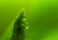
| 12/21/2005 08:43:25 PM | Water Drops in the Plant Worldby ksymeonComment: 7 - Oh, very nice. Very nice color. Criticism; difficult, as no idea what this is (will be back PC to see), but a little more detail/sharpness in whatever it is, 'somewhere' (even just the drops), may have made this even better in my opinion. Good use of DOF coupled with the unusual drops/patterns on the plant(?) to create an unusual abstract. Maybe a little more height, especially for 'here', not sure. edit:typo Message edited by author 2005-12-28 23:09:47. | | Photographer found comment helpful. |
| 12/21/2005 08:40:14 PM | Frosty's Flakesby TransitComment: 7 - Very good. Nice and simple, good coloring and seemingly good contrast control of the whites. Criticism; difficult, maybe a variation in composition, not sure. A little sharper on 'fore man', may have also made this even better in my opinion. Slightly grainy, but fairly minor, and may well be intentional. Good use of shallow DOF, enhanced by the seemingly 'bigger mouth' on the 'rear man'. | | Photographer found comment helpful. |
|
Showing 3771 - 3780 of ~4957 |
Home -
Challenges -
Community -
League -
Photos -
Cameras -
Lenses -
Learn -
Help -
Terms of Use -
Privacy -
Top ^
DPChallenge, and website content and design, Copyright © 2001-2026 Challenging Technologies, LLC.
All digital photo copyrights belong to the photographers and may not be used without permission.
Current Server Time: 07/26/2026 08:12:36 AM EDT.
|