| Image |
Comment |
| 12/29/2005 03:23:46 PM |
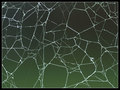
A Web of Polygonsby MeeraComment: 6 - Like the abstract'ness' of this, coupled with the shallow DOF. Criticism; difficult, but wish it were sharper, although I realize perhaps you've gone for a 'soft' look, especially to enhance the pattern(s). The frame 'works', but be better without it, in my opinion. |
 Photographer found comment helpful. Photographer found comment helpful. |
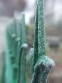
| 12/29/2005 03:13:02 PM |
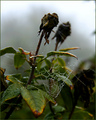
Nature's Workby autoolComment: 6 - Nice. Criticism; especially for this Challenge, if the web were more dominant (zoomed/tighter crop quality dependent), would give this more impact in my opinion. Like the 'deadheads'' effect. |
| Photographer found comment helpful. |
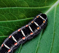
| 12/29/2005 12:03:24 AM |
Netby phoenix46Comment: 7 - Nice. Criticism; good like this, but wonder whether not cropping on the left would have worked better, depending what you had to work with of course. Toning works well here. |
| Photographer found comment helpful. |
| 12/28/2005 11:54:36 PM |
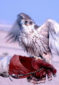
Do you think my pattern look good enough to join the prey show ?by lolor275Comment: 5 - Good potential. Criticism; depending on quality and what you had to work with, a really tight crop on this, eliminating the keeper's hand (even if that means 'cutting' the tail/feet/talons/etc), especially for this Challenge, would have likely made this much better in my opinion. Likely still be 'blurred', but still would enhance the pattern more. edit:typo Message edited by author 2006-01-05 22:55:04. |
| Photographer found comment helpful. |
| 12/28/2005 11:52:09 PM |
Dining Outby owenComment: 6 - Nice cropping/symmetry/composition. Criticism; could be a result of too tight a crop/zoom, but the quality seems to have degraded here, and is one of the first things that I noticed (or could just be blur/focal issues), so perhaps more zoom out (depending what you had to work with) to try to achieve that 'quality', may have made this better in my opinion. May also be the result of post processing too, who knows. |
| Photographer found comment helpful. |
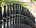
| 12/28/2005 11:46:52 PM |
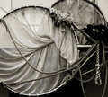
Bill's Gate...no not reallyby fivebalesComment: 6 - Good. Good perspective. Sharper focus on the 'in focus' areas and, depending on angle, trying to either eliminate or 'use' that palm(?) more, may have made this better in my opinion. Looks like the quality has started to degrade here, which may be a result of zoom/cropping too tightly, who knows. Perhaps a variation in cropping or a nudge rotation trying to gain more overall 'balance' as well. |
| Photographer found comment helpful. |
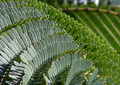
| 12/28/2005 11:41:44 PM |
Leaf Lineby admart01Comment: 7 - Very nice. Good colors. Obviously you've gone for this specific crop/framing, and it 'works' in my opinion, but I still wonder whether a slightly tighter crop to the center vein, or else of course the 'whole leaf', may have given this more impact, especially for this Challenge. Possibly even just 'as is' but with a fraction more 'empty space' on the left, depending what is there, of course. |
| Photographer found comment helpful. |
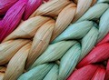
| 12/28/2005 11:39:04 PM |
Colour and formby pacpintoComment: 8 - Very nice. Good color and texture capture. Difficult, but perhaps slight sharper either overall or on the 'two in the center' and a nudge rotation/crop variation to gain more balance/symmetry, may have made this even better in my opinion. Seems a 'reflection issue' top left, but minor. |
| Photographer found comment helpful. |
| 12/28/2005 11:26:28 PM |
Natures Patternby MackComment: 7 - Very nice. Criticism; difficult, not much, but this just seems it needs something extra to 'lift it', especially here at this size, so perhaps more height may have helped, depending what you had of course to work with, not sure. Maybe even, a frame in this case, who knows. |
| Photographer found comment helpful. |
| 12/28/2005 11:20:32 PM |
postsby midget_monkeyComment: 6 - Nice. Criticism; 'if only' you had left the pattern of either the in focus 'post' (ie; it not cropped at the top and so tightly at the bottom), or else allowing more of the pattern of the 'others' to come into focus more, would have made this better in my opinion, but does of course deped on what you had to work with. |
Home -
Challenges -
Community -
League -
Photos -
Cameras -
Lenses -
Learn -
Help -
Terms of Use -
Privacy -
Top ^
DPChallenge, and website content and design, Copyright © 2001-2026 Challenging Technologies, LLC.
All digital photo copyrights belong to the photographers and may not be used without permission.
Current Server Time: 07/27/2026 01:13:33 AM EDT.