| Image |
Comment |
| 04/26/2006 06:06:46 PM |
Steps to championshipby KitaComment: 4 - Like the colors. Better 'symmetry' and balance, 'ironing' of the ribbons, would have made this better in my opinion. Harder to read the third 'label', perhaps because of harsh lighting/flash. Ultimately, unless you do something really unusual with this, in my opinion, this shot is going to be a colorful shot of four bird show ribbons... which for the viewer does not mean the same as likely does for you. |
 Photographer found comment helpful. Photographer found comment helpful. |
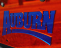
| 04/26/2006 06:04:22 PM |
AUBURN... TAG you're Itby Dirt_DiverComment: 3 - Unless 'Auburn' means something to the viewer, not going to have the same impact as it may for you/have been your intent. Perhaps a better crop and tweaking of colors may have given this a little extra, not sure. |
| Photographer found comment helpful. |
| 04/26/2006 06:03:06 PM |
bad dayby weiszComment: 3 - Not sure what you were going for here, but 'meets the Challenge', just, but the concept, not holding my attention/interest. |
| 04/26/2006 06:02:26 PM |
Celebrationsby eliniasComment: 4 - Not abstract enough in my opinion, if that was your intent. A bit more play with the light and depth may have given this a little extra, but likely difficult with the high key. |
| Photographer found comment helpful. |
| 04/26/2006 07:49:59 AM |
Wash Day Bluesby MichaelCComment: 4 - More towels, less dog, make this better in my opinion for this Challenge. Concept is good though, as is composition. Just the colors dominating more. |
| Photographer found comment helpful. |
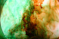
| 04/26/2006 07:48:50 AM |
diffusionby tcmartinComment: 4 - Like the effect, colors are good, but border slightly 'in between' the base 'schemes' mentioned for the Challenge. Perhaps a variation in crop/composition, tighter on the left, but not sure as does work well as is in my opinion also. |
| Photographer found comment helpful. |
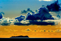
| 04/26/2006 07:46:38 AM |
Luminous Coronadosby LevTComment: 6 - Wow. Not sure what you've done here pp, but the colors have come off good. A tighter crop at the top and, not sure but perhaps 'something' with what appears to be the water surface, to get it maybe most subtle, no idea how though, especially in basic editing, make this even better in my opinion. Just noticed the.. plane or bird.. maybe 'enhancing' that via a tighter crop/framing variation, especially for this size, not sure. |
| Photographer found comment helpful. |
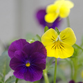
| 04/26/2006 07:43:11 AM |
Just a bunch of pansiesby tjmuellerComment: 6 - A little less green 'somehow', and a variation in composition/framing, make this even better in my opinion. Like your title. |
| Photographer found comment helpful. |
| 04/26/2006 07:42:17 AM |
Blue Moon Ice Creamby emberstlComment: 4 - Like the concept. Looks like it needs a boost of contrast and color tweaking, also wonder if perhaps a little too much empty space compositionally, especially at the top, although not sure. Like to see more texture/definition in the ice cream, unless it doesn't look appealing to do so. |
| Photographer found comment helpful. |
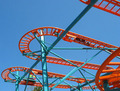
| 04/26/2006 07:40:23 AM |
Roller coasterby littlebigmanComment: 3 - Looks like good potential for this Challenge. A variation in perspective, composition and crop, likely have helped this, in my opinion. |
| Photographer found comment helpful. |
Home -
Challenges -
Community -
League -
Photos -
Cameras -
Lenses -
Learn -
Help -
Terms of Use -
Privacy -
Top ^
DPChallenge, and website content and design, Copyright © 2001-2026 Challenging Technologies, LLC.
All digital photo copyrights belong to the photographers and may not be used without permission.
Current Server Time: 05/15/2026 01:56:22 PM EDT.