| Image |
Comment |
| 04/26/2006 06:33:30 PM |
Emergingby esdarbyComment: 3 - Good potential. Not sure which scheme you were going for here. I see primarily orange, green and then 'purple', with tiny hints of yellow. Going for either a different angle, using the purple petals more and gaining the yellow, otherwise much tighter and adjusting the hue and using the red/green for the color scheme, not sure. Variation in the composition to gain a little more balance too, plus bigger (640). |
 Photographer found comment helpful. Photographer found comment helpful. |
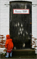
| 04/26/2006 06:29:33 PM |
Trespassby bucketComment: 5 - Bit too subtle for me. Like the concept though, but for this Challenge like to see 'somehow' those colors more dominant, which given the size of the color scheme here and the size of the main subject, would be pretty tricky. |
| Photographer found comment helpful. |
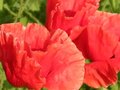
| 04/26/2006 06:27:54 PM |
Ribbon Ribbitby pidgeComment: 5 - Meets the Challenge and simple enough. Needs more depth and a variation in lighting in my opinion. |
| Photographer found comment helpful. |
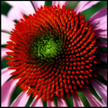
| 04/26/2006 06:18:26 PM |
Touch Me Not!!by doctabrezComment: 2 - Looks like good potential. Sharper focus, bigger (640 width), more control of the reds, a slight variation in angle/composition (allowing in more green and the petal 'chops' at more strategic places), make this better in my opinion. Also looks like you may have some pixelation/resizing/jpeg issues, not sure. Like to see the detail in the petal ruffles/crimping etc, which has not been captured, in my opinion. |
| Photographer found comment helpful. |
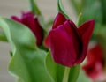
| 04/26/2006 06:15:18 PM |
tip toeby gtp1164Comment: 3 - This seems a victim of 'camera shake' and possibly pixelation issues pp, not sure. Sharper focus, variation in crop and composition, likely have helped this in my opinion. |
| 04/26/2006 06:14:04 PM |
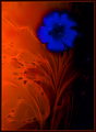
blue/orangeby pointandshootComment: 4 - Don't mind the concept, although can't work out how the flower got there/got like that, doesn't 'enhance' the image, in my opinion. Overall a bit dark, perhaps if the blue in the darker areas came through more, may have given this a little extra in my opinion. |
| Photographer found comment helpful. |
| 04/26/2006 06:12:31 PM |
...Life is Goodby RKTComment: 3 - Good potential. Not sure that you've 'used' the blue/orange color scheme available here to its best, perhaps a sharper angle, more refined crop, more attention paid to what is in the reflection and more 'blue' from the reflection, may have made this better in my opinion. |
| Photographer found comment helpful. |
| 04/26/2006 06:10:52 PM |
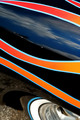
Blue Orangeby freakin_hilariousComment: 6 - For the creativity and concept. Like the matt of the orange but not sure it is overall balanced with the wooden(?) surface. The orange is a little harsh or 'something' pp perhaps, and detracts in myopinion. Perhaps a variation in the direction the orange is facing, variation in lighting and as mentioned, not so 'harsh'/bit more texture coming through, made this better in my opinion. |
| Photographer found comment helpful. |
| 04/26/2006 06:08:18 PM |
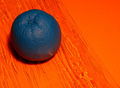
Orange and Blueby MaxheadrooMComment: 3 - Not abstract enough in my opinion - looks like handles rather than 'shapes', if that makes sense. Perhaps a variation in the lighting or something pp may have given this a little extra, who knows. |
| Photographer found comment helpful. |
| 04/26/2006 06:07:30 PM |
Rear Windowby annasenseComment: 5 - Like the concept. Tweaking of the colors/contrast and a crop variation, make this better in my opinion. |
| Photographer found comment helpful. |
Home -
Challenges -
Community -
League -
Photos -
Cameras -
Lenses -
Learn -
Help -
Terms of Use -
Privacy -
Top ^
DPChallenge, and website content and design, Copyright © 2001-2026 Challenging Technologies, LLC.
All digital photo copyrights belong to the photographers and may not be used without permission.
Current Server Time: 05/15/2026 01:56:47 PM EDT.