| Image |
Comment |
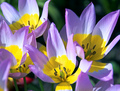
| 04/26/2006 10:19:08 PM |
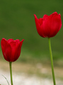
Tulipby DianaComment: 6 - Nice and simple. More refined crop, especially bottom left, make this better in my opinion. Difficult, but like to see the 'frayed edges' of the tulips in more detail, but minor. |
 Photographer found comment helpful. Photographer found comment helpful. |
| 04/26/2006 10:17:17 PM |
FlowERoticby unicumComment: 3 - Nice macro and use of light. Main colors I'm seeing are yellow, green then red. Color scheme not strong enough for this Challenge in my opinion. |
| 04/26/2006 10:15:08 PM |
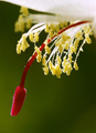
Spike Handby SherwinJamesComment: 4 - Like the concept. A variation in composition and sharper focus/more fore focus, make this better in my opinion. Bigger as well. Not sure on the frame, especially at this size. |
| Photographer found comment helpful. |
| 04/26/2006 09:13:12 PM |
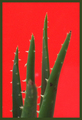
Crawling Outby DeeMizeComment: 2 - Very hard pressed to find yellow here, but do like the concept and composition and colors, but they are not 'complementary'. Bigger would have also helped you. |
| 04/26/2006 09:12:14 PM |
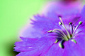
Yellow/Purpleby jbsmithanaComment: 5 - Nice. Variation in lighting (softer) and a little sharper make this better in my opinion. Difficult, but perhaps a tighter crop too, trying to eliminate the 'other' colors. |
| Photographer found comment helpful. |
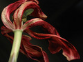
| 04/26/2006 09:10:42 PM |
Faded gloryby electinaComment: 4 - Not bad for a dead/dying flower shot. Like to see more green incorporated. |
| Photographer found comment helpful. |
| 04/26/2006 09:10:11 PM |
Lines of Colorby sammigurlComment: 3 - Meets the Challenge, just background is a little too bright in my opinion. Also not holding my attention overall enough, especially for what seems to be an abstract. |
| Photographer found comment helpful. |
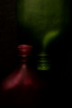
| 04/26/2006 09:09:03 PM |
the waters edgeby fordmanf1Comment: 3 - Like the concept, but struggling with the color scheme(s). Tweaking of the colors - red/green and/or blue/orange, plus sharper focus, make this better in my opinion. Not sure on the frame. |
| Photographer found comment helpful. |
| 04/26/2006 09:07:52 PM |
SYMMETRYby imagesloyolaComment: 4 - Colors are nice. Obviously dark overall but seems intentional. Your title draws attention to whether this is symmetrical or not, and it is slightly off, but fairly minor. Composition works well. edit:typo Message edited by author 2006-07-04 15:56:10. |
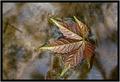
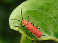
| 04/26/2006 09:06:15 PM |
Nature`s Colourby abhraComment: 6 - Good. Like the composition. Difficult likely with resulting contrast issues, but if the colors could be tweaked a little to become a little richer (possibly also the bug 'redder'), make this even better in my opinion. |
Home -
Challenges -
Community -
League -
Photos -
Cameras -
Lenses -
Learn -
Help -
Terms of Use -
Privacy -
Top ^
DPChallenge, and website content and design, Copyright © 2001-2026 Challenging Technologies, LLC.
All digital photo copyrights belong to the photographers and may not be used without permission.
Current Server Time: 05/15/2026 11:41:07 PM EDT.