| Image |
Comment |
| 04/26/2006 10:38:42 PM |
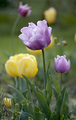
Seeing Purple Through Yellowby docurrieComment: 5 - Nice. Good use of 'forkeh'. Difficult, but like to have seen more definition in the fore tulip, and less green, especially the straps/leaves. |
| 04/26/2006 10:37:23 PM |
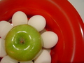
Flowerby LizzMComment: 2 - Not sure if you were going for an abstract shot here, but if so, a variation in the lighting, especially to gain more depth/drama and less glare, more fore focus and a slightly more refined crop, may have made this better in my opinion. As is, looks a little 'snapshottish'. Not sure on the concept, especially the eggs(?) (and the white they bring/no pun intended), but your call, obviously. |
 Photographer found comment helpful. Photographer found comment helpful. |
| 04/26/2006 10:34:30 PM |
Arabiaby xXxscarletxXxComment: 2 - Good potential. Less face and more 'colors' used, make this better in my opinion. LIghting, whilst perhaps intentional, too bright or 'direct'/something, in my opinion. An overall more balanced composition and refined crop, also have helped this. |
| Photographer found comment helpful. |
| 04/26/2006 10:33:03 PM |
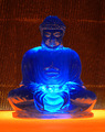
Enlightenment?by obsidianComment: 2 - Colors fairly well meet the Challenge. Overall just not holding my interest enough. Variation in background may have helped, not sure. |
| Photographer found comment helpful. |
| 04/26/2006 10:32:09 PM |
Flora Complimentariaby ArtifactsComment: 6 - Wow. Bright. Good detail in the water drops. Perhaps a more finely tuned crop, trying to eliminate the OOF area(s) especially on the right may have given this a little extra in my opinion. As well as reduced the green. Difficult, but seems slightly 'too bright' in some of the areas, though not sure. |
| Photographer found comment helpful. |
| 04/26/2006 10:30:08 PM |
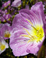
Tickle Her Fancyby smilebig4me1xComment: 3 - Less green and perhaps a tighter crop/zoom to take advantage of these two good colors together would have made this better in my opinion. |
| Photographer found comment helpful. |
| 04/26/2006 10:29:22 PM |
|
| Photographer found comment helpful. |
| 04/26/2006 10:26:56 PM |
Igneousby MQuinnComment: 5 - Difficult with abstracts, but perhaps a more finely tuned crop and trying to eliminate the upper reflection in the ball(?)(as the lower part seems good and 'interesting') make this even better in my opinion. Tweaking of the orange/colors too, especially for this Challenge. |
| Photographer found comment helpful. |
| 04/26/2006 10:24:11 PM |
Fire In The Sky (blue/orange)by gliphixComment: 3 - A much stronger crop, quality dependent, make this better in my opinion. Silhouettes and 'balance' works quite well, but the unusual patterns and colors in the sky especially, for this Challenge, likely put to better use with a tighter crop. |
| 04/26/2006 10:21:29 PM |
Emptyby TuckersmomComment: 7 - Like it. A little more balanced overall and, whilst difficult, more 'flow' with less graininess, may also have given this a little extra in my opinion. Possibly also more depth between the glasses (and clarity iin them) and the 'back' but not sure. |
| Photographer found comment helpful. |
Home -
Challenges -
Community -
League -
Photos -
Cameras -
Lenses -
Learn -
Help -
Terms of Use -
Privacy -
Top ^
DPChallenge, and website content and design, Copyright © 2001-2026 Challenging Technologies, LLC.
All digital photo copyrights belong to the photographers and may not be used without permission.
Current Server Time: 05/15/2026 08:33:33 PM EDT.