|
|
|
Showing 2931 - 2940 of ~4957 |
| Image |
Comment |
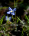
| 04/27/2006 08:33:46 PM | DPC-ish don't you think? :)by KrisbyComment: 4 - Looks 'flat' in my opinion. Not sure if it is pp or what. Variation in lighting and focal range/depth, may have given this a little extra in my opinion. Don't mind the composition, but, again, would like to have seen a lot more detail in the flowers. edit:typoMessage edited by author 2006-05-03 18:43:36. |  Photographer found comment helpful. Photographer found comment helpful. |
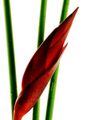
| 04/27/2006 08:32:25 PM | Heliconiaby kloutitComment: 7 - Nice. Like to see more detail in the heliconia though. Perhaps a little less contrast as well, not sure. |
| 04/27/2006 08:30:47 PM | Sereneby GIS_boyComment: 8 - Very nice. Wish it had a bit more height, but depends what was there/you had, obviously. Colors work well here, but still wonder if a tweaking of them a fraction more vivid (looks like might result in contrast/etc issues) make this even stronger, especially for the Challenge. Apologies in advance if wrong, but horizon looks like it needs a fraction nudge rotate up on the left. edit:typo Message edited by author 2006-06-17 18:14:23. | | Photographer found comment helpful. |
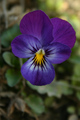
| 04/27/2006 08:28:05 PM | Johnny Jump Upby TwylaComment: 3 - Like the concept but too much detail seems to have been lost. Also, quality dependent, tighter crop, or just variation on angle/etc, to 'eliminate' the green, make this better in my opinion. |
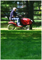
| 04/27/2006 08:27:09 PM | Sunday Driveby Drummerjd356Comment: 4 - Like to have seen the 'flying grass' more detailed, 'somehow'. Perhaps a crop variation, not sure. Also, wonder whether a hue adjustment in pp may have allowed you to 'change the color' of the gentleman's clothing, for the Challenge - making an even stronger and in my opinion, more unusual image. | | Photographer found comment helpful. |
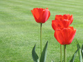
| 04/27/2006 08:25:39 PM | tulipaniby DebohComment: 5 - Nice. Like the simplicity and use of grass as background. Seems to be an issue with grain, but perhaps it is a consequence of resizing/etc, who knows. More detail/sharper in the tulips and the reds more 'controlled' (looks slightly blown in areas) and a more refined crop, make this even better in my opinion. edit:typo Message edited by author 2006-06-17 18:15:38. | | Photographer found comment helpful. |
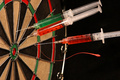
| 04/27/2006 08:15:43 PM | Doctor Dartsby TransitComment: 3 - 'Ok'. Meets the Challenge quite well but colors are not dominant enough in my opinion and the concept isn't holding my attention. Different, but... perhaps a variation in lighting or something, not sure. |
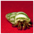
| 04/27/2006 08:13:27 PM | Backyard Treasureby glad2badadComment: 3 - Very nice and unusual effects here, hoping all 'bokeh' and in camera and not something pp. Main thing though, in my opinion, is this is predominantly blue, green, then 'other' colors. Like to have seen (quality dependent) a much tighter crop, eliminating the green and 'showcasing' that flower with the yellow center - which may also have meant some hue adjustment in pp for this Challenge to get blue/orange or purple/yellow, who knows. | | Photographer found comment helpful. |
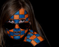
| 04/27/2006 08:11:14 PM | A Complementary Complexionby ShermyComment: 3 - Think I can see what you were going for but don't think you have achieved the full potential. Perhaps a variation in lighting and focus may have helped, not sure. Also, given what appear to be green eyes (and indeed the brown hair), perhaps going for the red/green scheme may have been more.. 'complementary'. Even a close up of the skin may have worked well here, but framed as is, with the lighting, clothing, etc.. not working as well as it could be, in my opinion. |
| 04/27/2006 08:07:48 PM | Red Carpet Strollby davidus428Comment: 6 - Good. Although the framing works quite well in my opinion, wonder whether this might have packed more punch with more 'red'/closer zoom, using the extra pixels, who knows. A little sharper on eyes, may have also given this a little extra. Perhaps the colors a little more vivid too, but difficult, especially with likely resulting contrast/etc issues. |
|
Showing 2931 - 2940 of ~4957 |
Home -
Challenges -
Community -
League -
Photos -
Cameras -
Lenses -
Learn -
Help -
Terms of Use -
Privacy -
Top ^
DPChallenge, and website content and design, Copyright © 2001-2026 Challenging Technologies, LLC.
All digital photo copyrights belong to the photographers and may not be used without permission.
Current Server Time: 05/16/2026 12:29:17 PM EDT.
|