| Image |
Comment |
| 04/27/2006 08:51:56 PM |
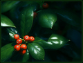
Holly Treeby NobodyComment: 4 - Don't mind the 'softening'. Looks like something done pp possibly with the 'blueish' undertones in the background, which detract, but fairly minor. The green in the leaves comes through nice but like to have seen the berries, especially their placement compositionally, a little more dominant. Berries tweaked color-wise too (though looks like resulting contrast issues), just bordering on orange as well, in my opinion. |
 Photographer found comment helpful. Photographer found comment helpful. |
| 04/27/2006 08:48:54 PM |
Beach Days (Blue & Orange)by sprite777Comment: 2 - Way too subtle in my opinion, plus the main color I first see is 'yellow'. Perhaps a tweaking of the eye, and more blue in the background, not sure, still be a bit of a stretch in my opinion. |
| Photographer found comment helpful. |
| 04/27/2006 08:47:10 PM |
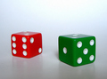
Sevensby bigjComment: 4 - Not bad. Good detail in the die. Surface/base detracts from the 'cleanness' of the shot, in my opinion. Overall, not holding my attention. |
| 04/27/2006 08:45:36 PM |
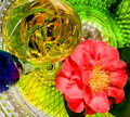
Camilia and Chardonnayby cislanderComment: 2 - Too busy in my opinion. Main colors I'm seeing first are yellow and pinkish red - followed by green then blue, etc. Perhaps tweaking in pp of the hue and a tighter crop may have helped you. Overall this shot with 'less', may have been stronger in my opinion. |
| Photographer found comment helpful. |
| 04/27/2006 08:43:29 PM |
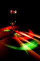
Kalaidoscopeby kiwinickComment: 5 - Like the colors and light play. A more refined crop and perhaps a little more 'light' (somewhere) make this better in my opinion. edit:typo Message edited by author 2006-06-17 18:14:00. |
| Photographer found comment helpful. |
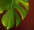
| 04/27/2006 08:42:46 PM |
Monstera Deliciosaby jimnessComment: 4 - Like to have seen the 'red' tweaked pp, coming over more brown in my opinion. Don't mind the composition and detail looks quite good, but 'bigger' would have helped you - color issues aside. |
| Photographer found comment helpful. |
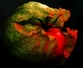
| 04/27/2006 08:41:38 PM |
hot tomatillo?by sfaliceComment: 5 - Don't mind the concept, not sure on the lighting and overall 'darkness'. Sharper / variation in perspective too, may have given this a little extra, in my opinion. |
| Photographer found comment helpful. |
| 04/27/2006 08:40:24 PM |
Taking the Turnby admart01Comment: 3 - Like to have seen the 'green' more vivid, 'somehow'. Not sure your choice of color for frame enhances that. The 'green' is too borderline here, to make a strong distinction, and hence 'color scheme', in my opinion. |
| Photographer found comment helpful. |
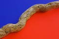
| 04/27/2006 08:36:42 PM |
Divisionby nards656Comment: 5 - Simple. Like to have seen a little more 'feel' here, whether it be texture of the wood, variation in lighting or just a little more 'depth', not sure. |
| Photographer found comment helpful. |
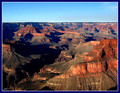
| 04/27/2006 08:35:33 PM |
Pima Pointby ElGordoComment: 4 - Tweaking of the colors, especially for this Challenge, make this better in my opinion. Like to see the blues/oranges even stronger. Frame detracts, including from likely impact of the subtle natural colors as well, in my opinion. Apologies in advance if wrong, and could just be the perspective, but horizon looks like it needs a nudge up on the left. |
| Photographer found comment helpful. |
Home -
Challenges -
Community -
League -
Photos -
Cameras -
Lenses -
Learn -
Help -
Terms of Use -
Privacy -
Top ^
DPChallenge, and website content and design, Copyright © 2001-2026 Challenging Technologies, LLC.
All digital photo copyrights belong to the photographers and may not be used without permission.
Current Server Time: 05/16/2026 05:57:05 AM EDT.