| Image |
Comment |
| 04/27/2006 09:27:04 PM |
Golden Dunesby Penny LaneComment: 4 - Like the concept, but like to see a little more definition in the dunes, and also the blue a little stronger. |
 Photographer found comment helpful. Photographer found comment helpful. |
| 04/27/2006 09:26:21 PM |
retreat of the redby bulitasComment: 4 - Your title draws attention away from the orange - which, if were tweaked and stronger, make this better in my opinion. Like the blue captured, but like to have seen the overall 'scheme' stronger. |
| 04/27/2006 09:25:26 PM |
G'day Mate! by cheegirlComment: 6 - Up from 5. Like this, but the 'green' of the chameleon is clashing a little with the green of the stem, and draws attention to the 'quality' of the skin of the stem as well, if that makes sense. Not sure what to suggest, perhaps 'putting it' on the 'red', who knows. Perhaps even the chameleon on its own, as has good color in it. Just needs a little 'extra', somewhere, especially for this Challenge, in my opinion. edit:typoMessage edited by author 2006-05-03 18:31:58. |
| 04/27/2006 09:22:16 PM |
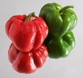
Complementary Companionsby strickerblue21Comment: 5 - Colors seem ok. Base detracts slightly in my opinion. Overall, a little too close to previous Challenges that to enter a shot like this is taking a certain risk in my opinion, has to be 'extra good', if that makes sense. This with a variation as mentioned in the base and overall a lot cleaner.. likely help this in my opinion. Just doesn't hold my attention/interest enough. |
| Photographer found comment helpful. |
| 04/27/2006 09:20:17 PM |
Blemishedby gotrondComment: 5 - Like the colors. Don't mind the abstractness. Less grain in the purple and more detail in the yellow, make this better in my opinion. |
| Photographer found comment helpful. |
| 04/27/2006 09:19:33 PM |
Freshly Washedby shankswareComment: 5 - Clean. Works well as a 'stock' type of shot in my opinion - just not holding my attention otherwise. |
| Photographer found comment helpful. |
| 04/27/2006 09:18:48 PM |
Purple Tulipby betsypdxComment: 5 - Like the purple and yellow, but would like to have seen less stem and leaf/green and more detail in the tulip/the tulip and color of it, dominating and complementing the yellow more. |
| Photographer found comment helpful. |
| 04/27/2006 09:17:49 PM |
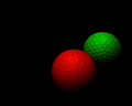
Stop and Goby dw_photoComment: 5 - Simple and clean, color is good, well done on the lighting to just about eliminate glare/reflection - just overall doesn't 'hold my attention'. |
| Photographer found comment helpful. |
| 04/27/2006 09:16:44 PM |
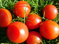
tomatoesby cll300661Comment: 5 - Color is good, but the blown areas detract, as does the 'a little too close' focal issues and the shadows, in my opinion. |
| Photographer found comment helpful. |
| 04/27/2006 09:15:56 PM |
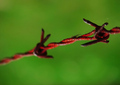
Tetanusby ZigomarComment: 7 - Like this, including the title. Like the simplicity and the vivid colors. 'If only' the focal point either on one of the barbs, else just a little 'wider'.. bringing in a little more detail and color, make this even better in my opinion. Up to 7 from 6. |
| Photographer found comment helpful. |
Home -
Challenges -
Community -
League -
Photos -
Cameras -
Lenses -
Learn -
Help -
Terms of Use -
Privacy -
Top ^
DPChallenge, and website content and design, Copyright © 2001-2026 Challenging Technologies, LLC.
All digital photo copyrights belong to the photographers and may not be used without permission.
Current Server Time: 05/16/2026 09:04:21 AM EDT.