| Image |
Comment |
| 06/19/2006 05:56:02 PM |
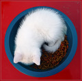
Ying-Yangby buzzrockComment: 4 - Good control of the whites. Like the concept. More 'food' to balance this out, especially with the title/concept and the 'bits' around on the red fixed (at time of shooting mostly - as realize difficult in basic pp), make this better in my opinion. |
 Photographer found comment helpful. Photographer found comment helpful. |
| 06/19/2006 05:50:11 PM |
Days go byby ibkcComment: 4 - Quite a nice shot, especially of the sky - framing just not strong enough in my opinion. Perhaps a variation in cropping may have helped - that is if you were unable to loop up that leg rope(?) or ski to form the top 'edge'. Looks like some slight 'fill flash' issues as well, but apologies in advance if wrong. |
| Photographer found comment helpful. |
| 06/19/2006 05:46:22 PM |
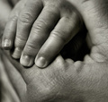
Joinedby RKTComment: 3 - Like the square framing and toning, but unless I am mistaken, it is the 'little thumb' that has been framed here, which is not visible enough due to focus, toning and composition issues, in my opinion - plus - well, not sure 'why' one would frame a thumb, unless it is a 'personal shot'. |
| Photographer found comment helpful. |
| 06/19/2006 05:43:10 PM |
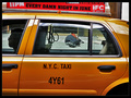
Every Damn Night in June...by visionistComment: 6 - Good. More refined crop possibly, but difficult given the incorporation of the sign. Possibly could have manipulated the 'edges' more in advanced, but still a good candid framing for basic. Possibly a b&w/toning effect could have given this an extra edge, who knows. |
| 04/28/2006 06:25:54 AM |
Pimp my duckyby h2Comment: 5 - 'Meets the Challenge' enough, composition is quite good, concept lacks a little, even with the seemingly painted beak, in my opinion. Blown areas from the lighting detract, but fairly minor. |
| 04/27/2006 09:50:36 PM |
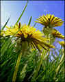
"Blow'in in the Wind"by tfarrell23Comment: 2 - Thought I commented, but seems it didn't 'stick'. Like this, especially the perspective, but the dominant colors here in my opinion are yellow, green and blue. |
| Photographer found comment helpful. |
| 04/27/2006 09:49:44 PM |
Bright Creationby aj1621Comment: 2 - Don't know what it is, but don't mind the color choice/combination. Bigger, better focus and exposure, likely help this in my opinion. edit:typo Message edited by author 2006-06-17 18:08:25. |
| 04/27/2006 09:48:23 PM |
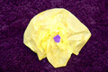
Shelterby balmikiComment: 3 - Like this, but a little too close in my opinion (OOF), and also, I'm seeing more pink/green here than red. Perhaps adjusting the hue in pp may have helped create a stronger image for the Challenge, who knows. |
| 04/27/2006 09:47:15 PM |
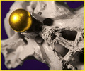
Skullby angela_packardComment: 3 - Colors quite nice, but the glare/reflection on the ball detracts in my opinion. 'Skull' not abstract enough nor holding my attention otherwise. Not sure on the frame, especially color choice. |
| Photographer found comment helpful. |
| 04/27/2006 09:45:39 PM |
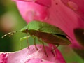
Stripes & Spotsby brizmamaComment: 3 - I see the purple and yellow, but the 'red' and 'orange' are the main colors here in my opinion. Composition quite good but overall, not holding my attention enough. |
| Photographer found comment helpful. |
Home -
Challenges -
Community -
League -
Photos -
Cameras -
Lenses -
Learn -
Help -
Terms of Use -
Privacy -
Top ^
DPChallenge, and website content and design, Copyright © 2001-2026 Challenging Technologies, LLC.
All digital photo copyrights belong to the photographers and may not be used without permission.
Current Server Time: 05/16/2026 09:57:32 AM EDT.