| Image |
Comment |
| 10/07/2006 09:53:34 PM |
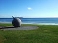
Portmarnock - Irelandby slo007Comment: 5 - Nice scene/potential. Wish the horizon was straight. Perhaps (if possible) a slight variation in perspective/angle, to enable the island in the distance to not be obstructed by the globe. Compositionally (again, depending what is there to the left), perhaps placing the globe on the right side of the frame, using the 'path' as a leading line, may have also given this a little extra, who knows. Colors are nice. Nice and clean. Like the single cloud in the sky. edit:typoMessage edited by author 2006-10-08 06:10:00. |
 Photographer found comment helpful. Photographer found comment helpful. |
| 10/07/2006 09:43:12 PM |
Troy Corser (WSBK)by AzrifelComment: 8 - Good shot. Nice and clean. Good panning(?) and stop motion. Like the composition but wonder whether a fraction more space/green at the top may have balanced this out a little more, but depends what you had to work with, obviously. |
| Photographer found comment helpful. |
| 10/07/2006 09:39:24 PM |
Too Close for Comfortby getnoutsideComment: 8 - Especially like the originality and simplicity. Colors are nice. Like the composition, however wonder if a fraction more centered, or else off-centered, plus a slight tweaking of colors may have given this even more impact. |
| Photographer found comment helpful. |
| 10/07/2006 09:27:38 PM |
The Climbby ShaneBlakeComment: 7 - Nice detail. Maybe a more refined crop, especially at the bottom and a slight variation in composition (maybe not so centered, not sure - depends what you had to work with, obviously) may have made this even better in my opinion, although does still work well as is. Framing color choice works, but wonder if another color rather than the green may have lifted this more and given it a little extra. |
| Photographer found comment helpful. |
| 10/07/2006 09:06:30 PM |
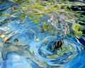
Water Sproutby robinssongComment: 8 - Nice image. Good play on the title, which for those who didn't take time to study it longer than 2 seconds, would likely be lost on. A more refined crop, especially top right corner, make this even better in my opinion. Like the colors and clarity - good stop motion and 'texture'. Perhaps a few sprouts closer to the surface for added effect and element(s), who knows. |
| Photographer found comment helpful. |
| 10/07/2006 09:03:57 PM |
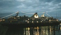
Cape Harbourby jacoloComment: 1 - This looks snapshottish. Your title suggests an image of a 'harbour', yet the main thing I see is a ship/liner. There are grain issues, as well as seemingly blur issues, it is overall too dark and the 'elements' on the left and right bottom corner are distracting as I cannot recognize them. Also (but quality dependent) this much bigger would have been better... maybe. If this was all you had to work with, your best or favorite shot for the month for the Free Study, perhaps trying to adjust the levels/lighting/something in pp may have helped this, or even a conversion to sepia or b&w, who knows. This image may hold some meaning to you (from a vacation etc), however to a viewer - they would not hold the same attachment - if that makes sense, and is indeed appropriate. |
| 10/07/2006 08:56:39 PM |
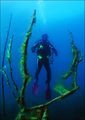
Poseidon's Tridentby ndsComment: 7 - Good, except for the grain in the darker areas (could be jpeg/resizing issues, not sure), especially on the wetsuit. Nice colors and composition. Like to see more clarity on the air bubbles, but that's likely another image. |
| Photographer found comment helpful. |
| 10/07/2006 08:42:36 PM |
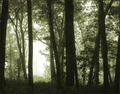
morning mistby dragonladyComment: 7 - Nice image. Like the tones/coloring. More refined crop, especially top left (but fairly minor), make this even better in my opinion. Also, whilst difficult, a fraction more definition or contrast/depth/definition, but this softness/haziness may well be exactly what you wanted. |
| Photographer found comment helpful. |
| 10/07/2006 06:40:16 PM |
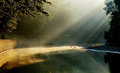
early lightby tateComment: 7 - Nice image. Like the colors, including the 'blue shoreline'. The light/rays captured are nice. Main issues in my opinion are what appears to be elements of resizing/jpeg issues (but apologies in advance if wrong - could just be the unusual water surface), the white 'something' bottom right, cloned/cropped out make this even better in my opinion. The only other issue (and it could just be a visual/perspective thing) is that this looks like it may need a fraction nudge rotate up on the left, but again - apologies in advance if wrong. |
| Photographer found comment helpful. |
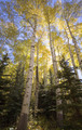
| 10/07/2006 06:13:23 PM |
Aspen Glowby remarshComment: 7 - Nice lighting, colors, composition and framing. Just wish a fraction more contrast, or possibly saturation, not sure - but likely difficult with exposure issues. May well be exactly as you intended anyway. Perhaps a more refined crop at the bottom, or a softening to help the 'glow' dominate more, not sure. |
| Photographer found comment helpful. |
Home -
Challenges -
Community -
League -
Photos -
Cameras -
Lenses -
Learn -
Help -
Terms of Use -
Privacy -
Top ^
DPChallenge, and website content and design, Copyright © 2001-2026 Challenging Technologies, LLC.
All digital photo copyrights belong to the photographers and may not be used without permission.
Current Server Time: 06/11/2026 05:14:34 AM EDT.