|
|
|
Showing 2501 - 2510 of ~4957 |
| Image |
Comment |
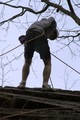
| 11/22/2006 04:14:57 PM | The Rappelby DiamondPeteComment: 3 - The perspective is good (with the rock face and overhanging branches), but the angle on the main subject is not .. enhancing the image. Perhaps a more side on angle, who knows. The ropes in the fore distract slightly as well. |
| 11/22/2006 03:51:45 PM | The Monk!by kbhatia1967Comment: 8 - Nice image. Variation in the colors, tweaking to try to gain a little more depth, may have given this a little extra in my opinion - although as is, does seem quite natural coloring. Just the stairs at the fore, their color mainly, perhaps dominate a little too much, not sure. A slight variation in the lighting/time of day may have also given this a little extra. Minor, but the exclamation in your title detracts from the simplicity, but you may well have your own reasons for putting it there. Nice symmetry. |  Photographer found comment helpful. Photographer found comment helpful. |
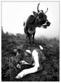
| 11/22/2006 03:47:24 PM | Bovine Burlesque by whiteroomComment: 9 - Great capture and example of perspective, fish eye 'advantage' or not. Toning works well here and I imagine any variation in toning, including sepia/colors, as well as the natural colors, still be a great shot. Detail is very good. Really like the angle. Given both the sloping landscape as well as the position of the mother, I wonder if a slight variation in composition and/or framing (wider?, not sure) may have made this an even better image. edit:typo & congratulationsMessage edited by author 2006-11-29 00:22:00. | | Photographer found comment helpful. |
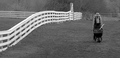
| 11/22/2006 03:44:20 PM | Fall Fence Lineby memew15Comment: 5 - Like the potential here. Wish the horse had more light/was not in the shadows. Straightening overall as well as a more refined crop, especially to eliminate the road sign on the right, make this better in my opinion. | | Photographer found comment helpful. |
| 11/22/2006 03:39:36 PM | Ancient Rock Window to the Milky Wayby PlanetMakerComment: 7 - Nice, hope it is 'real'. Two main factors holding this back for me are the bottom right corner dominates too much and the overall balance/framing - perhaps a variation may have made this even better, not sure. Difficult, but the beginnings of star trails, either 'more' or less, may also have made this even better in my opinion. Also, the sky perhaps, including the color(s), coming through just a little stronger, to give this even more impact/drama. |
| 11/22/2006 03:37:32 PM | Sun Sliceby bnileshComment: 6 - Nice colors, texture and background. Like to have seen a more unusual perspective/angle deployed for this Challenge with this shot. Minor, but the oof areas bottom left distract slightly overall in my opinion, perhaps a crop/framing variation to eliminate/minimise it, who knows. | | Photographer found comment helpful. |
| 11/22/2006 03:34:31 PM | The Farmerby elipsComment: 4 - Nice image and composition, toning works well. Perhaps a little more height framewise, not sure. For this Challenge, would like to have seen a stronger perspective/angle applied here 'somehow'. | | Photographer found comment helpful. |
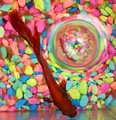
| 11/22/2006 03:29:41 PM | A Fish and a Bubbleby karmatComment: 7 - Unusual. Wish it was perfectly square (framewise and symmetrically), but fairly minor. Difficult, but the fish a little sharper/detailed too, but then you'd likely lose the good and unusual effects on the stones and bubble refracting them. Unusual color combinations that do work, in my opinion. | | Photographer found comment helpful. |
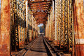
| 11/22/2006 03:27:48 PM | Rust Never Sleepsby walrus451Comment: 7 - Like this, but just wish the rust texture was more discernible/sharper/more depth/something. Like the symmetry, although visually, just looks like it needs a nudge up on the left but, not sure. Perhaps overall, mainly for balance (as well as being able to show off the 'rust' more), a variation in framing, likely more square, may have given this extra, not sure. Like your title. Perspective wise, this is good, but maybe even sharper, especially for this Challenge, with this image, may have also given more impact, who knows. | | Photographer found comment helpful. |
| 11/22/2006 03:21:52 PM | Cat tailby pyropixieComment: 6 - Like this. Depending what you had to work with, a wider/squarer framing, more refined crop on the left and perhaps a little less fore/bottom oof areas, make this even better in my opinion. Colors and oof lines/bokeh are nice. |
|
Showing 2501 - 2510 of ~4957 |
Home -
Challenges -
Community -
League -
Photos -
Cameras -
Lenses -
Learn -
Help -
Terms of Use -
Privacy -
Top ^
DPChallenge, and website content and design, Copyright © 2001-2026 Challenging Technologies, LLC.
All digital photo copyrights belong to the photographers and may not be used without permission.
Current Server Time: 06/11/2026 02:06:19 PM EDT.
|