| Image |
Comment |
| 12/15/2006 06:12:16 AM |
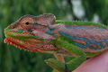
Lazy Ladyby andy74Comment: 6 - Very nice lighting, just wish the left side was not so dark and dominant. A little more height in the frame too. The softness is nice, but better placement of 'key' focal areas within the frame make this even better in my opinion. Like the angle. |
| 12/15/2006 06:10:41 AM |
Tannerby aaronwaveComment: 5 - Nice setting and colors. Wish Tanner were not chopped in half. A variation in perspective/angle, likely have made this even better in my opinion. |
 Photographer found comment helpful. Photographer found comment helpful. |
| 12/15/2006 06:09:42 AM |
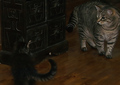
Mac in Dragby dsa157Comment: 6 - Poor Mac. He looks somewhat insulted. Variation in the background to 'take full advantage' of this set up, including the colors, may have given this an edge. Minor, but seems to be an 'issue' (white spot) behind Mac's head to the left of frame. Some sensor dust / something to the left of that too. |
| Photographer found comment helpful. |
| 12/15/2006 06:07:34 AM |
I Just Love Down Feathersby amsterComment: 4 - Nice pink nose. Image (including nose) looks over neat imaged (apologies if wrong), exaggerating the blown white areas and of course, losing the texture. Having said that, the 'feel' to the shot because of the processing, makes it quite unique. Variation in framing, as well as softer lighting, may have made this better in my opinion. The pupils look like there are flash / something issues in them. |
| Photographer found comment helpful. |
| 12/15/2006 06:04:49 AM |
You've Gotta Be Kidding: Just Try And Stop Meby J-MeComment: 4 - Don't get the title, unless it is something to do with the Christmas tree. Colors/saturation look a little odd, difficult fur to capture I imagine - could be some slight blur though, not sure. More refined crop would have helped this in my opinion. Because the collar is not fully visible, it is slightly distracting. |
| Photographer found comment helpful. |
| 12/15/2006 06:01:35 AM |
Here's Looking at Youby M_WestComment: 4 - Nice textures and color. Think for this Challenge a more creative take may have given this more of a portrait feel. The arm/hand(?) bottom right is slighty distracting, especially for a portrait. Variation in composition likely have helped this too in my opinion. |
| Photographer found comment helpful. |
| 12/15/2006 05:58:32 AM |
Riotby mattmacComment: 6 - Nice portrait of Riot. Good use of selective desat with his colors. Like to have seen that emphasized somehow, somewhere, even perhaps with a matching frame to his eye color. Variation in framing too, with perhaps a little less space on the left, not sure. Nice 'candid' capture. |
| Photographer found comment helpful. |
| 11/30/2006 03:07:38 PM |
I think I smell fish over there...by wetlandComment: 4 - Nice capture and composition. More height plus 640 width (if not height as well) make this even better in my opinion. Your call (obviously), but perhaps this shot might have looked even better with a toning/something effect, especially given the difficult contrast/etc issues. |
| Photographer found comment helpful. |
| 11/30/2006 03:05:29 PM |
A Meeting of Mindsby raishComment: 4 - Funny shot. Diagonal aspect not as strong as I'd like to have seen for this Challenge, the lighting is a bit harsh giving it somewhat of a snapshot feel, but fairly minor. Perhaps a more refined crop on the left, would have made this even better. Good capture and very good title. |
| Photographer found comment helpful. |
| 11/27/2006 06:59:00 AM |
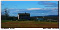
Civil War Scenicby MaryOComment: I gave this an 8. Thought it made a nice postcard. Text was nice and clean and the framing/crop well suited. Perhaps a little dark, but your design, font choice, etc made up for it, in my opinion. |
| Photographer found comment helpful. |
Home -
Challenges -
Community -
League -
Photos -
Cameras -
Lenses -
Learn -
Help -
Terms of Use -
Privacy -
Top ^
DPChallenge, and website content and design, Copyright © 2001-2026 Challenging Technologies, LLC.
All digital photo copyrights belong to the photographers and may not be used without permission.
Current Server Time: 06/11/2026 05:14:54 AM EDT.