| Image |
Comment |
| 12/15/2006 04:08:50 PM |
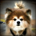
Mr. Big Stuffby SJCarterComment: 6 - Different. A bit too much pp/effects/something going on here in my opinion, especially for a fairly cursory look at while voting. Likely looks as you intended though, so your call, obviously. |
 Photographer found comment helpful. Photographer found comment helpful. |
| 12/15/2006 04:07:30 PM |
Boredby zaflaboutComment: 4 - Looks like difficult fur to capture using artificial light. Base/background colors, whilst do 'fit in' with the dog's coloring, perhaps placing the dog on a different color may have brought out the nice 'silver tones' in the fur more. Variation in angle/perspective likely have helped give this less of a 'snapshottish' type feel, in my opinion. |
| Photographer found comment helpful. |
| 12/15/2006 04:05:13 PM |
Mistyby PDavisComment: 3 - Nice big pupil capture on Misty. Don't mind the b&w but not sure the pp has made it work as well for the image as some more tweaking may have done. Seems to be a bit of grain/noise. The crop at the ears more finely tuned and this larger (if quality was there), make this better in my opinion. |
| Photographer found comment helpful. |
| 12/15/2006 04:01:42 PM |
Aussieby admart01Comment: 6 - Sharper/more clarity on the eyes (even with the soft effect) and the right side not so cropped/chopped, make this even better in my opinion. |
| Photographer found comment helpful. |
| 12/15/2006 04:00:51 PM |
Gingerby ShaneBlakeComment: 8 - Very nice, toning works well. Nice composition/crop. Just a little more clarity/pop on the eye and there is an odd 'edge'/something just above Ginger's nose ridge. |
| Photographer found comment helpful. |
| 12/15/2006 03:59:23 PM |
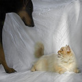
This is MY studio time.by saiphfireComment: 6 - Different. Focus seems sharpest on the backdrop, which is also too dominant in my opinion. More refined crop on the left too where the dog's paw is coming into frame. |
| Photographer found comment helpful. |
| 12/15/2006 03:57:29 PM |
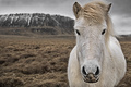
Braving the weathersby MephistoComment: 7 - Nice image of the horse. Your call (obviously), but think just a little less empty space on left for more balance make this even better in my opinion. For this Challenge, with this image, I also think including the name of the horse, would have given this more character and made it more 'personal'. |
| Photographer found comment helpful. |
| 12/15/2006 03:54:31 PM |
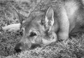
Shepherd Eyesby BalkoComment: 6 - Nice portrait, toning works well and makes this quite unique. Just wish the eyes were as sharp as the ears/nose seem to be. Perhaps a fraction more contrast may have given this more depth. Like the composition, just looks like it needs a slight rotate.. up left. |
| 12/15/2006 03:51:47 PM |
Profileby GoboltsComment: 5 - The background 'housing', whilst does add something to the shot, detracts from the 'Portraitness' for the Challenge in my opinion. |
| Photographer found comment helpful. |
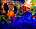
| 12/15/2006 03:50:37 PM |
Chappy IIby TerminatorComment: 5 - Nice shot of Chappy II. The blue stones dominate the image a fraction too much in my opinion. Good composition and elements though. Wish it were 640. |
| Photographer found comment helpful. |
Home -
Challenges -
Community -
League -
Photos -
Cameras -
Lenses -
Learn -
Help -
Terms of Use -
Privacy -
Top ^
DPChallenge, and website content and design, Copyright © 2001-2026 Challenging Technologies, LLC.
All digital photo copyrights belong to the photographers and may not be used without permission.
Current Server Time: 05/17/2026 03:05:57 AM EDT.