| Image |
Comment |
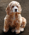
| 12/18/2006 05:32:35 AM |
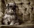
Ruggedly Handsomeby elsapoComment: 7 - Nice setup/background, toning is an unusual choice/combination, but does work and grow on you after a while, mainly because of uniqueness. Like to have seen both eyes, as difficult as it is with the fur. |
 Photographer found comment helpful. Photographer found comment helpful. |
| 12/18/2006 05:31:27 AM |
Junior ;-)by SergePComment: 3 - Like to have seen Junior without the distraction of people in the background. Bigger also would have helped and less blur. Not sure on the tight crop, but your call. |
| Photographer found comment helpful. |
| 12/17/2006 03:13:22 PM |
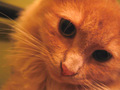
Navi on the prowlby sb404Comment: 2 - Looks too close and not sharp enough, but also there is a yellow tint here which perhaps is caused by artificial light and the exposure settings not adjusted accordingly. LIke the composition, but not so tightly cropped at the bottom also likely have helped this in my opinion. |
| Photographer found comment helpful. |
| 12/17/2006 03:12:02 PM |
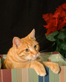
Gonna Be In Here How Long?by LSchraderComment: 4 - Like the concept however, in my opinion the box color (and possibly also the pattern) is not enhancing the cat's color/pattern. Focus seems good, but the pose .. just would like to have seen a variation. The perspective is making the paws seem pretty big, but maybe he/she has big paws, who knows. Additionally, the red poinsettia(?) at the rear is causing another 'color clash' in my opinion and the black background enhances all the color range. A more refined cop, especially at the dges of the box, plus a rotate up on the left to get the 'lines' straight, also make this better in my opinion. Not sure the vertical framing work as well as a more horizontal or square one would have. |
| 12/17/2006 03:08:26 PM |
Zoeyyby kaitlyn123Comment: 5 - Nice pose/capture of Zoeyy, but the orientation looks 'warped', needs rotating 'somewhere'. Better focus on Zoeyy's face and the paws/tail not chopped, make this better in my opinion. |
| 12/17/2006 03:06:56 PM |
Charlieby wetlandComment: 4 - Charlie's outline looks a little odd - almost 'spriteish', not sure if this is pp or what. His eyes with more lighting and maybe also getting down to his level, may have made this better in my opinion. 640 too. |
| Photographer found comment helpful. |
| 12/17/2006 03:04:04 PM |
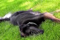
"No more portraits, Mum"by naomikComment: 5 - For this Challenge would have liked to have seen the dog's eyes more/open. Sharper too and a more refined crop, make this better in my opinion. Nice image, but for this Challenge, as mentioned - just like to have seen the dog's eyes, etc. |
| Photographer found comment helpful. |
| 12/17/2006 02:57:05 PM |
Hurry up and feed me!by wtheisenhalseyComment: 3 - Sure looks like good potential, what I can discern looks like needs to be sharper on the eyes and the box(?) in the background likely eliminated - but your main problem (if the quality is there) is the size here, which needs to be 640. Not sure your title matches the image, but your call. |
| 12/17/2006 02:55:46 PM |
Portrait of a ladyby holidayComment: 6 - Like the setup, but the fur looks like it has.. almost been air brushed, which could just be a shallow dof or pp, who knows. The colors are nice, but in my opinion there is a range of blues here that may need a little more attention to prevent either clashing or competition with the cat's eyes. Sharper on the eyes, less noise/grain, more 'depth' and the 'blue fur' on the left in less focus than the cat - make this even better in my opinion. |
| Photographer found comment helpful. |
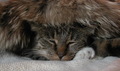
| 12/17/2006 02:53:04 PM |
Cat In The Hat Napby psquared40Comment: 5 - Oh, looks like such good potential.... 'if only' the fore blanket/fabric not so dominant and the cat's face 'larger'/bigger frame (640), sharper focus on the cat's face and the eyes open just a little more.. would have made this much better in my opinion. |
Home -
Challenges -
Community -
League -
Photos -
Cameras -
Lenses -
Learn -
Help -
Terms of Use -
Privacy -
Top ^
DPChallenge, and website content and design, Copyright © 2001-2026 Challenging Technologies, LLC.
All digital photo copyrights belong to the photographers and may not be used without permission.
Current Server Time: 05/16/2026 12:01:45 PM EDT.