| Image |
Comment |
| 12/18/2006 06:27:56 AM |
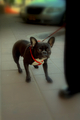
Who afraid of whomby natalka9Comment: 5 - Odd. Not sure if it is lens or pp, the effect does work in an odd way, but for this Challenge - hm, not sure. Does work in an odd way. Up to 5 from 4. Bigger would have helped. |
 Photographer found comment helpful. Photographer found comment helpful. |
| 12/18/2006 06:26:15 AM |
Rex Self Portraitby HoosComment: 2 - The flash eyes fixed and a variation in crop, plus bigger would have helped this. The fabrics in the background detract. |
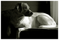
| 12/18/2006 06:25:34 AM |
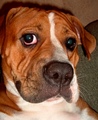
Mamüby tateComment: 4 - Like the concept and composition. Not sure on the toning. For this Challenge, like to have seen more of Mamü. Seems to be some grain and pp issues. Focus also seems sharpest on the cushion. |
| 12/18/2006 06:24:11 AM |
|
| Photographer found comment helpful. |
| 12/18/2006 06:23:31 AM |
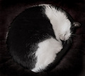
Looking Backby sibelingComment: 8 - Very nice. Shame about that paw cropped. Nice as is, but the light just a little more in the face - but what can you do. Nice 'elements'. |
| Photographer found comment helpful. |
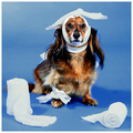
| 12/18/2006 06:22:41 AM |
The Good Patientby idnicComment: 7 - Like the concept - perhaps the 'bandages', placed more strategically, especially to give more perspective and dominance to the dog, may have made this even better in my opinion. |
| Photographer found comment helpful. |
| 12/18/2006 06:21:18 AM |
Elvis Is Evilby coronamvComment: 2 - Looks like good potential, but no idea what you've done in pp, but this almost looks like a sprite/been cut and pasted - the outline around the fur is very odd against the background. The eyes are suffering from flash/lighting issues as well. |
| Photographer found comment helpful. |
| 12/18/2006 06:16:42 AM |
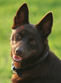
Working Like a Dogby nsoroma79Comment: 7 - Doesn't look too happy. Mainly the reflection in the glasses and the whie 'something' on the 'case'. Variation in lighting may have given this a little more depth, but this may be exactly what you were aiming for. |
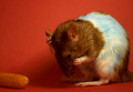
| 12/18/2006 06:11:06 AM |
Feeling Blue?by tapeworm_jimmyComment: 4 - Good potential. Saturation/contrast/something seems too 'pushed' and the red background not complementing the rat as well as another color likely would have. Not sure if you dye him/her, but there is blue markings on the white - hm.. which would explain your title, which I thought was because of the pose... Will be back PC to see exactly what you used to dye / tint this creature with. |
| Photographer found comment helpful. |
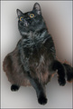
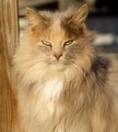
| 12/18/2006 06:08:41 AM |
the Barn Cat (aka Fuzzel)by piaffe529Comment: 7 - Lovely shot of a lovely looking cat. Shame about the background back right, detracts a little. Really wish this was bigger... |
| Photographer found comment helpful. |
Home -
Challenges -
Community -
League -
Photos -
Cameras -
Lenses -
Learn -
Help -
Terms of Use -
Privacy -
Top ^
DPChallenge, and website content and design, Copyright © 2001-2026 Challenging Technologies, LLC.
All digital photo copyrights belong to the photographers and may not be used without permission.
Current Server Time: 05/16/2026 06:41:30 PM EDT.