|
|
|
Showing 201 - 210 of ~4957 |
| Image |
Comment |
| 03/11/2010 03:44:12 PM | Laundry timeby Rino63Comment: PS
I also noticed the 'time' connection (but not until after I had done the CCC & didn't have time to comment then). Just wanted to let you know that I did see that as well. |  Photographer found comment helpful. Photographer found comment helpful. |
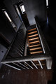
| 03/10/2010 10:31:32 PM | Don't fall!by snafflesComment:
 Critique Club Critique
First Impressions
Critique Club Critique
First Impressions
The 'frame' isn't the first thing I notice in the image. It's 'out of the box' and an odd angle, but the frame does indeed exist.
Photograph Information, Technicals & Composition Review
I'm trying to see if the angle/perspective grows on me the more I look at the image, and whilst it does slightly, I still find it 'unnatural' enough that it doesn't sit well to view.
I do wonder about it converted to b&w/toned and whether this would enhance the 'framing'.
Comments, Score & Placement Review
64/125 very middle of the pack for an 'unaverage' image, so I guess this is indicative for you.
A lot of positive comments, yet a total average from them of 6.5, perhaps doesn't resonate that well with what they have said.
Summary
I think there is potential with the staircase and the framing aspect but there is a lot else going on in the image that it competes too much for attention. The 'vertigo' aspect, whilst existant, perhaps could be enhanced by a variation in the angle/perspective, 'next time'. | | Photographer found comment helpful. |
| 03/10/2010 10:20:59 PM | Laundry timeby Rino63Comment:
Critique Club Critique
First Impressions
An odd image, with a little abstract thrown in, along with some creativity, however the black dominates too much in my opinion.
Photograph Information, Technicals & Composition Review
I think your technicals are good, for it appears you were trying to achieve - perhaps trying to minimize that black background may have helped, somehow. I guess you wanted the laundry to be OOF and/or shallow, creating the abstract, however perhaps more focus on it may have driven a stronger message, who knows.
Comments, Score & Placement Review
96/125 is pretty low down the pack, I think this may have been a bit 'out there' for most. You have 'two in one' for the framing aspect of the Challenge, which is quite good - but still, for me, as mentioned, a little 'odd' overall. I didn't vote in this Challenge.
A total score of 7.5 from your three commentors shows that they did like it, despite one showing you their score of less than that.
Summary
Perhaps the angle of the mirror also made this a little strange and difficult for people to connect with - it wasn't strange enough perhaps, and 'next time', maybe the set up and/or execution may be improved and produce a stronger image.
edit: wordingMessage edited by author 2010-03-10 22:22:59. | | Photographer found comment helpful. |
| 03/09/2010 08:30:41 PM | Into the Unknownby MarstonComment: 7 - Interesting image, made me stop and look twice when I first saw this - this is my second viewing, stopping to comment - interested to see 'how' and 'what' PC. More refined crop/angle adjust and maybe a little more 'pop' somehow, make it even better in my opinion. | | Photographer found comment helpful. |
| 03/09/2010 08:29:14 PM | At the endby briandsdComment: 8 - Like this, especially like the distant figure - looks like more potential with the shadows on the right at the fore... | | Photographer found comment helpful. |
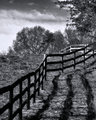
| 03/09/2010 08:28:30 PM | Country Waysby glad2badadComment: 8 - Really like this, especially the tones, composition and those very nice trees. Maybe the fence a little sharper, not sure. | | Photographer found comment helpful. |
| 03/09/2010 08:27:45 PM | No Passingby BudComment: 8 - Really like the straightness and the sun - more refined crop and less border make it even better, in my opinion. | | Photographer found comment helpful. |
| 03/09/2010 05:03:54 PM | | | Photographer found comment helpful. |
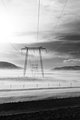
| 03/09/2010 04:58:21 PM | The mysteries of mist by RlivelifeComment: 5 - Good potential - bigger (800), if the quality was there and, undecided whether it would be stronger, especially for this Challenge, in b&w/toned, especially because of those yellow lines. It is easy to miss the distant subjects/people and, despite your title (which is likely the main reason I lingered and found them), the crop/composition isn't resonating strongly with the title. All just my 'opinion' on your image, of course. |
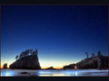
| 03/09/2010 12:46:52 AM | A night for stargazing by william88Comment: Beautiful image, I gave this a 7 during voting (the red border mainly). The video is very good, mostly like a 'moving photograph' - beautiful place, thanks for sharing it. Congratulations on the  . | | Photographer found comment helpful. |
|
Showing 201 - 210 of ~4957 |
Home -
Challenges -
Community -
League -
Photos -
Cameras -
Lenses -
Learn -
Help -
Terms of Use -
Privacy -
Top ^
DPChallenge, and website content and design, Copyright © 2001-2026 Challenging Technologies, LLC.
All digital photo copyrights belong to the photographers and may not be used without permission.
Current Server Time: 06/25/2026 06:53:40 AM EDT.
|


 .
.