| Image |
Comment |
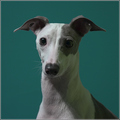
| 12/19/2006 02:19:52 PM |
Mouseby IvoryComment: 4 - Like the potential. Nice pose. Like the angle, although both eyes more visible likely better - but then you might lose the 'wispy fur'. Mainly the focus and/or slight blur and a little too much empty space in my opinion. Variation in framing/crop likely have given this an edge as well. |
 Photographer found comment helpful. Photographer found comment helpful. |
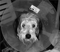
| 12/19/2006 02:17:51 PM |
My Dog Got Ran Over by a Raindeer!by phototrapComment: 3 - Possibly good potential. Removing the label, the collar not cropped, sharper, flash/lighting fixed and the title typo fixed, make this better in my opinion. |
| Photographer found comment helpful. |
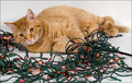
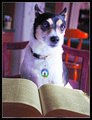
| 12/19/2006 02:16:03 PM |
I Didn't Do It...by alanfreedComment: 5 - Nice, but wonder about a variation in the framing, perhaps a little more height/square frame and the cat more strategically placed within it. Also, a much sharper perspective/angle may have allowed the cat to be more dominant and given this a little extra. |
| Photographer found comment helpful. |
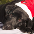
| 12/19/2006 02:15:48 PM |
A Tired Santaby griz210Comment: 5 - Nice composition - sharper/more clarity on the eyes/face/fur and the whites in the hat with more detail, make this better in my opinion. |
| Photographer found comment helpful. |
| 12/19/2006 02:12:18 PM |
|
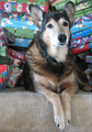
| 12/19/2006 02:11:29 PM |
My Bad Boyby UrfaKComment: 4 - The darker areas are difficult to discern, so perhaps a variation in lighting and/or angle/perspective may have given this extra. Frame seems a bit thick for this image, but your call. |
| Photographer found comment helpful. |
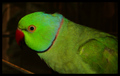
| 12/19/2006 02:10:24 PM |
Augustaby krakurComment: 3 - A little too close in my opinion for this Challenge. Perhaps a variation in crop on the right as well, to allow Augusta to 'feature' more, make this better for this Challenge, in my opinion. |
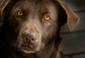
| 12/19/2006 02:09:01 PM |
Windows to the Soulby jeroweComment: 8 - Nice crop and composition. Wonder about a little more ear top left, so perhaps a slightly taller frame. And, 'if only' both eyes evenly lit, but fairly minor. |
| Photographer found comment helpful. |
| 12/19/2006 02:07:21 PM |
|
| Photographer found comment helpful. |
| 12/19/2006 02:05:54 PM |
Stanley IIby ChasSourekComment: 6 - Without looking, vaguely recall 'Stanley', don't think this has the same quality that that image does, in my opinion. Background color is nice, but like to have seen much more clarity/sharper on Stanley's eyes/face and more depth between him and the background. |
Home -
Challenges -
Community -
League -
Photos -
Cameras -
Lenses -
Learn -
Help -
Terms of Use -
Privacy -
Top ^
DPChallenge, and website content and design, Copyright © 2001-2026 Challenging Technologies, LLC.
All digital photo copyrights belong to the photographers and may not be used without permission.
Current Server Time: 07/27/2026 11:18:15 PM EDT.