| Image |
Comment |
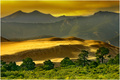
| 01/25/2007 04:57:21 PM |
Eldoradoby CutterComment: 8 - Very nice. Not sure if that sky is natural or not, or if pp, either way, coloring is very nice overall. Perhaps the green in the mountains 'tweaked' a little more to balance out the foreground green, but fairly minor. |
 Photographer found comment helpful. Photographer found comment helpful. |
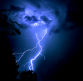
| 01/25/2007 04:55:30 PM |
Too Closeby thegrandwazooComment: 8 - Very nice. Like to have seen the gradient going down into the bottom right corner softened to lessen the distraction there, and a little on the left too. Minor, but the light filtering through the trees/bushes on the bottom left corner perhaps cloned out/darkened. The lightning coming through the trees/bushes at the bottom is a good effect, in my opinion. |
| Photographer found comment helpful. |
| 01/25/2007 04:48:57 PM |
|
| Photographer found comment helpful. |
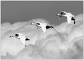
| 01/25/2007 04:40:16 PM |
Flight of the Swansby MAKComment: 6 - Nice capture. Toning works quite well, however I wonder about a slight variation to give it a little extra. 720 also, although some quality issues seem to be coming through at this size. Again, perhaps tweaking the tones in pp may have 'used' the grain/etc in some way. |
| Photographer found comment helpful. |
| 01/25/2007 04:36:43 PM |
WATCHERby notesinstonesComment: 9 - Wow. Even with the blown sky dominating a fraction too much overall, in my opinion, this is a very nice image. Took me a split second more than I anticipated to find the 'WATCHER', but he/she is a very good element and well placed in the image. Wish the WATCHER had a little more 'pop', but obviously difficult with these tones/ranges. Really like the overall feel of this image and the composition. The toning works very well also. Maybe the top cropped a fraction tighter, not sure. Sure this would make a very nice print. Again - just wish the WATCHER 'popped'. Up to 9 from 8 and taking liberty of adding to Favorites. |
| Photographer found comment helpful. |
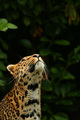
| 01/25/2007 04:20:01 PM |
Patiently Waitingby taljComment: 6 - Nice - but less 'space' at the top, while still retaining some for balance, make this even better in my opinion. Looks nice and sharp, so if the quality is/was there, perhaps a variation in cropping (tighter, 'somewhere'), may have brought out more detail in the leopard(?). But I realize, given your title, you may want it composed this way. |
| Photographer found comment helpful. |
| 01/25/2007 04:14:13 PM |
Green Fenceby TerminatorComment: 3 - Like the colors and composition, not sure on the vertical/square framing. Main thing that is holding this back is the size - if the quality was there, 720 would have helped this for this Challenge. A slightly more refined crop also, in my opinion. |
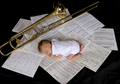
| 01/25/2007 03:55:56 PM |
Lil' Maestroby lauraodomComment: 5 - Like the concept, nice pose on the baby. The black fabric/backdrop is a little distracting, especially that it is primarily visible bottom right corner. Perhaps a variation in angle, perspective, and lighting (trying to get it a little more even and softer on the clothes), and also 'bringing into play' the song titles more (as you've obviously deliberately chosen them), make this even better in my opinion. |
| Photographer found comment helpful. |
| 01/25/2007 03:52:07 PM |
Popeyeby Art RoflmaoComment: 6 - A can of spinach and a (temporary) anchor tattoo (or two) would have helped your title (kidding - sort of). Nice pose/expression capture. Could just be the perspective, but seems slightly tilted (but apologies in advance if wrong). |
| Photographer found comment helpful. |
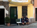
| 01/25/2007 03:48:43 PM |
High-Speed Accessby signal2noiseComment: 6 - Ha - well seen. More refined crop and, while likely difficult in this 'opportune situation', the ladies more defined, make this even better in my opinion. Difficult to ascertain, but seems the 'level' / perspective might be slightly off, but apologies in advance if wrong (although I realize that the street is likely sloped - perhaps 'accentuating' that more may have given this more of an edge, who knows). |
| Photographer found comment helpful. |
Home -
Challenges -
Community -
League -
Photos -
Cameras -
Lenses -
Learn -
Help -
Terms of Use -
Privacy -
Top ^
DPChallenge, and website content and design, Copyright © 2001-2026 Challenging Technologies, LLC.
All digital photo copyrights belong to the photographers and may not be used without permission.
Current Server Time: 07/27/2026 03:56:03 PM EDT.