| Image |
Comment |
| 03/13/2010 04:22:20 PM |
Promiseby DennisheckmanComment: 6 - I like the choice of subject, but find the OOF flower, but in the composition as is, a little distracting. I also wonder about some diffusing of the light to minimize/eliminate the hotspots, all be them subtle. Compositionally, I think the lower part of the image is the strongest. |
 Photographer found comment helpful. Photographer found comment helpful. |
| 03/13/2010 04:20:12 PM |
Lightningby hojop25Comment: 7 - Nice flip (being presumptious) - my eye wants to see it straightened. I like the tones. |
| Photographer found comment helpful. |
| 03/13/2010 04:19:24 PM |
Floral Fusionby WriteHeartComment: 7 - I like this, however the colors somewhat muted, doesn't pack the punch I think this would with a bump here and there in pp.. but personal preference. |
| Photographer found comment helpful. |
| 03/13/2010 04:17:56 PM |
Winter Woodland Symphony by MaryOComment: 8 - I do really like this - the feel of being there, the feel within the scene but, and I know you might not get this, the distant figure's clothing, including color/style, detracts, for me. Up to 8 from 7 as it does appeal - but mostly everything but the figure. Had they been in different clothes/the tones changed, who knows - but either way, just sharing my thoughts and vote with you. |
| Photographer found comment helpful. |
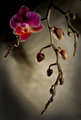
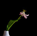
| 03/13/2010 04:14:34 PM |
As Times Goes Byby bubeltrubelComment: 7 - I like the sweeping/swaying nature of the flower and that the anthers are still 'intact'. Don't like the broken leaf and the vase detracts from the 'vision' that you put in my mind with the image from your (good) title and the flower. |
| Photographer found comment helpful. |
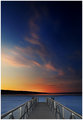
| 03/13/2010 04:12:59 PM |
FLY awayby vikasComment: 7 - I like the simplicity and natural colors - little distractions, like ethe one to the left of the end pier/dock gone, make it better in my opinion, especially for this Challenge. |
| Photographer found comment helpful. |
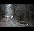
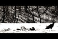
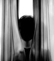
| 03/13/2010 04:11:13 PM |
d e p a r tby glad2badadComment: 7 - I like the scene and, before seeing your title, didn't like that he/she was looking out of frame... still undecided. A shame not a fraction sharper on the bird (or maybe more blurred, who knows), but also wish the silhouette was 'full', that is the head not in front of the background. More detail/definition in the carcass(es) and bones would be better, in my opinion. |
| Photographer found comment helpful. |
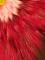
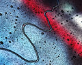
| 03/13/2010 04:08:15 PM |
Untitledby kleskiComment: 7 - I like the abstractness and the colors - can't help but wondering about focussing on a more interesting area of the image, i.e.: a tighter crop and even more abstract, if the quality was there (and maybe even if it wasn't). |
| Photographer found comment helpful. |
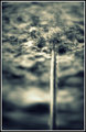
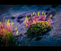
| 03/13/2010 04:06:40 PM |
Coming Back To Lifeby gyabanComment: 6 - I like the subject and for me, the beauty of the little scene and the light, are what appeal most and bring this closer to 'art', however I don't think the full potential has been reached. I also am distracted by the OOF fore on the left and the dark/black areas in the rear. |
| Photographer found comment helpful. |
| 03/13/2010 04:01:19 PM |
untitled 4by tateComment: 7 - Personal preference, but I like this better with just the neck and head. |
| Photographer found comment helpful. |
Home -
Challenges -
Community -
League -
Photos -
Cameras -
Lenses -
Learn -
Help -
Terms of Use -
Privacy -
Top ^
DPChallenge, and website content and design, Copyright © 2001-2026 Challenging Technologies, LLC.
All digital photo copyrights belong to the photographers and may not be used without permission.
Current Server Time: 06/25/2026 12:49:50 PM EDT.