| Image |
Comment |
| 03/13/2010 09:02:05 PM |
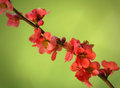
Hinomaruby Yo_SpiffComment: 7 - Nice abstract. Seems like only part of a 'set' though. Up to 7 from 6. |
 Photographer found comment helpful. Photographer found comment helpful. |
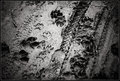
| 03/13/2010 07:47:04 PM |
Soulsby bspurgeonComment: 6 - I like the concept and the tones (although wonder whether sepia would pack more punch, but your call of course) - but too much of the image/frame is OOF and the parts that I find most interesting (left) don't dominate enough. |
| Photographer found comment helpful. |
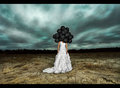
| 03/13/2010 07:45:02 PM |
The Twilight Zone by JaimeVinasComment: 6 - I like the colors and the bottom part of the dress, and this is personal preference/taste, but the top part doesn't seem to 'fit' - the positioning of the balloons, so low over the shoulders, detracts from, what I perceive, to be the 'head' aspect, the pose of the model is fairly 'plain' for the image - I like the other elements, including the lighting - the slant on the background I find detracts - I like the processing, composition wise I think fully centered or else 'other' - just my take on it. |
| Photographer found comment helpful. |
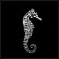
| 03/13/2010 07:42:05 PM |
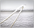
Sea Horseby pawdrixComment: 7 - I love these creatures, but don't feel this image fully does them justice, especially in an artistic sense (detail, clarity, exposure (fairly minor) composition/crop (stronger be better in my opinion) - there are also some issues in the background/something that are visible. But personal taste. On second thoughts - up to 7 from 6. I like the potential. |
| Photographer found comment helpful. |
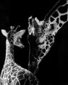
| 03/13/2010 07:38:24 PM |
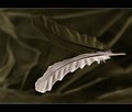
Mothers Touchby karenkComment: 6 - Good potential here, but for me, needs a variation in composition and/or cropping - much bolder/stronger. |
| Photographer found comment helpful. |
| 03/13/2010 05:52:58 PM |
Firstby npaselComment: 6 - More potential in my opinion - cropping or rather, possible 'pruning/picking off' some of the flowers to have no/less distractions from 'choppedness'... if you follow, to truly showcase the simple beauty (albeit in a tampered with & unnatural way) . |
| Photographer found comment helpful. |
| 03/13/2010 05:41:25 PM |
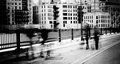
Boys Meet Girlsby GatorguyComment: 6 - Wish we could see the boys a little more and the distractions at the top of the building were somehow minimized (cropped maybe). |
| Photographer found comment helpful. |
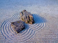
| 03/13/2010 05:40:15 PM |
|
| Photographer found comment helpful. |
| 03/13/2010 05:39:40 PM |
u n t i t l e d by PenelopeKComment: 6 - I like the simplicity and your composition (although wonder about a fraction more off the right, but your call of course), undecided on the frame - whether it is enhancing, especially at this size. |
| Photographer found comment helpful. |
| 03/13/2010 05:38:20 PM |
|
| Photographer found comment helpful. |
Home -
Challenges -
Community -
League -
Photos -
Cameras -
Lenses -
Learn -
Help -
Terms of Use -
Privacy -
Top ^
DPChallenge, and website content and design, Copyright © 2001-2026 Challenging Technologies, LLC.
All digital photo copyrights belong to the photographers and may not be used without permission.
Current Server Time: 06/24/2026 02:26:09 PM EDT.