| Image |
Comment |
| 04/11/2003 11:31:48 AM |
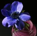
Black and Blueby RgoldComment: My favorite colors are portrayed here...a country feel. Very pretty and well done, in my opionion. Something about the lighting, however, bothers me a little. The color in the flower gets lost somehow and could stand out more. I'm not sure exactly what it is or what could be done differently to be honest. |
| 04/11/2003 11:26:54 AM |
|
 Photographer found comment helpful. Photographer found comment helpful. |
| 04/11/2003 11:24:28 AM |
"Anniversary Bouquet"by sfarrell23Comment: Very pretty flowers and pretty colors. Picture is just a bit dark, especially on the bottom and right. Colors could stand out more. Also seems a touch out of focus. |
| Photographer found comment helpful. |
| 04/11/2003 11:22:27 AM |
Hot Chiliesby imagesloyolaComment: The chili's are out of focus. Possibly focusing on the chili's, then carefully dropping the camera down to take the rest of this picture would have helped. The ridges of the plate they are sitting on seems to be in focus. Should be the other way around. Composition could have been a little better by arranging the chilis so they take up the entire top portion of the plate and hang down in a more uniform pattern. I love the idea of the photo. I love the contrast in color. |
| 04/11/2003 11:15:58 AM |
Sister Locksby lauraedwComment: Very interesting take on the challenge. Good photo for a hair product ad. I was noticing the sister models and how their gazes affects the photo. The gal with the curly hair is looking up at the camera where the other two are gazing to another sister. Possibly the curly haired gal should be looking to toward her sister to the right of her, maybe turning her head a little more to the right. Obviously, a white background would wash out their faces, but maybe having a black background would bright out the colors of their hair better than the current teal constrasting color. Get my point? Just being picky...LOL. Actually, it's a well done photo |
| Photographer found comment helpful. |
| 04/11/2003 11:00:33 AM |
Caught in the Undertowby LanSnakeComment: The lighting is a little harsh on the left. Working with brightness/contrast and possibly adjusting saturation would bring out the colors better. Otherwise, it's too dark and lost the colors. Very unique subject and funny. |
| Photographer found comment helpful. |
| 04/11/2003 10:57:54 AM |
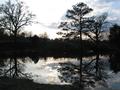
Golden Sunsetby mperez74Comment: Very pretty reflective sunset shot. I don't see the golden aspects that the title portrays should be there. Unfortunately, In another challenge other than color, this picture would probably score a lot higher because it is nicely done. |
| 04/11/2003 10:55:01 AM |
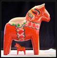
Dala Horseby MonaComment: Picture seems kind of flat. Doesn't really do the colors justice. Perhaps adjusting the contrast and saturation would help the colors stand out and look more vivid. Plus, I would have like to see the black background extend down to include the surface. The stark transition to white takes away from the horses. Otherwise, the artwork on the horses is fantastic and colorful. |
| Photographer found comment helpful. |
| 04/11/2003 10:50:39 AM |
Alice's Backdoorby mjf999Comment: My, that door really stands out in constrast to what the rest of the building must look like. Very interesting. |
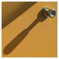
| 04/11/2003 10:46:56 AM |
The Doorby samtimesComment: Nice abstract photo...nicely focused...I like the texture that you were able to pick up from the door and the long shadows. It's just not very colorful, in my opinion. |
| Photographer found comment helpful. |
Home -
Challenges -
Community -
League -
Photos -
Cameras -
Lenses -
Learn -
Help -
Terms of Use -
Privacy -
Top ^
DPChallenge, and website content and design, Copyright © 2001-2026 Challenging Technologies, LLC.
All digital photo copyrights belong to the photographers and may not be used without permission.
Current Server Time: 07/17/2026 12:36:11 AM EDT.