| Image |
Comment |
| 08/12/2005 12:48:59 AM |
BIG brother! by les0910Comment: Although I have seen the concept before, this is done the best. The relative size of the two is right on, as is the position, and expressions. Nice lighting, just well done. 10 |
 Photographer found comment helpful. Photographer found comment helpful. |
| 08/12/2005 12:43:56 AM |
SAY WHEN!by NaldComment: Gross :) Concept is strong. Rendition is not. The highlights in the backdrop take away from the shot, as does the backdrop itself. You've blown out some highlights on the hands. The compostion would have beeen stronger with the plate placed on the left 1/3 line. This could have been accomplished with the crop. Also push for more detail in the focal points of the image. 4 |
| Photographer found comment helpful. |
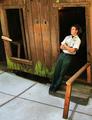
| 08/12/2005 12:37:59 AM |
New Perspectiveby akshayvhComment: Strong image. The faint image behind your subject's head is distracting as well as the glow in the upper portion of the door. Luckily they are easily fixed in PS. The large amount of light concrete takes away from the impact. I'd prefer a tighter crop. Otherwise very nice. 6 |
| Photographer found comment helpful. |
| 08/12/2005 12:33:20 AM |
|
| Photographer found comment helpful. |
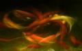
| 08/12/2005 12:31:29 AM |
Sea Monsterby davidus428Comment: Very original. The effect is awesome. You've got a winner. Well composed. Strong color, including the blends. Just the right amount of softness. Wow. 10 |
| Photographer found comment helpful. |
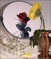
| 08/12/2005 12:29:19 AM |
If Only I Could Be.....by TDCollinsComment: Nice story telling on this image. The lack of reflection of the baby's breath is a quick giveaway and takes away some of the power of this image. I really like the drooping leaf on the mum(?) I rally denotes the sadness. 7 |
| Photographer found comment helpful. |
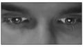
| 08/12/2005 12:25:11 AM |
e-LOVEby anthonyczajaComment: Wonderful highlights. I'd love to see the eyes much more in focus. The lighting is leaving a dark patch next to the nose that is strange. It has alot of potential. 5 |
| Photographer found comment helpful. |
| 08/12/2005 12:22:34 AM |
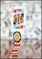
The Illusion Of Gamblingby MarkBComment: The illusion is very strong. Background does enhance the shot. The composition is only so-so. Good color and detail. 6 |
| Photographer found comment helpful. |
| 08/12/2005 12:20:40 AM |
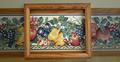
The Canvasby Nikolai1024Comment: I am missing the illusion. It looks like an empty frame hung over a wallpaper border. Technically the image has some nice color, especially the center wood, although the color fades on the right. The lighting does not really enhance the shot, not does the compostion. There is plenty of detail in the image. 3 |
| 08/12/2005 12:16:12 AM |
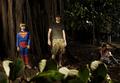
Family Portraitby neomachinaComment: I am missing the illusion. Looking at the photo, I find the foreground leaves distracting, the lighting to be fighting against the photo as a whole and the compostion to be bland. I do, however, find each figure in the image to be interest and enjoyable to look at. I would have found it much stronger to crop for the individual elements. 3 |
Home -
Challenges -
Community -
League -
Photos -
Cameras -
Lenses -
Learn -
Help -
Terms of Use -
Privacy -
Top ^
DPChallenge, and website content and design, Copyright © 2001-2026 Challenging Technologies, LLC.
All digital photo copyrights belong to the photographers and may not be used without permission.
Current Server Time: 07/16/2026 09:12:19 AM EDT.