|
|
|
Showing 951 - 960 of ~1613 |
| Image |
Comment |
| 07/08/2008 10:41:23 PM | Every Cent Helpsby arron_christensenComment: Critique Club Review:
Color Saturation and Hue: Colors are reasonably accurate, even after some processing. Nothing is over saturated.
Brightness and contrast: Image could be brighter for me. Looks almost a little under exposed. Contrast is very good. Shadows hold detail, and highlights are not blown out. Dark areas are nice and inky black.
Focus and depth of field: Nice sharp focus, and very good depth of field.
I like the composition here. It is hard sometimes to know where to crop a photo. With all the complex shapes you have here, it is easy to try to include too much. The result then would be that the money is minimized to the point where it would no longer be part of the subject. Crop too tight and the instrument and the story are lost. In some ways the image here leaves me a little unsatisfied. Perhaps it is the brown of the instrument that almost overwhelms the money. Or all the shapes that do compete a bit. As I look at the image, it's been over 5 minutes now, I'm starting to think that the guitar is un-necessary. The case would still tell the story and the money would take more of a central role.
I think that some do not see the image as charity, because they do not see street musicians as beggars. I agree that it is hard to make a living as a street musician, but previously I considered them performers working at their craft.
Either way, I think this image should have scored a bit higher. It has nice strong bones, and does tell a story that fits the challenge.
Nice work... |  Photographer found comment helpful. Photographer found comment helpful. |
| 07/08/2008 09:08:33 PM | Temperance and Justice Tarotby HuskysibeComment: Critique Club Review:
Color Saturation and Hue: Colors are good, and after reading the photographer's comments, the hue works for what he was going for.
Brightness and Contrast: The brighter highlight areas are starting to burn out and have lost detail. Shadow areas have good detail, and could withstand going a bit darker to eliminate the burnout of the highlights.
Focus and depth of field: Focus is nice and sharp. Depth of field is about as good as you could accomplish in this image. I don't think f3.5 would have done much more for you.
The biggest problem I see here, is the lack of a strong subject. The hair in front of the girl's face, tends to diminish it. If you were going for the face, the cards compete. If you were going for the cards, what is visible of her face competes. Also her face is almost dead center of the frame. A no-no of the rule of thirds crowd. Rules are made to be broken, but you do so at the risk of your score. There should be an overriding reason to center the subject.
If you were going for a candle lit effect, I think the scene is a bit bright. Even though this is a basic editing challenge, you can play with brightness, contrast, and saturation, among other things.
The background also competes. The case behind the girl and the red item in the case, are still strong enough to compete.
The plain wall to the left of the girl would work much better as a back drop. For this image, if you darken it some and reduce the contrast a bit, and reduce the saturation, I think you will find it looks more candle lit,the detail in the highlights will come back, and the attention will shift to the cards. As a bonus, the background will also be minimized.
You have some good ideas here, I like the colors, and the theme. Hope to see your work in another challenge soon.
|
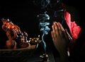
| 07/08/2008 03:28:43 PM | Faithful prayer brings peaceby sekarmalathyComment: Critique Club Review:
Color Saturation and Hue: Colors fit well in this image, skin tones are natural.
Brightness and Contrast: Brightness is appropriate for this image. Contrast is very good, highlights are not blown out. Dark areas are nice and inky.
Focus and depth of field: Focus is nice and sharp. Depth of field captures all the subject elements well. Perhaps if the red cloth had been allowed to go soft, it might have worked even a little better.
I like this image a lot. I like the smoke, and at the same time the smoke bothers me. I love the curves and the lighting of the smoke. Very nice texture. But at the same time, the smoke cuts the image in half, almost making two images out of one.
If there is no "rule" on the placement of the incense, I think someplace other than at the bottom of the picture, perhaps where the flame is. So that the image is no longer cut in half.
As is the photo tells a very strong story. Congratulations on a well deserved top 20 finish. | | Photographer found comment helpful. |
| 07/08/2008 02:22:32 PM | h o p eby jrmyrnsmComment: Critique Club Review:
Color Saturation and Hue: Colors are natural and fit well with this image.
Brightness and contrast: Contrast is excellent, brightness could be a bit brighter for me. (But then this could be my monitor. However, it looks like there was overcast sky and colors are just a little bit cool.)
Focus and Depth of field: Focus is sharp, and depth of field is used well to minimize background distractions. The top half of the flower does appear to go a little soft. It may be more of an illusion than real. Otherwise very nice job of eliminating background distractions, and considering the fact that the flower was just stuck in there likely very necessary.
Overall very good composition, the image sells the title rather than the other way round.
Very nice work. | | Photographer found comment helpful. |
| 07/08/2008 01:52:02 PM | Constructure slothby haukurhComment: Critique Club Review:
Color Saturation and Hue: Colors are bright and natural.
Brightness and Contrast: Contrast is good, but brightness is a little dark.
Focus and Depth of field. Focus is nice and sharp. Depth of field is good for this image.
The angle of the building makes the horizon look tilted, but looking at the curb in the parkinglot, it appears you horizon is really level.
The area around the dirt is not very brightly lit. The subject in this photo has way too much competion. The bright yellow stair well captures the eye and holds it there. Almost everything else competes also. The sky, the balconies, even the cars compete with the dirt.
You have a good idea here, but I think if you got closer to the dirt, so that the perhaps just enough surrounding area to show that it is a parking place, and that it is very full of dirt. Make the dirt look large. As it is, you have to look at the picture a bit, to see that there really is a lot of dirt there.
Nice idea for a first entry.
Hope to see you back for more challenges. | | Photographer found comment helpful. |
| 07/07/2008 09:20:59 PM | Heavenly Light (Faith)by choltmeierComment: Critique Club Review:
Color Saturation and Hue: Colors are natural and within expected parameters for this type of image.
Brightness and contrast: Overall brightness and contrast are done well.
Focus and depth of field: Focus is very sharp, and depth of field is used to good advantage to isolate a distracting background.
Shooting this image at a bit of an up angle without correcting the perspective makes it look like the statue is leaning a bit.
Using the sun for the halo is a neat idea, however it looks like it got away from you a little bit. The upper part of the hand and the cross are starting to wash out a little. I suspect that the religious tone may have hurt a bit in the voting, I would have thought this would have finished a little higher.
Nice interesting photo. | | Photographer found comment helpful. |
| 07/07/2008 09:12:40 PM | Audacious Hopeby scooter88Comment: Critique Club Review:
Color Saturation and Hue: Colors are very realistic, skin tones are natural.
Brightness and contrast: Highlights are not blown out, details are held in the shadows.
Focus and depth of field: Focus is nice and sharp. Depth of field is well used to remove any disracting background.
This is an excellent photo, and no surprise that it finished as well as it did. The message comes across very clearly, and the title is not really needed to express the message. Very strong image.
I love the way the girl's arms are used as a frame within a frame. Attention is driven straight to the eyes and face, and never allowed to leave.
It's hard to critique images that finish this high in the voting. If there were a lot to fix, they wouldn't score this well.
About the only things I see, and they are minor, are the partial object (goat) in the lower left corner which is a tiny bit distracting. The out of focus stick and wire in front of her hands, also a tiny bit distracting. And even smaller yet, the hair at the back of her head, and the fold of her robe at bottom left go a tiny bit soft.
None of these are huge.
This is an excellent piece of work, and please accept my congratulations on your well deserved finish. | | Photographer found comment helpful. |
| 07/07/2008 09:00:12 PM | Fortitude-"I can get through this"by UbersteinyComment: Critique Club Review:
Color Saturation and Hue: Colors are natural, skin tones are excellent!
Brightness and Contrast: Excellent work. Details are held in the highlights, and the darks are nice and inky.
Focus and depth of field: Lazer sharp focus, depth of field is about perfect for this type of image.
There are only two very minor things I can think of that you might want to look at in this image. There is a pale area to the right of her neck that is a little distracting. I'm not sure if it is background or what. But it is disconnected from everything else, and almost comes across as lens flare, which should not be the case with this lighting. The tear does not look quite real. Placing and size comes across as suspect to my eye. (Now if she really is crying I'm gonna feel like a jerk.)
Other than the two above mentioned details, this image is killer.
Congratulations on a very well deserved top ten finish. | | Photographer found comment helpful. |
| 07/05/2008 09:10:32 PM | A line of traffic waiting on a red-light...by egambleComment: Critique Club Review:
Color Saturation and Hue: Nice job of turning the real world monochrome and leaving the relfection in color.
Brightness and Contrast: The brightness and contrast in the monochrome part of this image is a bit better than the colored reflection. The reflected sky is blown out and featureless. The second vehicle in line blends into the sky at the roof.
Focus and depth of field: Excellent!
I'm not sure quite what is going on the parts of the reflection. The supports for the traffic lights, and some of the other horizontal lines, have the "jaggies". Perhaps an effect of the post capture processing.
The traffice does form a good leading line. You've done well here. My eye is pulled to the mirror by the color, and then it instinctively follows the traffic to the back of the line. No competition, no distractions. Very nice work.
So, what hurt your score... Outside of the previously mentioned jaggy lines, I think there were probably a few voters who saw more than one line. I wouldn't count the lights as lines, but some purisits... And, silly as it sounds, you said the light was red when it was green. | | Photographer found comment helpful. |
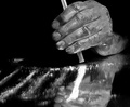
| 07/04/2008 05:47:35 PM | Straight Path to Nowhereby togtogComment: Critique Club Review:
Color Saturation and Hue: N/A (image is monochrome)
Brightness and Contrast: Very good. The powder is just starting to lose some detail in the highlight areas. The darks are nice and deep.
Focus and depth of field: Nice sharp focus, though the mirror cheated you a bit by the reflections seeming to be out of focus parts of the lines.
I see where you were going with the makeup. But it came out too shiny. Dirt tends to be duller. This came out looking almost like axle grease.
I like the lighting and I think had you used used your other contemplated image, the strength of the lines may have been diminished.
Overall a very good image.
So why didn't it score higher?
Two reasons come to mind.
1. Disturbing images never do as well as kids and puppies.
2. Though not mentioned in any comments below, you may have been hit with a little political correctness.
Overall, a powerful image with a real message. Nicely done....
| | Photographer found comment helpful. |
|
Showing 951 - 960 of ~1613 |
Home -
Challenges -
Community -
League -
Photos -
Cameras -
Lenses -
Learn -
Help -
Terms of Use -
Privacy -
Top ^
DPChallenge, and website content and design, Copyright © 2001-2026 Challenging Technologies, LLC.
All digital photo copyrights belong to the photographers and may not be used without permission.
Current Server Time: 07/20/2026 03:53:01 AM EDT.
|