| Author | Thread |
|
|
07/08/2008 09:08:33 PM |
Critique Club Review:
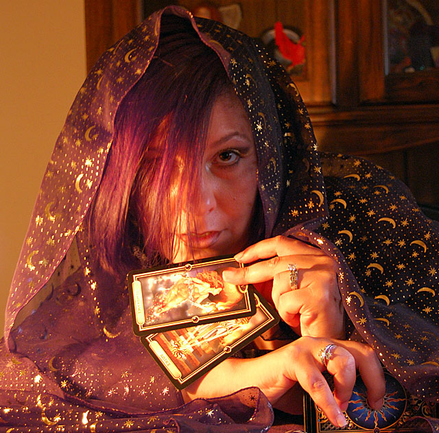
Color Saturation and Hue: Colors are good, and after reading the photographer's comments, the hue works for what he was going for.
Brightness and Contrast: The brighter highlight areas are starting to burn out and have lost detail. Shadow areas have good detail, and could withstand going a bit darker to eliminate the burnout of the highlights.
Focus and depth of field: Focus is nice and sharp. Depth of field is about as good as you could accomplish in this image. I don't think f3.5 would have done much more for you.
The biggest problem I see here, is the lack of a strong subject. The hair in front of the girl's face, tends to diminish it. If you were going for the face, the cards compete. If you were going for the cards, what is visible of her face competes. Also her face is almost dead center of the frame. A no-no of the rule of thirds crowd. Rules are made to be broken, but you do so at the risk of your score. There should be an overriding reason to center the subject.
If you were going for a candle lit effect, I think the scene is a bit bright. Even though this is a basic editing challenge, you can play with brightness, contrast, and saturation, among other things.
The background also competes. The case behind the girl and the red item in the case, are still strong enough to compete.
The plain wall to the left of the girl would work much better as a back drop. For this image, if you darken it some and reduce the contrast a bit, and reduce the saturation, I think you will find it looks more candle lit,the detail in the highlights will come back, and the attention will shift to the cards. As a bonus, the background will also be minimized.
You have some good ideas here, I like the colors, and the theme. Hope to see your work in another challenge soon.
|
|
Comments Made During the Challenge  |
|
|
06/30/2008 01:15:00 AM |
|
Nice composition. I also like the color. |
|
 Photographer found comment helpful. Photographer found comment helpful. |
|
|
06/27/2008 10:36:49 PM |
|
Good shot, lighting is a little harsh. Good luck |
|
| Photographer found comment helpful. |
|
|
06/27/2008 12:12:31 PM |
|
I can see the white balance being off here. If I am correct and the lights are tungston, a tungston white balance preset would have saved this image from being so orange-ish. |
|
| Photographer found comment helpful. |
|
|
06/27/2008 08:27:49 AM |
|
not bad, the idea of the tarots is good. I don't like the color temperature here, it seems too much hot. 7 |
|
| Photographer found comment helpful. |
|
|
06/25/2008 06:54:39 PM |
|
white balance seems off and a bit oof /4 |
|
| Photographer found comment helpful. |
|
|
06/25/2008 11:34:05 AM |
|
A good idea, but I find the background really distracting, and i'm not so sure I like the lighting. Play with this idea a little more and I think you could come up with something really cool though. |
|
| Photographer found comment helpful. |
|
|
06/25/2008 08:47:47 AM |
|
| Photographer found comment helpful. |
Home -
Challenges -
Community -
League -
Photos -
Cameras -
Lenses -
Learn -
Help -
Terms of Use -
Privacy -
Top ^
DPChallenge, and website content and design, Copyright © 2001-2026 Challenging Technologies, LLC.
All digital photo copyrights belong to the photographers and may not be used without permission.
Current Server Time: 07/01/2026 05:20:23 PM EDT.