|
|
|
Showing 921 - 930 of ~1613 |
| Image |
Comment |
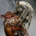
| 07/28/2008 11:04:30 PM | A recipe for beetle juiceby APOLAUFComment: Critique Club Review:
Wow! What a twisted photo...
Color Saturation and Hue: Colors are realistic, hues are normal, saturation is not overdone.
Brightness and contrast: Contrast is good, highlights could be a little brighter.
Focus and depth of field: Focus is nice and sharp. Depth of field feels a bit shallow. The spider goes soft on its back and on its legs in the foreground.
The spider's face is partially obscured by two of its legs. A different angle for the photo would have helped here. The biggest problem, outside of the gross out factor that got you a bushel of ones, in the voting, is that there is no defined point of interest in this image. The sharpest areas of focus are either beetle legs leading you away from the picture, or hairy spider abdomen, because the face is obscured by soft focus legs.
From this angle it about all has to be sharp, and even then there is the spider face problem. Seeing more of the face is probably the best quick improvement to the image.
|
| 07/28/2008 02:46:55 PM | Pinhole Cameraby pointandshootComment: This is the most creative image this challenge! I expect to see this one in the winner's circle. |  Photographer found comment helpful. Photographer found comment helpful. |
| 07/23/2008 05:05:40 PM | ....as hellby dougi555Comment: Great image. One of the best this week. As I am entered and on a team, I am not voting. Otherwise you would have a 10 from me. Love the colors and the detail. |
| 07/23/2008 01:40:58 PM | Colorsby LadyKComment: Critique Club Review:
Color Saturation and Hue: Colors are very saturated in this image, but work well here.
Brightness and contrast: The white area at the top of the marble has reached burn out and is a little bit distracting. A little darker background might be good also. There is a faint out of focus area that shows up to the left of the marble. Were it gone, it could help the image.
Focus and depth of field: Focus is good, but depth of field feels a little bit short. The softness at the edges of the marble become pronunced at the top, due to all the color and brightness there. If the whole marble were sharper, I'd like it better.
Overall: I like this image alot. Feels sort of like stained glass. Keeping the LEDs in soft focus was a nice touch.
| | Photographer found comment helpful. |
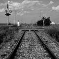
| 07/23/2008 12:02:29 AM | What my town was built fromby eyesdownComment: Critique Club Review:
Color Saturation and Hue: N/A Image is monotone (black and white)
Brightness and Contrast: Both are good. The electrical box at the left of the track is approaching the limit on brightness. Any further and detail would be lost, it does distract the eye a tiny bit and if a little darker it would be a bit better. Contrast is good. Most of the shadows are holding detail. Darks are nice and inky black.
Focus and depth of field: Focus could be a little sharper, part of this is an effect of depth of field. Your shutter speed (1/2500)was well high enough to stop any action. A smaller aperature, say around f/8 would have helped. The smaller the aperature, the deeper the depth of field.
I like the leading lines, and the rail crossing, but wonder how it would have looked had you walked past the electrical box to take the photo.
Did you do any processing besides convert to B&W? Had the sky been more dramatic (what no thunderstorm at the snap of the fingers) it would have helped also. Depending on the software, you could have tried different color filters before converting to black and white. This may have helped you pump up the sky a bit.
Not a bad score for your first try. Nice image. Hope to see you in the challenges again soon. You are off to a good start. |
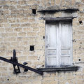
| 07/22/2008 11:49:14 PM | Time and wheatherby Rino63Comment: Critique Club Review:
Color Saturation and Hue: Colors are good, saturation and hue work well.
Brightness and Contrast: Brightness and contrast are appropriate for this image.
Focus and depth of field: Focus is nice and sharp, depth of field works well in this image.
Interesting image. Certainly is weathered. I'm not sure but it looks like you may have taken this on an overcast day. The lighting appears a bit flat. I can tell there is a lot of texture to the wall, but I can't see it in this image. I think they same goes for the doorway. At a good lighting angle, the texture of the stones (bricks?) would really pop.
The iron and pully distract a little bit, but not much. And in a basic editing challenge there is only so much you can do.
This picture has very strong bones. I would love to see it done again with better lighting, and maybe no quite so pale. It makes me want to see the story of this doorway to nowhere.
Nice image. | | Photographer found comment helpful. |
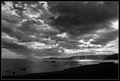
| 07/22/2008 06:24:25 PM | Light to guide my wayby JohannesFrankComment: Critique Club Review:
Color, Saturation, and Hue: N/A Image is monochrome (black and white)
Brightness and contrast: Brightness and contrast are very well done. The dark areas are nice and inky black. The bright areas are not taken beyond the limits, and still hold detail.
Focus and depth of field: Focus is excellent, and depth of field is appropriate to the subject.
Wow! I wish I had something this magestic to look at on my way home. I like the drama of the clouds, the rays of the sun lighting the water. It was an excellent choice to do this in black and white. Color would have taken the attention away from the light.
I think you could crop the left side a bit. The foreground object do compete with the rays of light slightly.
This is a very strong composition and very well done. |
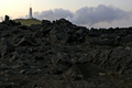
| 07/22/2008 06:16:38 PM | Harshby indridistefansComment: Critique Club Review:
Color, Saturation, and Hue: Colors are realistic, I would have liked maybe a little bit more saturation. Hue is accurate.
Brightness and contrast: Contrast is good. I would have liked the picture a little brighter.
Focus and depth of field: Focus is excellent. Depth of field is appropriate for this image.
I would have liked to seen this one brighter and more saturation to increase the contrast between the barren rocks, and what looks like green hills around the structure in the background.
Although the weather we get when we photograph, is the weather we have to deal with, I would like to see this picture redone when the sky is more dramatic, or on a sunshine day when the sun is lower in the sky and gives more texture to the rocks.
This image has some good bones and could be built upon for a more dramatic entry. | | Photographer found comment helpful. |
| 07/22/2008 05:57:06 PM | Ol' Rawlyby cbellerComment: Critique Club Review:
Color, Saturation, and Hue: N/A Image is monotone (Sepia)
Brightness and contrast: Both are very good, though right at their limit. Detail is starting to dissapear right below and to the right of the Rawlings logo.
Focus and depth of field: Focus is nice and sharp, depth of field is appropriate for this image.
Very nice compostition. I could see this hanging in a clubhouse or restaurant at a ball park. I like what looks like a shadowed glove in the background, and what appears to be signs along the outfield fence.
The biggest thing I see that hurt your score is that there was probably a fair number of people that didn't see the weathering in this image. The ball looks a little scuffed, but not old. A tattered old baseball would have worked better for me here.
Still though, a very good image with a lot of potential, and in another challenge would have scored much higher. | | Photographer found comment helpful. |
| 07/21/2008 07:35:18 PM | Flowing sheets of paperby IreneMComment: If anyone wonders why Irene wins so many ribbons, this picture is a good example. While this image did not win a ribbon, I wonder how many of us could have made as much out of a few sheets of paper and a couple of books.
Your creativity and imagination are amazing!
Excellent photo.... | | Photographer found comment helpful. |
|
Showing 921 - 930 of ~1613 |
Home -
Challenges -
Community -
League -
Photos -
Cameras -
Lenses -
Learn -
Help -
Terms of Use -
Privacy -
Top ^
DPChallenge, and website content and design, Copyright © 2001-2026 Challenging Technologies, LLC.
All digital photo copyrights belong to the photographers and may not be used without permission.
Current Server Time: 07/19/2026 05:43:57 AM EDT.
|