| Author | Thread |
|
|
07/22/2008 06:16:38 PM |
Critique Club Review:
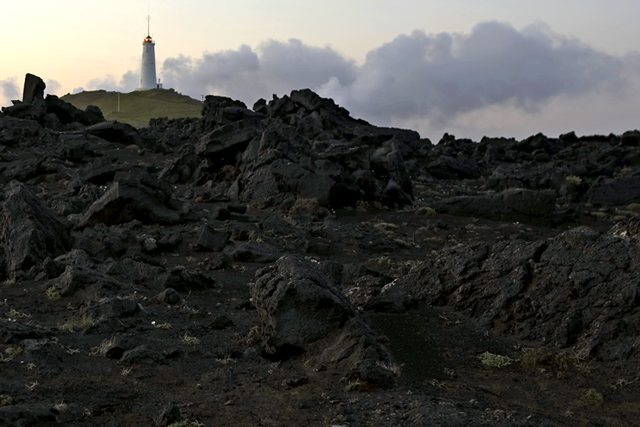
Color, Saturation, and Hue: Colors are realistic, I would have liked maybe a little bit more saturation. Hue is accurate.
Brightness and contrast: Contrast is good. I would have liked the picture a little brighter.
Focus and depth of field: Focus is excellent. Depth of field is appropriate for this image.
I would have liked to seen this one brighter and more saturation to increase the contrast between the barren rocks, and what looks like green hills around the structure in the background.
Although the weather we get when we photograph, is the weather we have to deal with, I would like to see this picture redone when the sky is more dramatic, or on a sunshine day when the sun is lower in the sky and gives more texture to the rocks.
This image has some good bones and could be built upon for a more dramatic entry. |
|
 Photographer found comment helpful. Photographer found comment helpful. |
Comments Made During the Challenge  |
|
|
07/10/2008 11:28:31 AM |
|
Love how you filled your shot with the harsh rocks! Lovely composition!! |
|
| Photographer found comment helpful. |
|
|
07/09/2008 10:09:53 AM |
|
Interesting image. However, I feel there are 2 things that could be improved. 1) There is too much foreground and 2) the foreground is too dark. |
|
| Photographer found comment helpful. |
|
|
07/09/2008 02:08:45 AM |
|
That looks like a steep climb!! |
|
| Photographer found comment helpful. |
Theme:
Classic /
System /
Light /
Dark
Home -
Challenges -
Community -
League -
Photos -
Cameras -
Lenses -
Learn -
Help -
Terms of Use -
Privacy -
Top ^
DPChallenge, and website content and design, Copyright © 2001-2026 Challenging Technologies, LLC.
All digital photo copyrights belong to the photographers and may not be used without permission.
Current Server Time: 10/03/2026 07:20:50 PM EDT.





 Add photograph to your favorites
 Add photographer to your favorites


