|
|
|
Showing 911 - 920 of ~1613 |
| Image |
Comment |
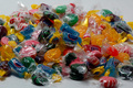
| 07/30/2008 07:04:07 PM | Sweet Revengeby desertsnailComment: Critique Club Review:
Color Saturation and Hue: All are done extremely well. Candy should have bright, jewel like colors, and that is what you have done here. Skin tones still look natural, so the hues are accurate.
Brightness and Contrast: Brightness is excellent. Contrast may be just a tiny bit high. The brown M&Ms are heading towards black.
Focus and depth of field: Perfect!
I love this photo! Personally I like the gummies the size they are. Any larger and they would not be able to stand on the skittles, and would have sunk into the candy.
About the only criticism I have is it appears noise is creeping into the image. A lower ISO and brighter lighting could help here. At 1/10 sec, the shutter speed is pretty slow already. A larger apreature would have killed your depth of field. On a small picky side note, the border appears a tiny bit heavy. Borders are always a risk in the voting, and about half what is here might have helped in the voting.
All in all a very strong photo, and a well deserved top 20 finish. Nice work! |  Photographer found comment helpful. Photographer found comment helpful. |
| 07/30/2008 06:53:52 PM | Sugar Treasureby t3nchiComment: Critique Club Review:
Color Saturation and Hue: Colors are good, nothing is over or under saturated, and hues are realistic.
Brightness and contrast: Brightness levels are a little low, making the picture look a little cool. Contrast is good.
Focus and depth of field: Focus is good, depth of field could be a little deeper in the front.
I think what hurts your picture here is that there is no central point of focus for the eye. There is a lot of candy, which does speak to the idea of a treasure horde. However, it is just a jumble that goes across the image, top to bottom and side to side. Perhaps confining it to a treasure chest, or some sort of box would help. The opposite thing you could have done was to photograph from the top down and filled the frame with brightly colored candy. Here, the foreground and backround are the same color, and with the under exposure, it tends to feel a bit cold and flat. If you look through the challenges and look at the winning photos, rich vibrant colors do well here. Head that direction with this image and you will score better. Just never lose sight of your own goals and ideas. In the end good scores are nice, but producing work you yourself like is the most important.
You have the start of a good idea. Do not be afraid to take it farther and run with it. | | Photographer found comment helpful. |
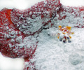
| 07/30/2008 06:43:09 PM | Who Killed Colonel Mustard?by ally153Comment: Critique Club Review:
Color Saturation and Hue: Colors are good, though I think a little more saturation could help sell the candy/sugar idea. Hues are realistic.
Brightness and contrast: Brightness is good, contrast could be a little higher.
Focus and depth of field: Focus is good, but depth of field is quite shallow. At the very minimum I would liked to have seen the entire victim and the weapon in good focus.
Cute photo... I would have liked to see the lighting from a different angle. None of the "characters" cast any shadow. Shadows help give the picture texture and depth. The white "floor" and background run together kind of giving a gummies in space effect. The blood on the floor is a nice touch and helps correct this a bit. A more realistic floor and background could help sell the murder scene idea.
Cool idea, I'd like to see it done again in richer colors and better focus. |
| 07/30/2008 06:33:29 PM | Confectioner's Flowerby 777STANComment: Critique Club Review:
Color Saturation and Hue: Colors are OK, saturation is good, and hues are realistic.
Brightness and contrast: Brightness and contrast are done well. The sugar holds detail, and contrast does not appear too high or too low.
Focus and depth of field: Focus is nice and sharp. Depth of field feels a bit shallow, as the larger clump of sugar goes soft in the foreground.
With the white sugar on the red flower, the flower petals tend to blend into the featurless background. A different color background would have helped here.
I'm not quite sure what this is. The moisture on the flower makes the sugar turn into globs, which in turn makes the petals look thick, heavy, and somewhat distorted. Brown areas on the upper left of the flower also distract a bit. Perhaps a lighter dusting of sugar on the flower flower, and the photo taken from a little greater distance, would have helped. Or perhaps a fine crystal sugar to give it more of a jewel effect.
The idea is a good one, I'd really like to see it done again. | | Photographer found comment helpful. |
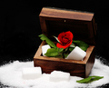
| 07/30/2008 06:20:53 PM | Lo scrigno delle dolcezzeby Rino63Comment: Critique Club Review:
Color Saturation and Hue: Colors are vivid, the red is on the edge of over saturation. Hues are natural.
Brightness and Contrast: Contrast may be a little high. The some of the whites in the sugar area have lost detail and are featureless.
Focus and depth of field: Focus is nice and sharp, but maybe a little shallow. Things start to soften by the time you get to the back of the box, and the sugar at the left of the box is very soft.
The compostion here is interesting. I would have liked it a bit better with less saturation, and not so much contrast. A little different lighting angle, not so much top down, may have helped give the sugar some definition also.
| | Photographer found comment helpful. |
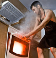
| 07/29/2008 06:10:04 PM | The Naked Chef and his hot & spicy beef recipe!!!by skariComment: Critique Club Review:
Color Saturation and Hue: Skin tones are accurate, colors are well done.
Brightness and contrast: With the exception of the light in the oven, nothing is blown out, shadows hold detail well.
Focus and depth of field: Focus is nice and sharp. Depth of field is appropriate for this image.
I think that a neutral density filter over the strobe, as well as the red, may have helped not blow out the light coming through the door.
I like the angle for this image. Nice take, too many people shoot only at eye level.
I think what hurt you most in this round, was the purists probably did not see this as "food" which required a recipe. Though it certainly is a recipe for disaster. I like this photo, as it has plenty of imagination, and nice departure from usual cliches.
|
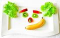
| 07/29/2008 06:00:07 PM | Smileby prinsComment: Critique Club Review:
Color, Saturation and Hue: Colors are bright, and possibly a little over saturated. Hue is realistic.
Brightness and contrast: Image appears to be a little too bright with too much contrast. Some areas of the plate are blown out and featureless, and there are areas on the banana headed that way. Particularly near the bottom of the banana, and the lettuce on the right. The lettuce appears to blend into the plate at bottom center of the leaf. The top of the plate has completely disappeared and cannot be distinguished from the background.
Focus and depth of field: Image feels a bit out of focus. Some of the lettuce may be sharp, if so then it the depth of field is too shallow.
Very imaginative, and made me smile. Try a different backround behind the plate, work on some of the technical details, and I think you have something here that will score a lot higher.
|
| 07/29/2008 05:44:50 PM | Fruit Punchby battymaddieComment: Critique Club Review:
Color Saturation and Hue: Colors appear a little washed out, and could use a little more saturation. Hues appear realistic.
Brightness and contrast: A little less bright, and a little more contrast here would help this image pop.
Focus and depth of field: Focus is OK. Depth of field comes across as a bit shallow, at the top of the head where the details go soft.
Pointandshoot has done most of my work for me already. Your re-edited image pops a lot better. I think you could still take if further though. The drink just begs to be a nice ruby red. With the white background, the rest of the image needs to be sharp and saturated. A different background with some soft detail like a blue sky with some soft clouds could have worked well also.
I'm a little surprised that this image did not score better. Even at thumbnail size it is an attention getter, and has nice bones to build upon. | | Photographer found comment helpful. |
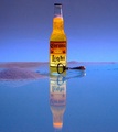
| 07/29/2008 05:22:06 PM | Recipe for relaxationby pdalzellComment: Critique Club Review:
Color, Saturation, and Hue: Colors are good, nothing is over saturated, hues appear realistic.
Brightness and contrast: I'm not sure exactly what you were going for here. The sand appears to be a little under lit, for a daytime shot. If you were going for a evening sundown tropical shot, then it could work.
Focus and depth of field: Both are done very well. Nice sharp focus, and the sand in the background goes soft, as it should if it is representing a beach.
I'm taking this as a representation of a giant bottle of beer near a sandy beach and small island. I like the lighting, and the underlight to light the beer is a neat idea. Kind of a beer lighthouse... The grain in the picture does distract a bit. Perhaps a longer exposure at ISO 100 would cure this. The light under the beer gives itself away at the front of the bottle. Perhaps a smaller hole, or putting the beer "ashore" with some beach in front of it, would hide the bright area in the bottom of the glass. I would also like to see the bottle not cut off in the reflection. Now if you would have had access to some tiny palm trees, and a sky with clouds....
All in all a very entertaining shot and a nice play on Corona Light, with the light. | | Photographer found comment helpful. |
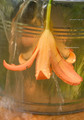
| 07/28/2008 11:13:40 PM | Elixer of Lifeby royalwhiteComment: Critique Club Review:
Color Saturation and Hue: Colors are OK, hues are realistic, but I would have liked more saturation in this image.
Brightness and contrast: There is not a lot of contrast in this image. I think you could bump the contrast up a bit to gain a little pop. Brightness is OK.
Focus and depth of field: Focus is sharp, and depth of field is good for this image.
Your take on the challenge is interesting, and having the benefit of your notes helps me understand where you are trying to go. The biggest problem I see here, is that it doesn't look like you are giving the flower a drink. Usually when flowers are pointed downwards, they are drooping or dieing. With the cascade of water, at first glance the flower looks like it is being drowned.
I would love to see this imaged done again, with the flower pointed up, shot from a low camera angle, with little streams of water cascading off the flower's petals.
You have some interesting insights, hope to see you in a challenge again soon.
|
|
Showing 911 - 920 of ~1613 |
Home -
Challenges -
Community -
League -
Photos -
Cameras -
Lenses -
Learn -
Help -
Terms of Use -
Privacy -
Top ^
DPChallenge, and website content and design, Copyright © 2001-2026 Challenging Technologies, LLC.
All digital photo copyrights belong to the photographers and may not be used without permission.
Current Server Time: 07/18/2026 07:38:34 PM EDT.
|