|
|
|
Showing 891 - 900 of ~1613 |
| Image |
Comment |
| 08/30/2008 07:03:42 PM | "...und dat is how much vood ve can chuck!"by heavyjComment: Critique Club Review
Color Saturation and Hue: Hues are realistic, skin tones are natural.
Brightness and contrast: Brightness is good, contrast comes across as a little low, as the blacks look more like charocal grey. Most likely because of the processing.
Focus and depth of field: Focus and depth of field are good, post processing has introduced softness to the image.
I get a kick of of this image. I probably sat here for 10 minutes trying to think of something to say. It just leaves me almost speechless. In the end, I'd say that I think this one is a bit overprocessed. Even the cord holding up the sign is bleeding into the surrounding area. And, while you were going for, it seems, the wild look... The processing around the eyes makes you look angry or downright mad. (Either definition of mad would fit.) The disembodied hand also puts me off a bit.
Other than that, congratulations on a quite humerous take on the challenge. Very creative and original. |  Photographer found comment helpful. Photographer found comment helpful. |
| 08/30/2008 06:33:08 PM | Study of the curvesby Rino63Comment: Critique Club Review:
Color Saturation and Hue: Colors are done well. Colors are nice and rich, but not over saturated. Hues are realistic.
Brightness and contrast: Both are done well. Shadows hold detail, and highlights are not blown out and hold the detail well also.
Focus and depth of field: Focus is very crisp, and depth of field is excellent.
As noted by others, this is a very busy picture. The eye cannot seem to find a place to rest, except in the empty sky above the subject. I like the motion blur of the coaster. The rock at the bottom (start of the coaster ride perhaps) and the pink object (a persons head?) are distracting. There is so much detail in the photo, and while I really like detail, here it all competes with each other.
I think, had you cropped the photo above the rock, and at the top of the track, you could have better emphasized the single curve and the speed of the coaster. The coaster would have been larger and more commanding of attention in such an image.
This image has a lot of potential. I would suggest playing with different croppings to see what all you can make out of it. | | Photographer found comment helpful. |
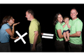
| 08/30/2008 05:43:18 PM | Generation Calculationby levyj413Comment: Critique Club Review:
Color Saturation and Hue: Color choices are excellent, especially the play on blue and yellow making green. Saturation is good, could even go a bit more on the shirts. Hues are accurate as evidenced in the skin tones.
Brightness and contrast: Nothing is overly bright, highlights are not blown out. (the math signs are very bright though, more on that later) I like the dark black of the background. As you have already noted,the lighting is a little bit harsh. But you can work with what you have at hand. Reading your comments, it appears you were quite creative with the limited resources.
Focus and depth of field: Focus is good, but seems like it could be a tiny bit sharper. Depth of field is very good.
I would have liked this a little better with a wider crop on the left, as she is cut off by the edge of the image. The girls blue shirt seems to have some sort of processing effect along the lower edge. (Doesn't look like shadow.) I think also choosing a different color for the math symbols might have worked a bit better. The biggest issue for me, is that the equals sign is so bright and so strong that it keeps drawing the eye to the dark area in the middle of the photo.
I like that their son is covering his face. It adds a touch of humor to the image, and fits in well with the broad smiles of his parents.
All in all a cute, humerous photo.
| | Photographer found comment helpful. |
| 08/30/2008 12:00:41 PM | Viola Ragazzaby Purple_GirlComment: I think your image scored a lot lower than it should have. At first glance the skin tones are washed out. However post challenge I have the advantage of seeing your intent.
Focus and depth if field are both very good.
I think that the crop may be a tiny bit tight. I'd like to see a little more hair on top of the head.
I really like the intent stare directly into the camera, and the expression of the model is fantastic. That tiny half smile, that sort of says I know something you don't, is great.
Although everything is very centered, I'm not sure there was a better way to do it. But you probably lost a few votes with the people who had the rule of thirds checklist in their hands.
Nice work... | | Photographer found comment helpful. |
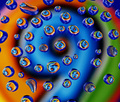
| 08/28/2008 03:55:16 PM | 9 + 6 + 6 + 6...by PatsfanComment: Critique Club Review:
Color Saturation and Hue: All are well done, colors are vibrant without being over saturated. Hues are pleasing to the eye.
Brightness and contrast: Brightness is at the right level for this type of image. Contrast is well done, nothing is overly bright or too dark.
Focus and depth of field: Focus is nice and sharp. Depth of field kept deep enough to keep the background soft and prevent overpowering the foreground, and sharp enough to be recognizeable.
This image reminds me of an old John Setzler photo. As already noted, the drops could have been done better. The misshapen and small drops distract from the well formed drops that form the sixes. Use of an eye dropper or pipette could help get you uniform drop sizes. A pattern, whether it be a sprial, or other shape might work well as opposed to the randomness here. A spiral in the same direction as the number 9 might look really good.
As is, a creative image, with some great colors and visual interest. I could see this hanging in a gallery or an office some place.
Nice work. Congratulations on your top 20 finish.
| | Photographer found comment helpful. |
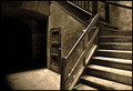
| 08/28/2008 10:31:21 AM | Under the Stairs by artvetComment: Wow! What a great image... This one is one of the best in the last several challenges put together. The top photos are always very good. But the difference to me is, how long can I just sit and look at the one image? Could I see it hanging on my wall for a week? A month? A year? Longer?
This is one of those that I do not tire. I love the texture, the way the light sets the scene, the tones, the play of the shadows. The image draws the viewer in, and invites the watcher to invent their own story. Photos that spark not only the interest of the viewer, but also the imagination, are not an every day occurance.
Congratulations on a very well deserved first place finish. | | Photographer found comment helpful. |
| 08/27/2008 01:46:52 PM | Transitional Approximation (Minimalist Photographic Art)by lpatrickComment: This photo came up in one of the forums, so I thought I'd stop by. (I don't vote anymore, I spend my time in the Critique Club. There are so few of us left.)
I really like this image. Minimalist images are easy to do, but the devil to do well. I like the purple, I like the shading. What I really like is that the shading seems to move, or shimmer. If you look closely an slowly follow the light down the image, you can see further and further as your eyes a adjust. But then the brighter area at the top will pull your eye back, and then you can't see as far down the image until you work at it again. What a cool visual effect!
It's the way the whole minimalist thing works. At first it appears there is not much there. But the more you explore, the more you find. But at the same time, sometimes you lose a little ground.
Excellent work! |
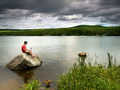
| 08/24/2008 07:37:22 PM | Environmental Web Managerby levyj413Comment: Critique Club Review:
Color Saturation and Hue: Colors are good, saturation could be a little higher, but is very good at this level. Hues are natural, skin tones are accurate.
Brightness and contrast: Brightness and contrast are both very well done. However the bright area on the lake distracts the eye a bit.
Focus and depth of field: Focus is sharp, depth of field is nice and deep, which is important in this image.
This is a very good image, but at the same time that bright area on the lake and other elements keep the eye in motion and distract from the subject. Since this is an advanced editing challenge, had you darkened the lake a bit, it would have really helped focus attention on the subject. Given the dark clouds, the darker lake surface would have also fit in well in this regard.
As is, it is a very interesting and enjoyable photo. Congratulations on a well earned top 25 finish. | | Photographer found comment helpful. |
| 08/24/2008 07:25:31 PM | Mellowbrook Farm, Elmwood, WIby alexjackComment: Critique Club Review:
Color Saturation and Hue: Colors are nice and vibrant. Saturation is nice and deep, but not overdone. Hues are realistic, especially the skin tones.
Brightness and Contrast: Brightness is good, as is contrast. Though if the hat was truely black, it may be a tiny bit too bright.
Focus and depth of field: Focus is excellent. Depth of field is deep enough to keep all of the subject in focus.
A circular polarizing filter would have eliminate the reflections from the lenses of his glasses. The pose, while natural to describe his profession, does as noted by others below, leave the impression of a very strange right arm. Cropping the arm, and the distracting yellow cords, would have helped the technical merit of the image, but at the same time removed any trace of his occupation. (Except for his hat.) The large bright (white) disk behind him as well as the white cord or streamer, also distract somewhat.
I really like the lighting of this image. I would loved to have seen this, with him posed up near the front of the cow, so that it too could be included in the picture. | | Photographer found comment helpful. |
| 08/24/2008 07:12:57 PM | Dressmakerby Rino63Comment: Critique Club Review:
Color, Saturation and Hue: Colors are good, saturation is accurate, and skin tones are realistic.
Brightness and contrast: The image is not overly bright. But at the same time, the white material behind the hands is blown out and featureless for the most part.
Focus and depth of field: Focus is very good. I really like the detail found in the hands. Depth of field is a bit shallow, as it is soft near the front of the image. I would have liked the pins sharp, rather than soft.
The scissors are distracting and lead the eye out of the image.
I think you really tried to do too much here. The center piece of this image are the hands. Those are terrific hands, and nothing else should be in the way.
I would love to see this done again, with some cloth that has a little color, and just a needle and thread, and those great hands. You have the bones of a very powerful picture here. Keep at it.
| | Photographer found comment helpful. |
|
Showing 891 - 900 of ~1613 |
Home -
Challenges -
Community -
League -
Photos -
Cameras -
Lenses -
Learn -
Help -
Terms of Use -
Privacy -
Top ^
DPChallenge, and website content and design, Copyright © 2001-2026 Challenging Technologies, LLC.
All digital photo copyrights belong to the photographers and may not be used without permission.
Current Server Time: 07/19/2026 06:46:23 AM EDT.
|