|
|
|
Showing 761 - 770 of ~1613 |
| Image |
Comment |
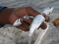
| 09/16/2008 04:28:18 PM | Death Gripby GraciousComment: Interesting photo, but I don't see what is supposed to be immovable. Everything here looks like it can be moved pretty easily. |
| 09/15/2008 10:47:50 PM | Overby BrinComment: Critique Club Review:
Brightness and Contrast: Image is mildly over exposed, which is part of the challenge. I think perhaps it could be taken up a bit more with an increase in the contrast. I'd like to see the rocks a little lighter, a little brighter, but would still want the figure dark the way it is now.
Focus and depth of field: Focus is nice and sharp. Depth of field is great.
There is really not much more you can do with this image. What makes the image is all the detail in the rocks, and the sky. If you brightened all that much more, the detail would be lost, and the final result would be less than you have now.
I see what looks like a small island beyond the subject. Perhaps that against a bright sea and bright sky, would have worked better for an overexposed challenge.
This is an excellent image, just one that has a harder time carrying the theme of the challenge. |  Photographer found comment helpful. Photographer found comment helpful. |
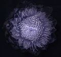
| 09/15/2008 06:20:36 PM | Just for funby waveComment: Critique Club Review
I can't quite decide if this is nice and sharp, or a bit soft. Perhaps depth of field is just a little shallow. The center of the flower is sharp, but the edges of the petals are a little soft.
Lighting is flat, and the subject is centered, which also probably cost you a few votes. Some angle to the flower, as opposed to head on, would be beneficial also.
I do like the colors, and the way it fades to white at the edges on the left of the flower. This to me, is the strongest part of the image. If you could carry that through the image, it should do better in the voting.
| | Photographer found comment helpful. |
| 09/15/2008 06:14:20 PM | 1cm Cleaner on a bottleby nicoengelbrechtComment: Critique Club Review
Color Saturation and Hue: Colors are vivid, saturation is appropriate for the subject, hues are natural.
Brightness and contrast: Image could be a little brighter, contrast is good as the blacks are nice and dark. Lighting is flat though.
Focus and depth of field: Depth of field is too shallow. The washer or seal under the stopper is nice and sharp. The figure appears soft at the head, and the rest of the image is soft. A smaller aperature would make the depth of field deeper.
The wire assembly for opening and closing the bottle really compete with the subject. For this view, the doll really has to be lazer sharp. Lighting from the side could help add relief and apparent sharpness to the doll. Although the area is small, perhaps a small flashlight, torch, or whatever they call them where you live, could be used to form a small spotlight to draw attention to the doll.
Another approach might be to pull back further yet, and sort of do a play on the whole angels dancing on the head of a pin thing.
Interesting picture, I've never seen a doll this small. | | Photographer found comment helpful. |
| 09/15/2008 06:00:37 PM | The Dark Knightby SoulComment: Critique Club Review
This image meets the challenge, as it is defiently over exposed. However, the large bright area on the right side of the image is very distracting, and seems not to serve a purpose. I see you raised the ISO, and used a longer shutter opening to get the over exposure. I think the higher ISO gave you the noise and grain that appear here. More light, with a lower ISO and shorter exposure could help here.
Had the mask been a little darker, it would have stood out more. If you look at some of the higly ranked entries you can see what I mean.
I do like the mask, and the expression on the mask. I think you have something to work with here. |
| 09/14/2008 02:08:58 PM | |
| 09/13/2008 11:30:11 PM | Hopefulby RetroesqueComment: I like the picture. The butterfly is nice and sharp, with excellent colors. The soft focus on the boy, helps the butterfly pop. | | Photographer found comment helpful. |
| 09/13/2008 11:23:47 PM | l_2f25e875f42889a70f4ea3647469069c.jpgby rocklova72Comment: I'd like to see this one done again around sunset. This looks like almost high noon, where the light is almost directly overhead, and things tend to look flat.
Around sunset, with that warm golden light, there should be some great shadows to give this a lot of texture. The light then would compliment the rust on the rails. And as Judi says, crop out the bridge support. Or take a bit different angle if you re-shoot. |
| 09/13/2008 11:18:35 PM | A New Beginningby Shutter-For-HireComment: Critique Club Review:
Color Saturation and Hue: Colors are vivid, saturation is appropriate for this image, and hues are natural.
Brightness and Contrast: Either you like this style or you don't. The lighting is angular and there is plenty of contrast. Personally I like the lighting and the contrast. However, I think people are used to seeing babies rendered brightly and softly. This style of lighting is harder and harsher. It would work better with adults or teens. The angle of the light emphasizes texture, and in this case makes the baby's hands look wrinkled. I believe that what the voters might have liked a little better is to be able to see more of the baby's face. Faceless things are usually scary. A very light fill, so that more detail could be seen, might have gotten you more votes.
Focus and depth of field. Both are excellent. The focus is sharp all the way to the back of the subject, but the background is softened so as not to distract. Nice work.
As I sit with the image a bit. I think that if the light had been softer and warmer, this would have improved your score. A soft box, and a gold tint to the light would really warm this image up. | | Photographer found comment helpful. |
| 09/13/2008 08:59:49 PM | InfraChokeby KaliComment: Wow! What a beautiful image. It looks like a living deep sea creature almost. I love the way it softly glows in the center. I could see this on my wall, and not tire of it for a very long time. | | Photographer found comment helpful. |
|
Showing 761 - 770 of ~1613 |
Home -
Challenges -
Community -
League -
Photos -
Cameras -
Lenses -
Learn -
Help -
Terms of Use -
Privacy -
Top ^
DPChallenge, and website content and design, Copyright © 2001-2026 Challenging Technologies, LLC.
All digital photo copyrights belong to the photographers and may not be used without permission.
Current Server Time: 07/19/2026 02:26:17 AM EDT.
|