| Image |
Comment |
| 03/15/2009 02:42:35 PM |
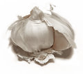
take off your clovesby posthumousComment: Critique Club Review:
Color Saturation and Hue: Very well done. Nothing is over saturated, and hues are appropriate for the subject, and in this case the challenge.
Brightness and contrast: Nice clean white background. The details hold well throughout, with just a hint of burnout at the highlight at the upper middle of the head of garlic.
Focus and depth of field: Focus is razor sharp, and depth of field is excellent.
Composition: The centered composition works well here. To do a rule of thirds, would have resulted in an image that was done that way than for no other reason than the rule of thirds is one of the first things taught. The almost square format, works well here also.
Subjective: The (mildew?) stains on the garlic distract a bit. I like all the detail, yet at the same time the eye has a hard time figuring out a place in which to rest. I'm wondering how a little softer focus, or perhaps a bit of glow would have worked. Maybe even a little bit of revealed garlic clove down in the right side...
Overall a very well done image, that well deserves its place in the top 40. |
 Photographer found comment helpful. Photographer found comment helpful. |
| 03/11/2009 04:32:09 PM |
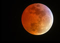
Total Lunar Eclipseby marboComment: I really like your image. Full moons are usually so flat looking. I love the red from the earth's shadow, and the softer light really makes it leap from the page. I would love to see the details of the equipment used for this image. Very nice work. |
| Photographer found comment helpful. |
| 02/19/2009 11:03:37 PM |
|
| Photographer found comment helpful. |
| 02/19/2009 11:03:33 PM |
Erasedby GreatJobBobComment: It took a second to see that every thing but the computer screen was blank. Nicely done. |
| Photographer found comment helpful. |
| 02/19/2009 11:03:24 PM |
|
| Photographer found comment helpful. |
| 02/17/2009 10:42:06 PM |
|
| Photographer found comment helpful. |
| 02/17/2009 10:40:44 PM |
|
| Photographer found comment helpful. |
| 12/26/2008 11:25:59 PM |
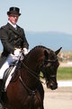
Nick Qwick Says Hiby LadyKComment: I like the space above the rider, but I would like just a little more on the left of the frame. Part of his leg and arm are missing.
If you aren't going to show the full height of the horse, I'd recommend a higher crop on the bottom of the picture. |
| Photographer found comment helpful. |
| 12/26/2008 11:21:37 PM |
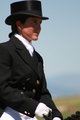
Barbara Craboby LadyKComment: All around nice image. Depth of field is very good. Everything that needs to be sharp, is. Background is nice and soft, so as not to distract, but still enough is there to understand what it is. I like the crop you've chosen. The little bit of the horse is enough to give us the info we need to figure out what she is doing. A little bit more space above the hat, and perhaps low enough to see the other hand, might be good. Otherwise, a really good photo. Nice work. |
| Photographer found comment helpful. |
| 12/26/2008 07:03:08 PM |
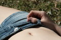
Tummy Shotby LadyKComment: Nice sharp focus, with good depth of field. Looks like a little dirt and dryness in the knuckle area too. The background could be a little softer, but is not really distracting as is. |
| Photographer found comment helpful. |
Home -
Challenges -
Community -
League -
Photos -
Cameras -
Lenses -
Learn -
Help -
Terms of Use -
Privacy -
Top ^
DPChallenge, and website content and design, Copyright © 2001-2026 Challenging Technologies, LLC.
All digital photo copyrights belong to the photographers and may not be used without permission.
Current Server Time: 07/18/2026 02:42:08 AM EDT.