| Image |
Comment |
| 07/14/2013 11:04:04 PM |
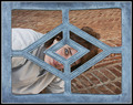
Coca-Cola Classicby LydiaComment: Too early for frogs? Or was this during your pre-frog, formative years?
I like that you resisted the temptation to over process. |
 Photographer found comment helpful. Photographer found comment helpful. |
| 07/13/2013 08:31:54 AM |
|
| Photographer found comment helpful. |
| 07/13/2013 08:28:50 AM |
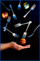
Nine Forksby LydiaComment: So... Did you actually capture them in the air? Or, are they lying on a dark surface, and the shot taken from above? |
| Photographer found comment helpful. |
| 07/13/2013 08:26:40 AM |
|
| Photographer found comment helpful. |
| 07/13/2013 08:22:14 AM |
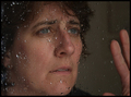
Needing Annby LydiaComment: A little too high of an angle for me. I would also like to see a lower camera angle. |
| Photographer found comment helpful. |
| 07/13/2013 08:18:49 AM |
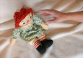
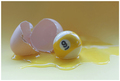
- 9 Egg -by LydiaComment: Ha! Now I know where our cat came from.... It's your fault! I won't tell Sharon... |
| Photographer found comment helpful. |
| 07/12/2013 06:20:45 PM |
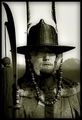
Dead Eyed Palace Guardby docpjvComment: This I would proudly hang in my home, and never tire...
It is images like this that makes me want to make images. Beautiful! |
| 07/05/2013 04:08:28 PM |
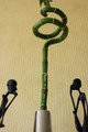
RST - Resting, Standing, Thinkingby KiritoComment: Critique Club Review:
Color Saturation and Hue: Colors and hues are realistic and seem accurate for the subject displayed.
Brightness and Contrast: The image could benefit from more light, and better lighting. The figures do have detail, and they do appear to be thinking. But the brightness of the background, and the busy stripes, distract the viewer.
Focus and depth of field: There is a sharp area in the image, but the relatively shallow depth of field hurts the image. The image is soft in more areas than it is sharp.
Personal observations. I find myself wanting to see more of the two figures. They seem unnaturally cut off by the edge of the frame. Lowering the plant in the center could help as well. The chrome object is a little distracting for me. As already suggested, a different crop is an idea to try. More of the two figures, and then crop right at the top of the upper spiral. The bud and leaves above the top of the spirals distract a little as well.
All in all good bones in this picture. I would like to see it done again, with some changes incorporated. It could make quite an entertaining poster. |
| 07/05/2013 03:56:50 PM |
All 'Bout Cloudsby Dr.ConfuserComment: Critique Club Review:
Color Saturation and Hue: Seems a little de-saturated to be realistic. However, your comments do not say what effect you were going for. Based on the title, the de-saturation works well, as a more colorful sunset would have competed more strongly with the clouds.
Brightness and Contrast: The brightness and contrast are appropriate for the subject. Though the sun is a bit bright for me. However, there is not a lot to be done about that, given the sun's position in the sky.
Focus and depth of field. A nice sharp image. Depth of field does not come into play in this image.
Composition: I think the coulds are excellent. I would like to have seen this sky just a few minutes later, when the sun is even more hidden. I suspect that it (the sun) would have been less of a distraction, and made the clouds an even stronger statement in the sky. |
| Photographer found comment helpful. |
| 06/22/2013 12:14:27 PM |
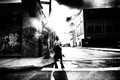
"There are no men like me. Only me."by PennyStreetComment: Excellent use of light and shadows. I like the placing do your subject as well. Not the safe side walk, not the cliche middle of the street. Just sort of venturing out there. Congrats on the Top Ten. |
| Photographer found comment helpful. |
Home -
Challenges -
Community -
League -
Photos -
Cameras -
Lenses -
Learn -
Help -
Terms of Use -
Privacy -
Top ^
DPChallenge, and website content and design, Copyright © 2001-2026 Challenging Technologies, LLC.
All digital photo copyrights belong to the photographers and may not be used without permission.
Current Server Time: 06/26/2026 12:59:10 PM EDT.