|
|
|
Showing 1371 - 1380 of ~1613 |
| Image |
Comment |
| 01/10/2003 02:26:17 PM | En El Mar La Vida Es Más Sabrosaby amonteforteComment: I really wish I could speak/read Spanish here. An english translation would have really helped. My guess, from what little (and I mean very little) Spanish I know, is that this translates roughly as.. (I hope) In the (sea?) (life?) is more (delicious? flavorful? tasty?) This picture certainly seems to communicate that. The biggest thing I see is that fill flash, or more fill flash, or reflector would have been helpful here. As it is the girls faces are in shadow and it takes a bit away from the bright surroundings. 7 |  Photographer found comment helpful. Photographer found comment helpful. |
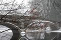
| 01/10/2003 01:56:13 PM | Bridge over Troubled Waterby svitalComment: This is a very pretty picture. There is a lot to like about it. However, the water does not look at all troubled. To me the picture just doesn't illustrate the titile. So I am going with a 7. |
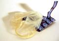
| 01/10/2003 01:50:08 PM | tired of sexby andresComment: My first response was Eeeeewww! Man I hope this isn't used. However, trying to get beyond all that and resisting the urge to vote a 1 for gross. Depth of field is good, lighting is a bit bright upper right, or the whole thing should have been handled differently to wash out the entire background. This doesn't say tired of sex to me. Says just had sex, or at best tired because I just had sex. Somebody obviously wasn't tired of sex just a few minutes ago. Thought does come to mind that if you had torn the package just a bit different, and played with the positioning a bit, the shadow would have looked like the Playboy logo. I'm handicaped by not knowing the song, but as I say the illustration does not seem to fit all that well. So I am voting a 4 here. |
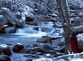
| 01/10/2003 01:35:09 PM | WINTER by Tori Amosby indigo997Comment: I'm a sucker for long exposure flowing water shots. However, this is certainly a beautiful, welll done exposure. I can feel the gentle stillness of the cold winter day in this one. 9 | | Photographer found comment helpful. |
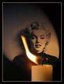
| 01/10/2003 01:29:14 PM | Candle in the Windby Harz_JoergComment: I really like this one. About the only drawback, for me, is the light line of the border. It is brighter than anything except the hottest part of the flame, and it imparts a rigid frame to a picture where everything else is soft curves fading in and out. The flame is is a bit washed out at the center, but I don't know if you could have done anything else. Over all, contrast is excellent, lighting and exposure are excellent. I like the way you handled the picture of Marilyn Monroe. The way the flame curves to reveal and frame her face is great. Even without knowing the words to the song, the picture graphically demonstrates that she is indeed the candle in the wind. While I have mentioned a few drawbacks, the rest of the photo is so powerful and well done, that I am still going to vote it a 10. | | Photographer found comment helpful. |
| 01/10/2003 01:07:03 AM | Carrieby zadoreComment: Critique Club by Request
I enjoyed this one during the challenge. I like the grain. Almost a Pointillist effect.
I think the cropping would have worked better higher from the bottom of the picture, or lower showing the mouth. The nose leads away from the eyes, which are the highlight of the picture as it is.
The left side of the frame goes a bit dark. The eye is lost in shadow at the left edge. Contrast is a smidge high, the ridge and tip of the nose are starting to burn out.
Focus is good, depth of field is good. The mode’s eyes really make this piece, which is why I would vote for a tighter crop. Lot of expression there. I like the angle to the face from the camera. I voted a 7 in the challenge, and on reflection it still holds up.
-alex | | Photographer found comment helpful. |
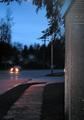
| 01/09/2003 12:17:15 PM | Stormy Weatherby shohnComment: I see where you were going here, but the sky came out blue. So it looks more like just a wet street. (More like After the Rain Has Gone.) Focus is a bit soft for the majority of the frame. The trees look very soft. The structure to the right of the picture I would like to see more of, or less of. I like the reflection of the the cars lights and other lighting in the water on the street. 5 | | Photographer found comment helpful. |
| 01/09/2003 12:12:23 PM | "Needles and Pins"by JMSComment: Very good illustration of a song title. Your manipulation of color, saturation, and contrast really make this picture pop. The border is an excellent choice and adds, rather than competes/distracts/or merely decorates the picture.
If this one doesn't win a ribbon, it darn well should. 10! | | Photographer found comment helpful. |
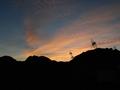
| 01/09/2003 01:55:58 AM | Sky Over Hooverby shantanuchandraComment: Critique Club
By levelling out the horizion, you created diagonal lines all across the picture, with the power line towers leaning over at a threatening angle. The eye keeps getting drawn to the towers, expecting them to fall.
The strength here is the colors of the sunset and the mountains etching the sky. I don't know if it would have been possible to escape the power lines for a clearer picture, but that would be one idea. If the power lines were intended to be the subject, I think it would really have worked better with vertical towers and less sharpening.
The sky colors are great, the silhouette of the mountains makes a nice dark frame and sharp cut across the sky.
Focus is good, contrast is good. Your exposure is right on the mark. Any darker and the sky would be too dark. Any brighter and you would lose detail in the clouds as well as making the mountains a muddy brown instead of a nice sharp black. There is a lot of potential here.
-alex |
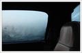
| 01/09/2003 01:40:47 AM | Aloneby jimmythefishComment: Critique Club
This a very interesting photo. I'm not sure that it exactly says travel to me. It strikes me more as "stuck in the middle of God knows where". The fogged windows make for a very erie feel. What's out there, is it safe? Are those marks on the window somebody/something trying to get in?
The back window competes with the side window for attention. It does compliment the side window effect, but once the eye goes there then where? You can't crop it, because you would loose too much of the seat. Perhaps a different angle.
Excellent depth of field. Nice sharp focus. Lighting is great. Makes a it a real mood piece. The seat and window work well together. The seat says expectation, waiting for a passenger. The window says you might get something you didn't expect. You've got a good eye for pictures.
-alex | | Photographer found comment helpful. |
|
Showing 1371 - 1380 of ~1613 |
Home -
Challenges -
Community -
League -
Photos -
Cameras -
Lenses -
Learn -
Help -
Terms of Use -
Privacy -
Top ^
DPChallenge, and website content and design, Copyright © 2001-2026 Challenging Technologies, LLC.
All digital photo copyrights belong to the photographers and may not be used without permission.
Current Server Time: 07/17/2026 07:31:14 AM EDT.
|