|
|
|
Showing 1351 - 1360 of ~1613 |
| Image |
Comment |
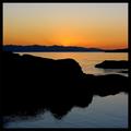
| 01/26/2003 11:37:56 PM | Olympic Peninsulaby jimmythefishComment: Critique Club Review
It's hard to find anything here to recommend to improve. This is just a really outstanding photo. Any less sky, and you would lose part of the sunset. Perhaps the only possible improvement I would suggest here, is that if the photographer had waited another minute or two to take the picture, the rays of the sun coming over the tops of the hills in the distance might have been even a bit more pronounced. Then again the whole effect could have dissapeared, I wasn't there.
For a cloudless sky, this is just a terrific job on all accounts. Composition, exposure, contrast, color rendition, focus, all are excellent.
Well done!
|  Photographer found comment helpful. Photographer found comment helpful. |
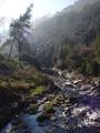
| 01/26/2003 08:15:33 PM | Riu Ripollby bcncrazyComment: Critique Club Review
I like this photo a lot. The haze makes for a dreamy quality as the light filters past the tree. The stream does a good job of leading the eye to the top of the picture, it is a shame there isn't a bit more there. With the haze and the washed out sky, more trees to filter the light and create streamers would have worked quite well.
The lens flare is the only real distracting element. A lens hood or a helpfull hand shading the lens would have been very beneficial here.
The exposure was about as good as you could get under these conditions. Had you gone much darker and you would have lost the detail in the shadows at the lower left of the frame. Any brighter and the sky have overwhelmed the picture. Contrast is excellent, focus is good, possibly could have been a tiny bit sharper. |
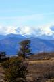
| 01/26/2003 07:57:21 PM | Hop, Skip and a Jumpby rll07Comment: Critique Club Review
By using a portrait orientation, as opposed to the more traditional "landscape" orientation, the tree in the foreground has become the center of attention. In this case, litterally. I'm not sure what the silver line is that runs across the picture. A road, a power line? It does distract a small bit, but then unless there was a way to hide it by camera angle you are stuck with it for challenge use. Focus seems a bit soft, at 1/45 second if you were at maximum zoom it could be camera shake.
The overall contrast and color rendition are very good. I really like the mountains in the distance, and the interplay of the clouds and snow. You caught the transition quite well, and the lighting is great for this type of shot. The shadows defining the mountains in the distance, show that this is not one of those high noon shots where everything goes flat. There are some very good elements here. I'd like to see one in landscape orientation from either beyond that tree, or to the right of it. |
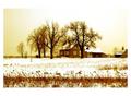
| 01/25/2003 06:14:20 PM | House in the Snowby nathaliedooComment: Critique Club Review
I think that one of the things that might have hurt your score is the picture's size. Smaller pictures tend not to do as well because the details are harder to see. While I am not a rule of thirds purist, the centering of the main focus of this picture results in the building on the right being cut off. It tends to be a small but jarring end to the direction the eye wants to move. The darker patch at the bottom of the screen tends to act as a barrier to the eye. I don't know that cropping it out would have worked better, but it might be something to try, or to have approached the scene at a bit of a different angle to use it to lead the eye into the scene.
Overall this is a very good picture. I believe that your score should have been higher, and as I mentioned before I suspect the size to be part of the cause. I really like the overall exposure. Even though it tends to wash out in places, like the sky above and to the right of the trees, I think with this scene it works quite well. I especially applaud your manipulation of the colors. Had this been straight color, or black and white, this picture would not nearly have been as strong. I really like the mood the coloring sets in this piece. Focus, contrast, and exposure are all very, very, good. | | Photographer found comment helpful. |
| 01/25/2003 06:03:37 PM | Morning Dipby jitamsComment: Critique Club Review
Overall a bit darker than I would like, but it is still within reasonable limits. Given that the title is "Morning Dip", I take it that the focus is the ducks and their "pool party". As is, there are several things competing in this photo. The power lines are a minor distraction, but the trees and the format are trying to steal the show from the ducks. Perhaps a landscape format shot would have worked better. Also if you had captured more of the reflections of the ducks, that would have helped focus attention on the ducks. Focus seems a little bit soft. That could be from the camera trying to focus on the center of the picture, which is an area quite distant from the center of attention. I keep thinking that you were swayed trying to serve to purposes here. I see you as interested in the ducks, but at the same time trying to show as much landscape as possible to fit the theme. Since the background is essentially flat, I would recommend going for the ducks and the slight berm right behind them. Overall contrast is very good, and color rendition is excellent. |
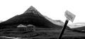
| 01/21/2003 09:39:10 PM | Place of stillnessby vjozComment: Critique Club Review
It would appear that the foreground is in the shadow of a cloud or possibly another mountain. I see that the background of the picture is brighter. I see three things fighting for attention here. The sign, the buildings and the mountain. The eye wants to go to the brighter area in the background, but the sign is in the way. I would have recommended that the photographer waited until either all the area was in sunlight, or all in shadow, for a more even photo. The sky has essentially become negative space. If you take the sign out of the photo, it loses something, but the sign is a bit distracting the way it just pops up in the picture. Perhaps standing further back, so that you can see the base of the sign would help. I would also recommend having waited for better or different lighting if possible.
As it is, your exposure control was very good for the wide range of light you were trying to capture. Focus is very good as well. I believe you were right in choosing not to do color. | | Photographer found comment helpful. |
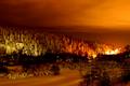
| 01/20/2003 08:42:53 PM | Winter Landscape at Nightby SharQComment: Review Club Critique
Very interesting photo, to say the least.
I think the coloring really makes this image.
The focus does seem a bit soft, but not fatal. The trees are not as well defined as they could be. The lights in the hot spot to the right center of the image are blown out, and are the only real downside to anotherwise excellent image. Had you been able to move your location such that the hotspot was shielded from view, this could really help. I think that simple cropping alone wouldn't do it as you would lose a lot of the bright sky above those lights. Perhaps if you could have chosen an angle where they were hidden by trees/bushes/rocks etc.
The hillside to the left is brighter than the surrounding area, though there is not much to be done about that. Were it more orange like the rest of the picture, it would be better. But that would require editing that is illegal for the challenge. About the only other thing you could do is to play around with the overall exposure to see if that could help. However, when it is that cold you only want to spend so long taking pictures.
-alex | | Photographer found comment helpful. |
| 01/20/2003 08:27:48 PM | "Squash The Troll"by teachme53Comment: Critique Club Review
I don't think there is really a lack of lighting here, I believe the chosen background makes the scene seem a bit darker than it really is. Also the shadows from the position of the lighting feed the sensation. However were the scene any more brightly lit, the hair and the yellow in the chest would start to lose detail. Perhaps a lighter background and a lighting direction that casts less shadow could help here.
Focus/depth of field is very good. Color saturation and balance are very good also.
Is the red on the Troll's right hand supposed to represent blood? If so, it is almost un-noticeable. Perhaps more blood would have worked here. Or none... As it is the red splotch is a question mark that doesn't really detract, but at the same time doesn't really add to the image either.
As someone else noted, the elephant is a bit small to really imply the troll is being squashed. However, overall it is a cute/humorous image.
|
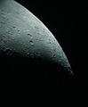
| 01/17/2003 11:16:19 PM | A Lunar Landscapeby Fibre OptixComment: So barren, so cold, so lifeless. I like the way the moon fades into the darkness at the bottom of the frame. If you stare at the image, the darkness seems to almost creep up from the bottom. Very nice job on the overall exposure. 8 |
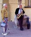
| 01/16/2003 01:16:08 AM | Blowing In The Windby JEMComment: Critique Club review
Interesting composition. The musician seems lost in his music, while the listener, if he is even listening, seems displeased, and looks like he waiting for someone off camera. The biggest fault I see with this photo is the position of the tree behind the musician. It appears to be growing out of his head. A different camera angle would have helped here, or if it was a posed shot, repositioning the models.
Considering the title, I think positioning the camera more to the right, so as to avoid the intrusion of the window and the tree behind the head, and possibly elminating the passerby would lead to a stronger photo. This would have put more focus on the musician, which is the strongest element here.
In this photo, the over all exposure is good. The colors are a little bit cool. The bricks have almost a blue cast to them. However, saturation is good. Contrast is very good. Depth of field and sharpness are excellent. | | Photographer found comment helpful. |
|
Showing 1351 - 1360 of ~1613 |
Home -
Challenges -
Community -
League -
Photos -
Cameras -
Lenses -
Learn -
Help -
Terms of Use -
Privacy -
Top ^
DPChallenge, and website content and design, Copyright © 2001-2026 Challenging Technologies, LLC.
All digital photo copyrights belong to the photographers and may not be used without permission.
Current Server Time: 07/17/2026 03:47:51 AM EDT.
|