| Image |
Comment |
| 09/19/2004 09:04:37 PM |
Gone Swimmingby OlyuziComment: Critique Club Review:
Composition is good, but colors run cool. The heaviness of the blue makes the picture look cold. First thing that comes to mind is that it is too cold to swim today. This almost looks like it could be a beach in Alaska. The darkness of the picture almost renders the chair as an outline.
Depth of field is good also. Did you use zoom? Things look a little compressed as if a higher level of zoom was used.
Overall a good picture and with some editing for color and brightness it could be very good. All the basic structures are there. |
 Photographer found comment helpful. Photographer found comment helpful. |
| 09/19/2004 05:02:48 PM |
Down by the river, under the stone bridgeby RUEDISCHMUTZComment: Critique Club Review:
Overall a pleasing photo. The patch of sky in the upper right does pull the eye away from the subject a bit. Perhaps a bit mor brightness also could have helped. The darkness of the bushes at the left of the arch also detracts a bit. All in all, the picture does make me want to go see this place. Well done. |
| 05/08/2004 03:14:56 AM |
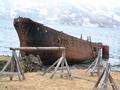
High Security by jjbeguinComment: Man am I a sucker for pictures with texture and detail like this. Saturation, contrast, lighting, all great. Absolutely beautiful! 10! |
| Photographer found comment helpful. |
| 05/08/2004 03:12:40 AM |
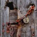
Left in the Northby stinaComment: Interesting photo, shame you didn't go larger on size to make it easier to see/judge. But you've probably heard plenty of this by now. Overall an interesting photo. The wooden structure in the left foreground is a little distracting. Good contrast. 6 |
| Photographer found comment helpful. |
| 12/28/2003 04:43:57 PM |
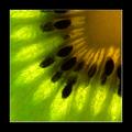
Kiwi Sunshineby puyaComment: I'm not a big border fan. This is a border that works. I like everything about this picture, the focus the lighting, the exposure. The kiwi seems to glow with a light of it's own. I would love to have a stained glass window just like this. This is art!
10! |
| Photographer found comment helpful. |
| 11/25/2003 02:28:53 PM |
|
| Photographer found comment helpful. |
| 11/25/2003 02:27:10 PM |
|
| Photographer found comment helpful. |
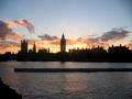
| 11/25/2003 02:25:27 PM |
Propaganda Centralby reeveyComment: The focus here looks a bit soft, and the setting sun is blown out at the right of the tower. Also, the subject is dead center of the photo. I'm not a rule of thirds hardliner, but it would have been helpful here. |
| Photographer found comment helpful. |
| 11/25/2003 02:14:48 PM |
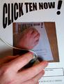
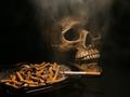
Smoking is Dead Sexyby TechnoShroomComment: Good exposure, contrast, lighting and color saturation. Definetly a strong message. Good use of the smoke with the skull. 10! |
| 11/25/2003 02:12:35 PM |
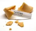
An Unfortunate Cookie by thelselComment: Good overall exposure. Though the lighting angle seems to be a bit too much to the rear, which shadows the message. Overall a very good effort and well themed for the challenge. 9 |
| Photographer found comment helpful. |
Home -
Challenges -
Community -
League -
Photos -
Cameras -
Lenses -
Learn -
Help -
Terms of Use -
Privacy -
Top ^
DPChallenge, and website content and design, Copyright © 2001-2026 Challenging Technologies, LLC.
All digital photo copyrights belong to the photographers and may not be used without permission.
Current Server Time: 07/17/2026 12:31:08 PM EDT.