|
|
|
Showing 1251 - 1260 of ~1613 |
| Image |
Comment |
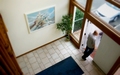
| 09/09/2006 07:14:39 PM | Compositionby FocusPointComment: Critique Club Review:
Exposure, color, saturation, hue, and contrast are all good. Focus and depth of field, are a bit soft. Were you going for a soft focus effect. A smaller f-stop will get you more depth of field. The area in best focus appears to be just inside the door, near the base of the plant. From there it gets softer especially as you rise up the walls.
This challenge has proven a bit difficult to critique because the challenge was understood in so many different ways by different people.
Without having seen your other pictures, I think that a picture with the door open, and without people, might have worked a bit better.
What you've done is create competing elements that vie for the title of subject. A photo that guides the eye around the frame, so as to become and endless loop, might be a better idea. |  Photographer found comment helpful. Photographer found comment helpful. |
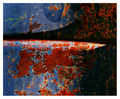
| 09/09/2006 04:22:39 PM | Rustby MadMan2kComment: Critique Club Review:
Nice photo! Focus, color, saturation, hue, exposure, depth of field, and lighting are all excellent. I really like your use of the angle of the light to bring more texture and shape to the subject. I notice you flipped the picture vertical. (Yes I am sitting here twisting my head all around to see it from different angles.) I think the flip did improve the photo. People (western cultures) read left to right & top to bottom, and tend to see pictures the same way. The other way, the light would seem to come from the bottom, which is less "natural".
One thing, already suggested during the challenge, would be to rotate so the seam would be vertical. The seam and associated shadow, would look good in a vertical format. | | Photographer found comment helpful. |
| 09/09/2006 04:11:51 PM | End of the Dayby ShannonLeeComment: Critique Club Review:
Good photo, and interesting angle. Too many people shoot from eye level and little else. Good focus, depth of field and and color. To my eye the sky comes across a bit washed out, and almost completely burned out between the foreground and background umbrellas. It's really tough to hold it all together when shooting into the sun. Cloning the man, and possibly the gull, out of the background might have helped a bit. Overall I like the picture and composition. It fits the challenge well, and definetly communicates the point that all the people are missing. Good job! | | Photographer found comment helpful. |
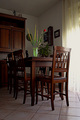
| 09/08/2006 09:04:14 PM | Home sweet home......by Rino63Comment: Critique Club Review:
The vase and flowers does come across as the subject of the piece. Which probably cost you some points. Curtains are completely blown out at the right of the picture, losing all detail. Since the rest of the picture is darker in comparison, the eye keeps going to the featureless white space.
The rest of the room is a little dark for my taste, but the colors, focus, depth of field, are all very good. I really like the lighting of the vase, and its contrast to the surroundings. | | Photographer found comment helpful. |
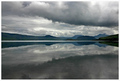
| 09/08/2006 08:42:31 PM | Distanceby BrinComment: Critique Club Review:
Wonderful picture! Color, focus, contrast and exposure are dead on. The composition comes across as a little bit dark, but then it was a dark day, so it works very well. If there were any flaw, and it would be very minor, the clouds in the sky with all their detail tend to compete just a bit with the rest of the picture. Obviously it's not bad, look at your score. I'm just scratching my head for any possible improvement. (And I'm not really finding one.) Great job! |
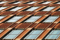
| 09/08/2006 08:36:02 PM | Building Study No. 9by banmornComment: Critique Club Review:
What an interesting piece. It definetly fits the challenge. I think your rotation of the image really worked. (Yes I did twist my head around to see it the other way.) Focus, depth of field are all good.
About teh only thing I see that might have stopped you from making the top 10, is the picture comes across as a little cold. By that I mean the colors are a little muted and voters here seem to go for more saturated, brighter colors. Having said that, personally I like this picture a lot, and think it is fine the way it is. Had I voted on this challenge, it would have received and 8 or 9 from me. | | Photographer found comment helpful. |
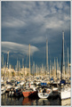
| 09/08/2006 08:29:44 PM | Where did I park my boat???by alexgarciaComment: Critique Club Review:
Nice Picture! Colors overall look very good, only thing that comes to mind is the possiblity that red boat has lost some of its punch during the manipulation. Blues and sky are great. Though I think there may be a bit too much sky. The boat masts draw the eye up, and then the clouds at the top compete for attention. I like the vertical format of the picture, it really fits with subject. Tall boats = tall picture. I would agree with one of the other comnenters that more water would have been nice. Those reflections are really great. | | Photographer found comment helpful. |
| 09/07/2006 04:17:10 PM | Depthby Man_Called_HorseComment: Critique Club Review:
As noted in other comments Nathan comes across as the subject of the piece. You've cropped the top of his head, which is a little distracting. I'm not sure if you meant to frame the mask on the wall with Natan's arms. If you meant to, then it's almost centered in the picture (see the rule of thirds) and is small for a point of interest. If you didn't want that effect, then a shallower depth of field to isolate Nathan from the background would have helped. The triangular lighter colored object sticking out from behind Nathan's forearm also interrupts the flow of the picture. Overall lighting, focus, color, and saturation are done well. |
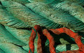
| 09/07/2006 04:03:16 PM | Textured Colorsby madcrabberComment: Critique Club Review:
I don't see the red rope as the subject, like some of those who commented. I do see it as a distraction. I love the color, texture and pattern of the main coil of rope. Focus and depth of field are great. You uswed the lighting to your advantage and you can almost feel the texture. However, I keep wanting to see what is behind the red rope. Less red, or no red I think might help things. As it is the red rope creeps in from the bottom and pulls the eye away. I think the other thing your score suffered from is having a picture that would have worked well in another current or recent challenge. Voters seem to vote lower when that happens. Not sure why. | | Photographer found comment helpful. |
| 09/07/2006 03:55:47 PM | Last Chance for Vacationby ElliottjmsComment: Critique Club Review:
While you may not have meant the picture to have a subject, to my eye the lighting of the center house is different enough to highilte it and make it the subject of this picture. I wouldn't grade you down horribly for this, but some voters will kill a picture if they think it doesn't meet the topic. Overall I like this picture. Looks like a decent sunset type affair. The focus is good, color and contrast work well. The cars in the foreground distract a bit, and might work better if they were cloned out. |
|
Showing 1251 - 1260 of ~1613 |
Home -
Challenges -
Community -
League -
Photos -
Cameras -
Lenses -
Learn -
Help -
Terms of Use -
Privacy -
Top ^
DPChallenge, and website content and design, Copyright © 2001-2026 Challenging Technologies, LLC.
All digital photo copyrights belong to the photographers and may not be used without permission.
Current Server Time: 07/17/2026 06:51:38 PM EDT.
|