|
|
|
Showing 1211 - 1220 of ~1613 |
| Image |
Comment |
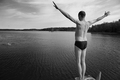
| 09/14/2006 02:01:12 PM | The Plungeby xianartComment: Critique Club Review:
Exposure, lighting and contrast are all good in this piece. Focus and depth of field are done very well.
I wouldn't have amputated the diver's feet. He's going to need them. The person in the water is a distraction where (s)he is. Either a different camera angle, or relocating the swimmer so that it looks like the diver is taking the plunge to join the swimmer, would have worked well. I would not remove the swimmer. For me, the swimmer helps tell the story as to why the diver is taking the plunge. However, at this angle and distance, the swimmer tends to pull the eye out of the frame.
Although this was a basic edititng challenge, were I going for an advanced challenge, or going to print the image for my wall, I would have removed the small island in the background. It breaks up the smooth flow of the shorline a bit, and without it the solitude is magnified.
Overall I like the photo a lot. It tells a story, and captures the feeling of the title. Good job! |  Photographer found comment helpful. Photographer found comment helpful. |
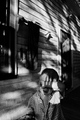
| 09/14/2006 01:52:40 PM | I Can Block the Sun with my Handby xianartComment: Critique Club Review:
Timeless photo. This could have been taken this morning or 100 years ago. How impressive! I like just about everything about this picture.
I like the focus, the lighting, the composition, the grain, the pose, the camera angle.... There really isn't anything here not to like.
So the question becomes, why didn't this photo score higher?
I tend to think that voters here gravitate towards brighter pictures. There are a lot of shadows here, including one across his face that would have already blocked out the sun. I think some probably didn't understand the grain, and took it for an accident rather than a purposeful application. The only distraction I see is the object hanging on the wall to the left of his head, is a very minor distraction for me.
I just don't know.... I would have expected top 10, or certainly top 20. Would have bet cash money that it would have made top half of the class. Evidently this picture really spoke to some of us, and the rest just weren't listening. | | Photographer found comment helpful. |
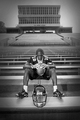
| 09/13/2006 07:22:22 PM | Contemplationby trnqltyComment: Critique Club Review:
Impressive photo! This picture tells and entire story. Definetly a good demonstration of a picture being work 1,000 words.
There are only two things that come to mind here. The helmet position does make it look more like a commerical ad. A player would likely have a helmet alongside themselves, as opposed to at their feet where it could get knocked off the bench. And, though you did a great job of isolating him with focus and lighting, the stadium comes across flat enough, that I could almost take it for a printed backdrop in a photo parlour.
Still these are two minor points. I really like this picture, and congratulations on cracking the top 20. | | Photographer found comment helpful. |
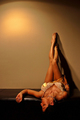
| 09/13/2006 07:07:27 PM | Sensuousby RudyC310Comment: Critique Club Review:
Focus and depth of field are a little off. f10 should have given you a sufficient depth of field, but the torso and legs look sharper than the rest of the image.
Color, saturation and hue are good. Lighting is a bit harsh, resulting in a highlite on the wall that competes with the rest of the image. It is so different and brighter, that it makes the color look off, over the rest of the photo. If I cover the highlite, the rest of the picture looks fine.
About the only arguement I have with the pose, is the furniture. With the model looking down a long piece of furniture that leads out of the frame, the eyes are drawn along a path that goes nowhere.
Overall a good picture, and nice job. Congratulations on making the upper half of the class in a tough challenge. |
| 09/13/2006 06:57:45 PM | Dawnby sigrun_thComment: Critique Club Review:
Focus is nice and sharp.
Color, saturation and hue are done well. Contrast is good. About the only thing I see in this picture that you might want to change, is to crop out some of the sky. There is so much negative space there, and it goes dark all across the top a little early, so that the negative space dominates the picture. If you cropped almost halfway down, you would still get the full range of colors in the sky. The darkness of the sky would not complete with the foreground, and it would be an interesting panoramic view.
As it is, it is still a very pretty picture that does well to communicate the stillness of first light in the morning. Nice job. | | Photographer found comment helpful. |
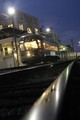
| 09/13/2006 12:33:25 PM | Street Car @ Dauphineby theonemuleComment: Critique Club Review:
Focus: The building is sharp, so I gather the train is moving, as it appears to be a bit soft. You need a little more motion blur to make it clear the train is moving, to the viewer. Decent overall exposure. Had it been any more, the lights would have overpowered the piece.
The angle at which you took the picture is interesting, but in this case it makes it look like the building is falling over backwards.
Color, saturation, and hue are all done well.
I do applaud your taking the picture from the level of the tracks. Very good point of view, and works well here. Too many cameras never leave the photgrapher's eye level. Nice job. |
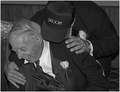
| 09/13/2006 12:22:59 PM | ....and a kiss for the new Dad too!by CaitlynComment: Critique Club Review:
Focus is nice and sharp, I would have liked to have seen the depth of field more shallow, so as to isolate the groom and the father inlaw from the background. The chair rail on the wall off horizontal, and whatever the object is that on the table at left, distract a bit.
The picture could have been a little lighter, to my taste. There is some room for brightness, without losing the detail in the whites.
The cap tells us that the person standing is the groom, but I have to agree with some of the others, I would have liked to see his face and what he is doing to create the reaction observed.
I don't think it is necessary to see the eyes of the father in-law. If you are laughing so hard your eyes are closed, that tells a story also.
Nice phtograph, it makes me smile just looking at it. | | Photographer found comment helpful. |
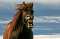
| 09/13/2006 01:15:18 AM | Freestyleby BrinComment: Critique Club Review:
I love this picture! It just really makes me want to laugh along with the horse.
Focus is good, but depth of field seems a bit shallow. Looks soft around the ears, not sure why. I like the lighting and color, I'm OK with the shadow on the face as it obviously comes from the horses hair.
A little darker sky would have helped the horse pop from the background.
If there were anything I would want differet, it would be for the horses eyes to be open. (You will mention that to the horse, won't you? ;-)
Congratulations on a very entertaining photo, and a deservedly good score. | | Photographer found comment helpful. |
| 09/13/2006 01:07:01 AM | Confined to her cellby justamistereComment: Critique Club Review:
Focus is very good, and depth of field is used to advantage to separate the subect from the background. The photo looks a bit over-processed by the the halo along the front of the legs, and a little unfinished by the lack of contrast in the trees in the background.
I don't find the bandaid as distracting as some other commenters. It really isn't that large, and bandaids happen. I would rather have had the feet not cut off. Had you been able to get an angle that showed the feet, or hid more of the lower body, I think it may have worked better. Good positioning of the subject otherwise.
Other than the afore mentioned trees, the rest of the lighting and color is very nice. Good skin tones, and nice highlites on the hair. |
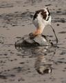
| 09/13/2006 12:58:22 AM | Avocet searches for foodby sfaliceComment: Critique Club Review:
I took me a bit, and a read of your comments to figure out what was going on. I was guessing part of an old glass bowl, or remnants of a jellyfish. Had there been a bit of motion blur, it would have been easier to understand what was going on. Makes for a very interesting photo though.
Focus and depth of field are very good. The bird is nice and sharp, and the softness in the foreground and background, do a good job of focusing the attention on the subject. Exposure, color, and contrast are done well. You have managed to keep the detail in the white feathers of the bird, with out looking grey or dingy. I really like that you got down to the bird's level for this shot. All too often cameras never leave the eye level of their owners.
With the spray of water in front of the bird, with such a static capture, it hides the bird a bit, and may be why you lost some points. Perhaps a different angle, or a bit of a motion blur, would better tell the story. As is, it is still a pleasing photo.
| | Photographer found comment helpful. |
|
Showing 1211 - 1220 of ~1613 |
Home -
Challenges -
Community -
League -
Photos -
Cameras -
Lenses -
Learn -
Help -
Terms of Use -
Privacy -
Top ^
DPChallenge, and website content and design, Copyright © 2001-2026 Challenging Technologies, LLC.
All digital photo copyrights belong to the photographers and may not be used without permission.
Current Server Time: 07/18/2026 11:11:17 PM EDT.
|