|
|
|
Showing 1191 - 1200 of ~1613 |
| Image |
Comment |
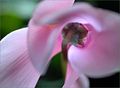
| 09/16/2006 01:29:44 AM | luminescentby IreneMComment: Critique Club Review:
Interesting picture.
I like the color, saturation, brightness, contrast, hue, and lighting.
The background is very good. If the black areas on the right, were more like the areas to the left of the flower, I would like it a bit better. The soft green and blue patterns of the background are great.
The flower itself confuses me. The stem is very sharp where it attaches to the flower, but then the flower goes immediately soft. But then the really soft petal just left of the stem has a really sharp area, and then the petal that appears to be behind the soft petal is sharp again. Thus the flower because of the stem, appears to be facing away, yet a petal that would appear to be further away than the stem or the soft petals appears sharper. I wind up wondering exactly how is this flower built, what parts am I looking at? There just aren't enough visual clues, and the dominat parts around the subject are very soft. So the sharper petal on the left competes with the rest.
All of the above probably lead to some of the other comments you received. You came up with a pleasing picture to my eye. But, I believe the confusion factor cost you points. I can sit here and put all the visual clues in order, and work out the the structure of the piece; but most voters will not devote that kind of time as they look through 200 pictures. The major part of the story has to be told in a few seconds, so that they will stick around for the deeper meaning. |  Photographer found comment helpful. Photographer found comment helpful. |
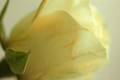
| 09/16/2006 01:11:31 AM | one roseby dragonladyComment: Critique Club Review:
Color, saturation, hue, and contrast are all good. I would have liked a bit brighter image. I see you did this in a tent, but it reminds me of an overcast or cloudy day. I think going with a soft focus filter, would have worked better than the shallow depth of field. As is the green competes with the pastel of the yellow. Lightening the green might work well too. I know you wanted a shallow depth of field, but the top of the bloom (right side) on the far side of the flower just sort of merges with the background. Had the background been a different color, or the flower a little sharper, this wouldn't happen.
The biggest distraction, because it is in the more sharply focused area, is the browning markings on the petals. While this might be a natural marking of the flower, the impression it gives me is a flower that has been over handled, or an older flower that is starting to deteriorate. If it is markings, a sharper image, with more depth of field would have communicated this. If the flower is deteriorating, or over handled and bruised, then the soft focus could have covered up the problem.
Overall this is an enjoyable picture. Nice job. |
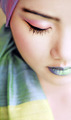
| 09/16/2006 01:00:40 AM | Saruta by librodoComment: Critique Club Review:
Not sure what to do here, except say congratulations on winning! Talk about intimidation. How can I improve a photo that came in first, from a photographer with five first place finishes, ten second place finishes, and numerous third place and honorable mentions? But enough of my whining....
Color, saturation, hue, lighting, contrast are all fantastic! Pose, angle, and cropping are great also.
I like the way the eye is sharp, and the rest goes soft.
If I could find anything that I think would be an improvement, (and I'm really looking hard here), would be that the chin goes a little soft a little quick on the right side; almost blending into her chest. And the other that catches my eye is that her hat is a little too sharp on the front of the bill. I think I would like it a little better soft, more like the other fabric in the piece. Both items are very minor. Would not stop me from giving this a 10.
Congratulations on a very well deserved first place finish. This is just an amazing picture that does not tire the eye. I could look at this every day for year, and still not be bored. | | Photographer found comment helpful. |
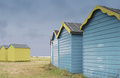
| 09/16/2006 12:46:08 AM | Beach Hut 79by KHoltComment: Critique Club Review:
Good take on the challenge.
I like the lighting, color, contrast, hue, brightness, and saturation.
I also like the way you kept the grass a light green so that it didn't compete witht the rest of the image.
Very good focus and depth of field.
The differing angles of the beach huts is a bit distracting. I imagine that they probably don't want you relocating their beach huts though...
I would have liked to have seen a little more ocean. In the space between the huts. But again, moving huts.... ;-)
The sky color is good, but a little more detail would have been interestng. It's much better than the featurless skys too often seen in photos, but it teases me for a bit more.
Ovreall a very good photo, one I could see hanging on my wall. Congratulations on your top 20 finish. | | Photographer found comment helpful. |
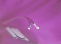
| 09/15/2006 02:16:09 PM | 3 + 3by AlainComment: Critique Club Review:
Interesting shot. It took me a bit to figure out what this was. The shallow depth of field makes a nice contrast, but makes it hard to tell what it is. If this was your goal, it worked well. If not, then it didn't work so well. However, confused voters tend to vote lower. When I first saw the picture, I thought it was three strands of cable or string and three plastic things against a purplish-pink backround.
Lighting, color, saturation, hue, brightness, and contrast are all done quite well.
Given that the lower part and right hand side of the flower's petals are soft, The sharper detail on the upper and left parts is a little distracting. I've tried picturing it both ways, and I think I would like it best if all the petal material were soft. Especially given the softness of the stamens.
As an abstract piece, this picture really works for me.
| | Photographer found comment helpful. |
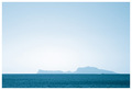
| 09/15/2006 02:00:18 PM | Capriby Rino63Comment: Critique Club Review:
Nice color tones, comes out almost a monochromatice study in blue.
You received some nice comments, and no negative comments, so why didn't this picture score higher?
Lighting, color and contrast are all good. Though cooler colors (blues grays) sometimes get fewer votes than the warmer colors.
The passing boat is a little bit distracting. Not big enough for detail, not small enough to ignore. You have a lot of sky. While a pretty color it is empty, and overwhelming. Looking at this picture I wish for a larger island. The sea is bold and large, the sky is huge, and the island comes out small in comparison.
Still, this a nice enjoyable picture and I feel that you should have scored a little higher than you did. | | Photographer found comment helpful. |
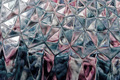
| 09/15/2006 12:55:08 AM | Abstact Pastels under Glassby mpreslarComment: Critique Club Review:
I just like sitting here and looking at this one... The shapes seem to change as you look at them, along the bottom of the frame.
Focus and depth of field are done very well. Color, saturation and hue are fine. The whites could be a little bit brighter for me. Contrast and lighting are well done. Detail is not lost in the brights or the darks.
I'm not sure how you could have done it, but the only thing I see is that the pattern seems to run off the edge. Maybe catch it along the lines of the patter for the edge of the frame. But that would be really tough.
Very nice picture. | | Photographer found comment helpful. |
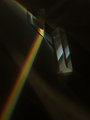
| 09/15/2006 12:47:55 AM | Prism Bluesby EVincentComment: Critique Club Review:
The colors are too saturated to really be called pastels, and it cost you points. Some people put more weight on the challenge topic than others, but very few ignore the topic in their voting.
Lighting, color, saturation, hue, focus and depth of field are all done well. The surface of the background makes the rainbow look a bit too sharpened almost grainy. A smoother surface would have helped here.
The scratches or cuts in the surface near center bottom, in the main highlight are a little distracting. Cloning them out would have helped.
All in all, this is a very good picture. Unfortunately the challenge wasn't well met. There is more than one person here who would rail against such a statement and say that the pictures be judged on their own merits regardless. However, in that case we might as well have free studies for every challenge and be done with it.
Looking at your profile I see your scores are improving every round. You are on your way. | | Photographer found comment helpful. |
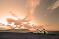
| 09/15/2006 12:37:57 AM | Pastoraleby BrinComment: Critique Club Review:
Very nice picture.
Focus is great. Lighting, color, saturation, hue, contrast, brightness are all done quite well.
I don't know if there ever really has been a sky like this, but there sure ought to be. I do find the purple vegetation in the foreground competes a bit with the sky. I'm not sure what to make of the house. It seems to be at an un-natural angle. Did it really seem to lean and warp like that? With the very pink sky, a warmer white on the house seems to be in order. I could have liked this picture as well with just the water in the foreground, maybe even better. Sort of an enchanted island in the distance sort of thing.
As it is, I really enjoyed this picture.
| | Photographer found comment helpful. |
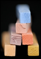
| 09/15/2006 12:30:39 AM | Edibility Factorby hotpastaComment: Critique Club Review:
Focus is good. Depth of field is so shallow that the yellow block looks soft on the right half of the face because the edge doesn't stand out and the face in that area is featurless. Since your goal was a very shallow depth of field, I won't argue with you. Though with the title and the soft focus, my first thought was moldy cheese.
Lighting, color, saturation, contrast, and hue are all done well. Except for the afore mentioned yellow block, the features on the faces of all the other blocks are nice and sharp, with plenty of texture and relief from proper lighting.
Nice take on the challenge, and a very enjoyable picture. | | Photographer found comment helpful. |
|
Showing 1191 - 1200 of ~1613 |
Home -
Challenges -
Community -
League -
Photos -
Cameras -
Lenses -
Learn -
Help -
Terms of Use -
Privacy -
Top ^
DPChallenge, and website content and design, Copyright © 2001-2026 Challenging Technologies, LLC.
All digital photo copyrights belong to the photographers and may not be used without permission.
Current Server Time: 07/18/2026 07:52:39 AM EDT.
|