|
|
|
Showing 1181 - 1190 of ~1613 |
| Image |
Comment |
| 09/16/2006 11:43:09 AM | Rosesby lifternessjtComment: Critique Club Review:
Lighting, color, saturation, hue, contrast, exposure, are all done excellently.
Focus is great. Depth of field, I wish there was a little less of it. If the DOF was a little shallower, you would still have the sharp edge and detail around the rose, to contrast with the softness of the rose. However, the back edge of the stone to the left of the rose serves only to distract the eye. It is somewhat soft now, but softer yet would pull the eye back to the rose even more. I would even like to see the furthes leaves go soft at their tips.
The roses are fantastic, keep the eye there as they tell the whole story. Very well done!
|  Photographer found comment helpful. Photographer found comment helpful. |
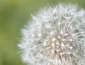
| 09/16/2006 11:36:03 AM | Soft Dandelionby diablo2097Comment: Critique Club Review:
I noted your comment about wanting to do b/w pastels. Most voters would not consider any shade of black or white a pastel. Pastels are usually considered pale colors. Here the green is a bit too dark to call pastel, and white is ummmm... white.
I see you wanted to so a soft focus piece, which is fine. But also what I see here is center of the Dandelion is soft, and then there is a sharper ring of focus before it goes soft again at the edges. The soft center competes with the sharp ring.
I like soft focus pictures, but most successful ones have less complex structures. As compex as this structure is, it is a good thing that there were sharp areas. Had the whole thing been soft, it would have looked somewhat like a cotton ball.
Overall, I like this picture. I think it has a lot of potential and I would encourage you to take it again when your coupling ring arrives.
|
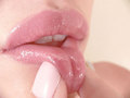
| 09/16/2006 11:26:15 AM | Pinchby escapetoozComment: Critique Club Review:
Lighting, color, exposure, saturation, hue, and contrast are all very well done.
Focus is excellent. Depth of field is good, though the lips start to go soft just a little bit early for me. Or maybe a little too late. The sharpness of the lips at the edge of the mouth on the left draws the eye right out of the frame. Either that, or move the model to the right so there is a little space between the lips and the edge.
The skin tones are great, as well as the rest of the compostion.
Overall, this is a very good picture and I could see it hanging in a gallery. | | Photographer found comment helpful. |
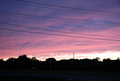
| 09/16/2006 11:18:27 AM | Summer Slips Away Softlyby EssAreDubyaComment: Critique Club Review:
Lighting, color, saturation, contrast and hue are all done well.
But those power lines are killers. (As you probably have already deduced from the other comments.) The power pole sticking up above the trees, and the light or white spot in front of the trees are also distractions. Looks like the light is illuminating a flag pole just left of center. (Is this a cemetary?) As this is an avanced editing challenge, I would have cloned them out or shot from a distance and angle where they would have added to the composition.
There also appears to be a very dimly lit road in the foreground. Taking it a bit darker could have turned it into a silhouette, and reduced the distraction here. If you did it using contrast, it might give you a little more definition to your clouds.
|
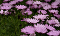
| 09/16/2006 11:07:03 AM | The dawning of springby NuzzerComment: Critique Club Review:
I think some of the comments you have already received have pointed out the things I see in this picture.
The large green area does compete. The softness of the foreground flowers push your eye to the green area. The green just comes on too strong. The brightness could go up a bit. The photo looks like it was taken on a dark cloudy day, or the camera under exposed the shot.
I do like the shallow depth of field in the back of the frame. It is detailed enough to tell us the flowers go on, maybe forever, yet push the eye back forward to the flowers in focus to keep the eye in the picture.
I might have trimmed of a couple of the buds, that stick up into the flower bloom area. There is one along the right third of the photo, right at the back of the sharp area that competes with the blooms.
Overall, this is a very nice picture. | | Photographer found comment helpful. |
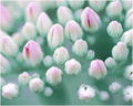
| 09/16/2006 10:57:21 AM | Herbstfreude, Up Closeby puzzledComment: Critique Club Review:
Color, saturation, brightness, contrast, and hue are all excellent.
Focus is good, and depth of field was used very well to create the desired effect.
A couple of things that I see are, there is a line, (spider web maybe?) that looks almost like a scratch, just above the lower left-most flower bud. Faint, and I didn't pick it up right away, but once seen keeps calling the eye back. The other is the open area at the middle right third of the frame. Again not bad, but to my eye a little too large and as such competes with the rest of the subject.
At first I thought I wish one or more of the flowers were open, but as I look at the photo it is fine the way it is. Maybe just a tiny bit more pink might be nice. There seems to be a lot of white. Not a lot more pink, just a very little bit.
Overall this is a really good picture, as reflected by your score, and one you should be proud of. Excellent job! | | Photographer found comment helpful. |
| 09/16/2006 01:42:52 AM | | | Photographer found comment helpful. |
| 09/16/2006 01:41:05 AM | | | Photographer found comment helpful. |
| 09/16/2006 01:36:56 AM | | | Photographer found comment helpful. |
| 09/16/2006 01:35:26 AM | | | Photographer found comment helpful. |
|
Showing 1181 - 1190 of ~1613 |
Home -
Challenges -
Community -
League -
Photos -
Cameras -
Lenses -
Learn -
Help -
Terms of Use -
Privacy -
Top ^
DPChallenge, and website content and design, Copyright © 2001-2026 Challenging Technologies, LLC.
All digital photo copyrights belong to the photographers and may not be used without permission.
Current Server Time: 07/18/2026 11:13:12 AM EDT.
|