|
|
|
Showing 1111 - 1120 of ~1613 |
| Image |
Comment |
| 09/25/2006 08:36:36 PM | Obtuse & Acuteby jhuangComment: Critique Club Review:
Focus is very good. Depth of field is a bit shallow, as evidenced by the softness neart the bottom of the frame. Having the camera at more of a right angle to the watch face would help decrease the depth of field needed.
I would go along with those who wish to see more of the watch face. The sudden cut off of the bottom portion of the watch is distracting.
Lighting, color, saturation, and hue are done well.
As a representation of geometry, I'm afraid your presentation was a little obtuse for a fair number of the voters. Interesting and creative take on the challenge, but judging by the scores; over a few heads.
|
| 09/25/2006 07:26:13 PM | "What happened, Mommy?"by rushartistryComment: Critique Club Review:
Focus and depth of field are done well.
Color, saturation, and hue are very good. Skin tones are dead on.
I might wish for a smidge brighter picture for a more vivid rendition, but then it may just be my monitor.
I find myself wishing to see more of the quilt, and a little less of the flags down front. They cause a little bit of distraction for me.
Overall a very enjoyable picture. One that I think should have scored a bit higher. |
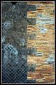
| 09/25/2006 07:20:19 PM | Pompeii Construction: Building Materials Uniteby steffyldComment: Critique Club Review:
I'd have to agree with some of the other comments.... A closer shot, would still give us the mixture, but at the same time give us more drama through the detal and texture. From this distance, it minizes the feel of the piec. About one quarter of what you have here, in the same image size, is something I would really like to see.
Your focus looks good, but there is so much going on, that it is hard to concentrate in one spot to make sure. The eye is constantly pulled everywhere, which is very distracting.
Color, saturation, and hue are done well. Lighting from a sharper angle should help with the texture. As is it seems a little flat.
I do like the color and contrasts a lot. |  Photographer found comment helpful. Photographer found comment helpful. |
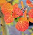
| 09/25/2006 07:14:06 PM | Expression of Anthocyanins and Carotenoidsby hahn23Comment: Critique Club Review:
Focus is nice and sharp, depth of field was used well to isolate the subject from the background clutter.
Color saturation and hue are done quite well. Lighting, brightness and contrast are done very well also.
Unfortunately I thinky your score suffered from the votes of those who take the challenge litterally. (I don't see no stinking test tubes....)
This is a nice picture. Some evidently didn't grasp the chemistry that goes on in nature. Not enough drama for a top finish here, but certainly not worth over 100 votes less than a 5. | | Photographer found comment helpful. |
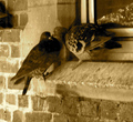
| 09/25/2006 07:06:12 PM | A different kind of chemistry.by headbgoneComment: Critique Club Review:
Focus is soft, image comes across as out of focus as opposed to a soft focus, if that is what you were going for.
I would have preferred the image lighter/brighter. Sepia is an interesting twist.
I realize the pigeons are where the pigeons are. However, all the architectural lines and angles are a little distracting.
Overall a creative interpretation to the challenge. |
| 09/25/2006 03:46:16 PM | Math IS Fun!by theyetifanclubComment: Critique Club Review:
Good thing he hung in there as long as he did. Nice picture.
As others have noted, the highlight on the nose is completely blown out and featureless. His right eye, viewer's left, starts to dissapear into the shadow. Along with the birght nose, it becomes a little distracting. A lighting angle less from the side and a little more towards the front, would help here. Or a second fill light could also do the job.
I like the crop, overall brightness, color, contrast, saturation, and hue are fine.
A very amusing photo, and one to be pround of. Nice work.
|
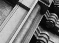
| 09/25/2006 03:38:56 PM | Doing lines...by moosemayhemComment: Critique Club Review
There are some nice shapes here. The lighting is a bit low, and contrast a little soft.
If this had been taken to extreme contrast where it was almost all white and all black, it would make for increased drama in the piece.
Interesting composition, and focus/depth of field are fine. Just needs more punch. | | Photographer found comment helpful. |
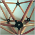
| 09/25/2006 01:25:36 AM | Lines at playby rapidComment: Critique Club Review:
Focus is good. Depth of field is either too shallow to give good detal on the back of the truss, or too deep to soften it so that it doesn't compete. Depends on which look you were going for.
With the low ASA number, you must have oversharpend the image, because the result is a lot of grain.
Contrast looks a bit low, the image seems a bit washed out. As if under exposed and then lightened to make it look right.
Although the foreground connector is supposed to be the subject, the eye keeps going to the one in the background due to the lines of the geometry. I would suggest playing with the angle of the shot, and the rotation of the object to get the feel you want.
Overall an interesting photo with a lot of potential. |
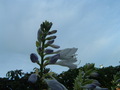
| 09/25/2006 01:06:25 AM | Solitaireby TemperpolkComment: Critique Club Review:
I'm not sure how this picture was meant to meet the challenge of Geometry. Which also hurt your score in the voting, as other noted the same thing during the challenge.
Outside of that.... Though the stem of the flower is vertical. The hedge becomes the horizon in this picture and along with the light pole in the background, give the viewer the impression the camera was tilted, and eye slides off to the left.
As noted in the remarks, some people thought the light pole was an interesting "UFO". Others saw it as a distraction. I fall into the latter camp, as it is not large enough to be the subject, but is just enough to distract.
I would liked to have seen the flowers in sunlight. Flowers usually denote color, brightness, life, joy, happiness etc. Here they appear to have been photographed in the shade. Thus the picture becomes somewhat cold, pale, and a bit lifeless.
Focus is nice and sharp, and I would suggest a higher f-stop for a wider aperature, to lessen depth of field to help separate your subject from background clutter.
|
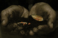
| 09/25/2006 12:55:38 AM | From the earthby Rino63Comment: Critique Club Review:
Focus is nice and sharp. Depth of field is OK. Though a shallower depth of field to soften the background, starting at the wrists, would have been an idea that may have served well. Holding the arms closer together to block out the lighter area that starts at the joining of the hands would work well too.
Photo is a little on the dark side for the subject. Seeds usually represent life, fertility, growth etc. Had you taken the hands and dirt to black and white, the seeds and seed pod would have really popped here.
Overall I've enjoyed this picture, and it makes a nice statement. | | Photographer found comment helpful. |
|
Showing 1111 - 1120 of ~1613 |
Home -
Challenges -
Community -
League -
Photos -
Cameras -
Lenses -
Learn -
Help -
Terms of Use -
Privacy -
Top ^
DPChallenge, and website content and design, Copyright © 2001-2026 Challenging Technologies, LLC.
All digital photo copyrights belong to the photographers and may not be used without permission.
Current Server Time: 07/20/2026 03:52:46 AM EDT.
|